Choosing the right UI approach in a Tailwind-based project is not just about picking a component library. It directly affects how you structure your code, how much control you have over styling, and how easily your project can scale.
Many developers compare DaisyUI and shadcn/ui because both aim to simplify UI development with Tailwind, but they take completely different approaches. DaisyUI provides prebuilt class-based components so you can build interfaces quickly. shadcn/ui gives you reusable component code that lives inside your project, giving you full control.
This difference often creates confusion. Developers either pick speed and later struggle with customization, or pick flexibility and slow down initial development.
What will you learn from this blog?
By reading this blog, you will understand how DaisyUI and shadcn/ui work in real development scenarios, how their approaches differ, and what trade-offs come with each. You will also learn when to use each tool based on your project requirements, instead of relying on generic recommendations.
Who should read this?
This blog is for developers working with Tailwind CSS, especially those using React or Next.js, who are deciding between a faster development workflow and a more flexible, scalable UI architecture. It is also useful if you are starting a new project or rethinking your current frontend setup.
What is DaisyUI?
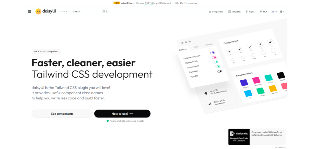
DaisyUI is a Tailwind CSS plugin that provides prebuilt UI components using semantic class names. Instead of writing multiple utility classes, you use simple class names like btn, card, or alert to build UI faster. It works by extending Tailwind with component classes and design tokens, so you still stay within the Tailwind ecosystem while reducing repetitive code.
One of the main advantages of DaisyUI is its theme system. It comes with multiple predefined themes and allows you to switch or customize them using configuration. This makes it useful when you need consistent styling across your application without spending time on design decisions.
How it works
DaisyUI is installed as a Tailwind plugin and automatically adds component classes to your project. You use these classes directly in your HTML or JSX without creating separate component files.
npm i -D daisyui@latest// app.css
@import "tailwindcss";
@plugin "daisyui";Once installed, you can start using components immediately:
<button class="btn btn-primary">Click me</button>

<div class="card bg-base-100 shadow-xl p-4">
<h2 class="card-title">Card Title</h2>
<p>This is a simple card using DaisyUI</p>
</div>
Key features
- Prebuilt component classes on top of Tailwind
- Built-in theme system with multiple themes
- Works with any framework (React, Vue, HTML, etc.)
- Reduces the need to write repetitive utility classes
When developers use it
DaisyUI is commonly used when speed is important. It works well for dashboards, admin panels, prototypes, and projects where you want a clean UI without spending much time on styling decisions.
What is shadcn/ui?
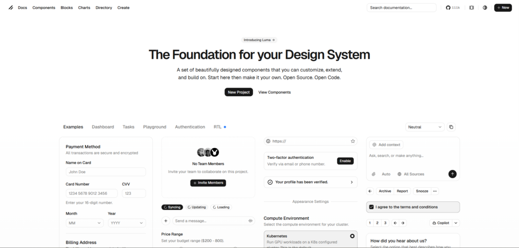
shadcn/ui is not a traditional component library. It is a collection of reusable Shadcn UI components that you copy into your project and own completely. Instead of installing a package and using predefined classes, you generate components as actual code files, which you can edit, extend, or restructure based on your needs.
This approach gives you full control over styling and behavior. The components are built using Tailwind CSS and follow accessible patterns, but nothing is locked. You are free to modify everything, from structure to design tokens, without depending on external updates.
How it works
shadcn/ui uses a CLI to add components directly into your project. Each component becomes part of your codebase, which means you can customize it like any other React component.
npx shadcn@latest init -t [framework]Supported templates: next, vite, start, react-router, and astro.
For Laravel, create the app first with laravel new, then run npx shadcn@latest init.
npx shadcn@latest add buttonThis will generate a component inside your project:
// components/ui/button.tsx
export function Button({ children }: { children: React.ReactNode }) {
return (
  <button className="px-4 py-2 bg-primary text-white rounded-md">
    {children}
  </button>
);
}
You can now modify this component as needed:
<Button>Click me</Button>Key features
- Full ownership of component code
- Built with Tailwind CSS and modern React patterns
- Easy to customize and extend
- No dependency on external UI library updates
When developers use it
shadcn/ui is commonly used in React and Next.js projects where flexibility and long-term maintainability are important. It is a good choice when you want to build a scalable design system or need full control over how components behave and look.
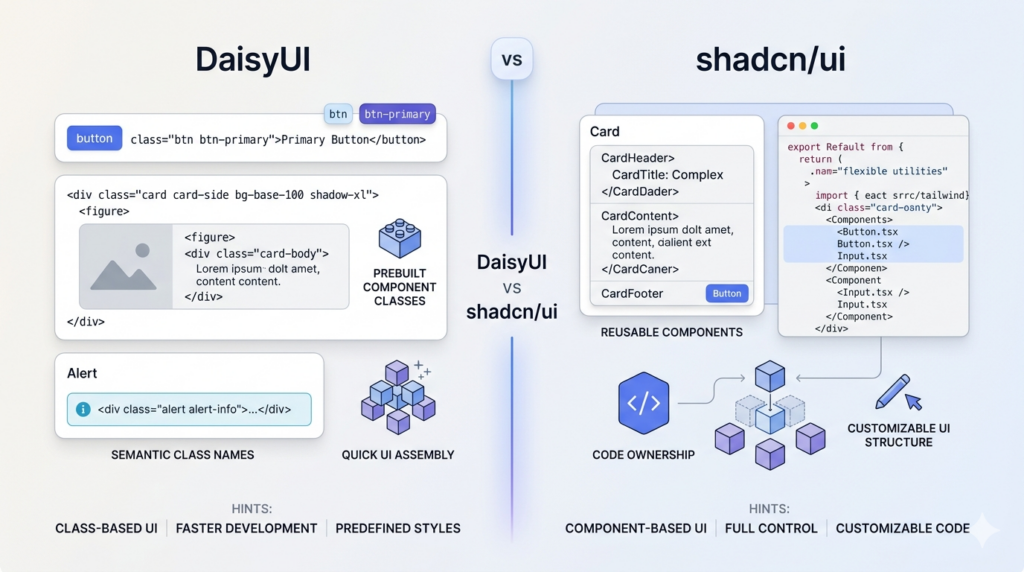
Core Differences Between DaisyUI and shadcn/ui
DaisyUI and shadcn/ui may look similar at a glance because both work with Tailwind CSS, but their core approach is completely different. The difference is not just in features, it is in how you build and manage your UI.
Approach
DaisyUI uses a plugin-based approach. It provides predefined component classes so you can build UI quickly without worrying much about structure or styling. The focus is on reducing development time.
shadcn/ui uses a component-based approach where you add actual code into your project. You control how each component is built and maintained, which makes it more flexible.
Styling approach
DaisyUI abstracts Tailwind into semantic class names. Instead of writing multiple utility classes, you use simple class names like btn btn-primary.
<button class="btn btn-primary">Button</button>shadcn/ui uses Tailwind utilities directly inside component code. You write or modify the styles yourself, which gives more flexibility but requires more effort.
<button className="px-4 py-2 bg-blue-600 text-white rounded-md">
Button
</button>
Component ownership
With DaisyUI, components are not part of your codebase. You rely on the plugin and its predefined classes. Customization is mostly done through configuration, theme variables, or by overriding styles using Tailwind utilities. This works well for standard UI needs, but if you want to change the internal structure of a component, you have limited control.
For example, modifying a button’s spacing or colors is easy, but changing how a complex component like a modal or dropdown behaves may require workarounds or custom implementation.
With shadcn/ui, components are part of your project. You can edit the structure, logic, and styling without any limitations. Since the code is inside your repository, you can refactor components, split them, or integrate custom logic like state management, animations, or API handling directly into them.
This also means:
- No dependency on external updates
- No risk of breaking changes from a library update
- Full control over component behavior and structure
The trade-off is that you are responsible for maintaining the components as your project grows.
Development trade-off
DaisyUI gives faster initial development because you can build UI with minimal setup and fewer decisions. You can quickly assemble pages using predefined classes without thinking about component structure or styling patterns. This is useful when you are building MVPs, internal tools, or projects with tight deadlines.
However, as the project grows, you may start facing limitations when you need more control. Overriding styles or creating custom variants can increase complexity, especially if the UI requirements become more specific.
shadcn/ui requires more setup and understanding at the beginning. You need to generate components, understand their structure, and manage styling yourself. This can slow down early development compared to DaisyUI.
But in the long run, it provides better flexibility. You can:
- Create reusable patterns tailored to your project
- Maintain consistent design at scale
- Avoid dependency-related issues
- Optimize components for performance and specific use cases
In simple terms:
- DaisyUI optimizes for speed in the beginning
- shadcn/ui optimizes for control and scalability over time
Installation and Setup (Step-by-Step)
The setup process is one of the biggest practical differences between DaisyUI and shadcn/ui. One focuses on quick integration, while the other requires a bit more setup but gives you control from the start.
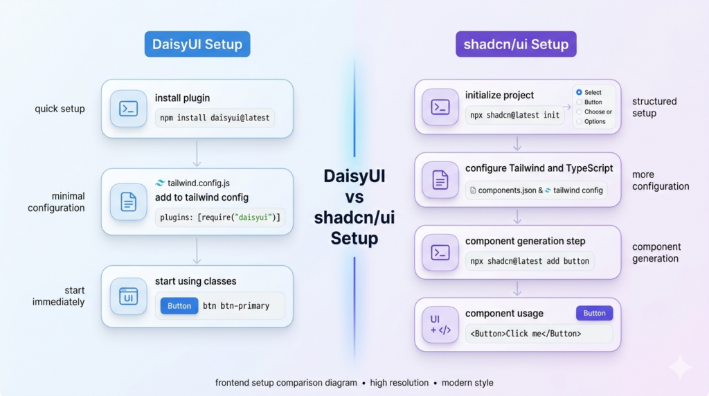
DaisyUI setup
DaisyUI is installed as a Tailwind plugin, so if you already have Tailwind configured, the setup is very quick.
npm i -D daisyui@latestAdd it to global CSS:
// global.css
@import "tailwindcss";
@plugin "daisyui";
Add it to your Tailwind config:
// tailwind.config.js
module.exports = {
content: ["./src/**/*.{js,ts,jsx,tsx}"],
plugins: [require("daisyui")],
};
That’s it. You can start using components immediately:
<button class="btn btn-primary">Click me</button>There is no need to create component files or manage imports. Everything works through class names.
Official installation guide: https://daisyui.com/docs/install/
shadcn/ui setup
shadcn/ui requires a bit more setup because it integrates directly into your project structure. It is commonly used with React and Next.js.
Initialize shadcn/ui:
npx shadcn@latest init -t [framework]Supported templates: next, vite, start, react-router, and astro.
For Laravel, create the app first with laravel new, then run npx shadcn@latest init.
During setup, you will configure:
- Tailwind CSS
- TypeScript support
- Component directory
- Styling preferences
Add a component:
npx shadcn@latest add buttonThis generates a component inside your project:
// components/ui/button.tsx
export function Button({ children }: { children: React.ReactNode }) {
return (
  <button className="px-4 py-2 bg-primary text-white rounded-md">
    {children}
  </button>
);
}
Use it like a normal React component:
<Button>Click me</Button>Official installation guide: https://ui.shadcn.com/docs/installation
Setup comparison
DaisyUI setup is faster and requires fewer steps. You install a plugin and start using classes immediately.
shadcn/ui setup takes more time because it configures your project and adds components as code. However, this setup ensures that everything is aligned with your project structure from the beginning.
In practical terms:
- DaisyUI is quicker to start
- shadcn/ui is more structured and customizable from day one
Component Architecture Comparison
The way you build components in DaisyUI and shadcn/ui is fundamentally different, and this directly impacts how your codebase evolves as your project grows. This difference is not only about syntax, but it also affects how you reuse UI, maintain consistency, and manage changes over time.
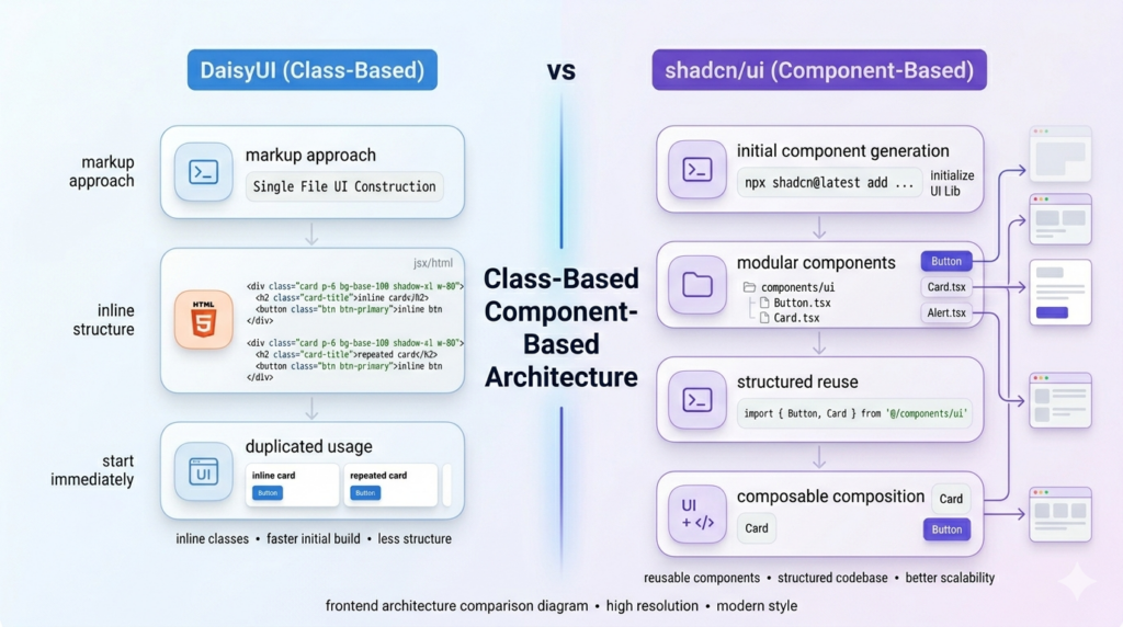
Class-based approach in DaisyUI
DaisyUI follows a class-based approach where UI is built using predefined class names directly in your markup. Instead of creating separate component files, you compose UI using Tailwind utilities along with DaisyUI component classes.
<div class="card bg-base-100 shadow-xl p-4">
<h2 class="card-title">Card Title</h2>
<p>Card content</p>
<div class="card-actions">
  <button class="btn btn-primary">Action</button>
</div>
</div>
This approach makes development faster because everything stays in one place, and you do not need to think about component structure in the early stages. It works well when building simple interfaces or prototypes where speed is more important than long-term structure.
As the project grows, the same approach can introduce challenges. Repeating similar UI across multiple files can make updates harder, especially when the same pattern is used in many places. Maintaining consistency also becomes difficult because small variations in class usage can lead to inconsistent UI. To handle this, developers often start creating their own reusable components on top of DaisyUI, which adds an extra layer to manage.
Component-based approach in shadcn/ui
shadcn/ui follows a component-based approach where each UI element is created as a reusable React component inside your project. These components are part of your codebase, which means you can modify them without any external dependency.
import { Button } from "@/components/ui/button";

export function Card() {
return (
  <div className="p-4 border rounded-lg">
    <h2 className="text-lg font-semibold">Card Title</h2>
    <p>Card content</p>
    <Button>Action</Button>
  </div>
);
}
This structure makes it easier to manage UI as your application grows. Since components are modular, changes can be made in one place and applied everywhere. It also allows you to integrate logic, handle different states, and extend components based on your needs without rewriting UI in multiple places.
At the same time, this approach requires more upfront effort. You need to understand the component structure, manage files, and think about reusability early in development. This can slow down initial progress compared to DaisyUI, especially for smaller projects.
Trade-offs in real projects
In smaller projects, DaisyUI allows you to move quickly because you can focus on building UI without worrying about structure. It reduces the number of decisions you need to make in the beginning and helps you ship faster.
In larger applications, the lack of structure can become a limitation. Managing repeated UI patterns and making global changes requires more effort. This is where shadcn/ui provides an advantage. Its component-based approach creates a more organized codebase, making it easier to maintain and scale over time.
In practice, the choice depends on how long your project is expected to grow. DaisyUI works well when speed is the priority, while shadcn/ui becomes more valuable when maintainability and scalability start to matter.
Customization and Theming
Customization and theming in DaisyUI and shadcn/ui are fundamentally different. DaisyUI provides a ready-to-use theme system out of the box, while shadcn/ui gives you low-level control using CSS variables and Tailwind configuration.
DaisyUI theming approach
DaisyUI provides a built-in theme system where you can enable predefined themes and apply them using a simple attribute. Unlike shadcn/ui, you do not define tokens manually. Themes are already configured and applied globally.
You enable themes directly in your CSS configuration:
.dark {
--background: oklch(0.145 0 0);
--foreground: oklch(0.985 0 0);
}
In this setup:
- Light is the default theme
- Dark follows system preference
- Cupcake is an additional enabled theme
To apply a theme, you use the data-theme attribute:
<html data-theme="cupcake"></html>Once applied, all DaisyUI components automatically adapt to the selected theme without any changes in component code.
Theme switching in real projects
In real applications, themes are usually switched dynamically. A common approach is to use the theme-change utility, which allows users to switch themes and stores the selected theme in local storage.
This makes it easy to:
- Toggle between light and dark mode
- Persist user preference
- Apply themes without manually handling state logic
Since DaisyUI handles themes internally using CSS variables, switching themes updates the entire UI instantly.
Explore all available themes and configuration options in the official DaisyUI theme documentation. It covers built-in themes, custom themes, and advanced setup.
shadcn/ui theming approach
shadcn/ui uses CSS variables with semantic theme tokens instead of predefined themes. Instead of switching between ready-made themes, you define design tokens like background, foreground, and primary, and components automatically use those values.
The core idea is simple. Components do not hardcode colors. They rely on tokens.
<div className="bg-background text-foreground">
Content
</div>
These tokens are mapped using CSS variables in your global styles:
/* globals.css */
:root {
--background: oklch(1 0 0);
--foreground: oklch(0.145 0 0);

--primary: oklch(0.205 0 0);
--primary-foreground: oklch(0.985 0 0);
}
Tailwind then maps these variables into utility classes like bg-background, text-foreground, bg-primary, and text-primary-foreground.
This setup is enabled by default in components.json:
{
"tailwind": {
  "cssVariables": true
}
}
Predefined style presets
In addition to custom tokens, shadcn/ui also provides predefined style presets that you can configure in your components.json. These presets define the base styling, spacing, and overall design defaults for your components.
{
"style": "base-nova",
"rsc": true,
"tailwind": {
  "config": "",
  "css": "app/globals.css",
  "baseColor": "neutral",
  "cssVariables": true
}
}
The style field controls the preset you are using. Some commonly used options include base-nova, radix-nova, base-vega, and radix-vega.
The baseColor defines the default color system, while cssVariables: true enables the token-based theming system using CSS variables.
These presets are not full themes like DaisyUI. Instead, they act as a structured starting point for your design system. You still control all tokens and styling, but you begin with a consistent base instead of building everything from scratch.
Token system and pairing
shadcn/ui follows a semantic token convention where each color has a paired foreground value. The base token controls the background, and the foreground token controls the text or icon color on top of it.
--primary: oklch(0.205 0 0);
--primary-foreground: oklch(0.985 0 0);
Used like this:
<div className="bg-primary text-primary-foreground">
Hello
</div>
This ensures proper contrast and consistency across components without manually adjusting text colors.
Dark mode handling
Dark mode in shadcn/ui works by overriding the same tokens inside a .dark class instead of switching themes.
.dark {
--background: oklch(0.145 0 0);
--foreground: oklch(0.985 0 0);
}
When the .dark class is applied, all components automatically adapt because they are using the same tokens.
Refer to the official shadcn/ui theming documentation to understand how CSS variables and design tokens are structured and used across components.
Practical difference
DaisyUI and shadcn/ui take completely different approaches to theming, and this difference becomes clear when you start working on real projects. DaisyUI handles theming at the framework level. You enable themes, apply them using a data-theme attribute, and all components automatically adapt without modifying component code. This makes it faster to implement features like dark mode or multiple themes with minimal effort.
shadcn/ui handles theming at the design system level. Instead of switching themes, you define and manage CSS variables that control the entire UI. Components rely on these tokens, so any change in variables reflects across the application. This approach requires more setup, but it gives you precise control over colors, spacing, and overall design consistency.
In practical use, DaisyUI is more suitable when you want quick theme switching and predefined design options. shadcn/ui is better when you want to build a custom design system where every token is defined based on your product requirements.
Developer Experience and Performance
Developer experience and performance are closely connected when working with UI libraries. The way a library is structured affects how quickly you can build features, debug issues, and optimize your application.
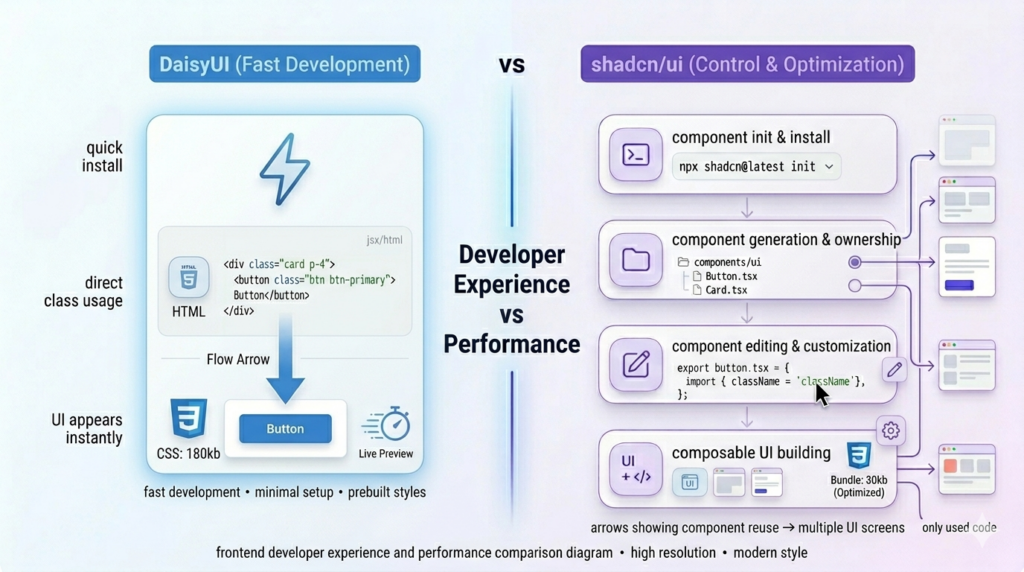
Developer experience
DaisyUI provides a smoother initial experience because it reduces the number of decisions you need to make. You install the plugin and start using predefined classes. There is no need to create components, manage imports, or think about structure in the beginning. This makes it easy to onboard and useful when you want to build UI quickly.
However, as the project grows, the same simplicity can create friction. Since most of the UI is written directly in markup, managing large components or maintaining consistency across files can become harder. Debugging styles may also require checking multiple class combinations and overrides.
shadcn/ui has a slightly slower start because it requires setup and understanding of its structure. You need to generate components and work within a component-based system. This adds some initial overhead, especially for beginners.
Over time, this structure improves developer experience. Components are organized, reusable, and easier to maintain. Debugging becomes simpler because styles and logic are contained within components instead of being spread across multiple files.
Performance
DaisyUI adds styles through a plugin, which means all component styles are included as part of your CSS bundle. Since it is built on Tailwind, unused styles are generally removed during production builds, but you are still relying on a predefined set of styles.
For most applications, this does not create a noticeable performance issue. However, if you are only using a small subset of components, you may still include more CSS than necessary.
shadcn/ui does not include any runtime library or global component styles. Since components are added directly into your codebase, only the code you use is included in your final bundle. This gives you more control over what gets shipped.
This approach can lead to better optimization, especially in larger applications where reducing unused code is important. You can also fine-tune components for specific use cases without carrying extra styles.
Practical impact
In real development, DaisyUI helps you move faster in the early stages because it minimizes setup and decisions. It is easier to prototype and build UI quickly.
shadcn/ui improves long-term development experience by providing structure and control. It makes large applications easier to manage and optimize over time.
In simple terms, DaisyUI focuses on reducing effort at the start, while shadcn/ui focuses on improving control and maintainability as your project grows.
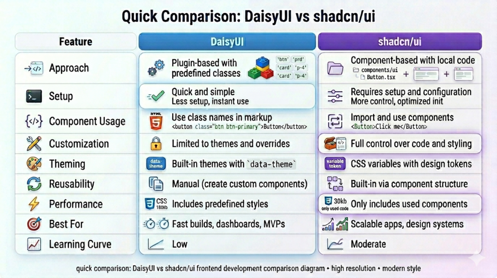
Pros and Cons
Understanding the strengths and limitations of DaisyUI and shadcn/ui helps you make a more practical decision. Both tools solve UI problems effectively, but they come with different trade-offs depending on your project needs.
DaisyUI
Pros:
- Faster development with predefined component classes
- Minimal setup required
- Built-in theme system with easy switching
- Works across multiple frameworks
Cons:
- Limited control over component structure
- Customization can become complex for advanced UI
- Reusability needs manual abstraction in larger projects
- Can lead to inconsistent patterns if not managed properly
shadcn/ui
Pros:
- Full control over component code
- Highly customizable and flexible
- Better suited for scalable applications
- No dependency on external UI libraries
Cons:
- Slower initial setup
- Requires understanding of component structure
- More responsibility for maintaining the design system
- Not ideal for very quick prototypes
Common Mistakes Developers Make
When choosing between DaisyUI and shadcn/ui, many developers make decisions based on surface-level comparisons instead of real project needs. This often leads to issues later when the project grows or requirements change.
One common mistake is choosing DaisyUI only for its speed without considering long-term requirements. It works well for quick builds, but if your project later requires heavy customization or a structured design system, you may end up rewriting components or adding extra layers to manage consistency.
Another mistake is choosing shadcn/ui too early for simple projects. While it provides flexibility, it also requires more setup and planning. For small projects or prototypes, this can slow down development without adding much value.
Developers also tend to underestimate the importance of component structure. With DaisyUI, skipping the creation of reusable components can lead to repeated code and harder maintenance. With shadcn/ui, over-engineering components too early can make the codebase unnecessarily complex.
A related issue is not planning for scalability. Some projects start small but grow over time. Choosing a tool without considering future requirements can lead to refactoring effort later.
Finally, many developers focus only on UI appearance instead of the development workflow. The real difference between these tools is not how they look, but how they affect your code, customization, and long-term maintenance.
Quick Comparison Table
This table gives a side-by-side view of DaisyUI and shadcn/ui based on practical development factors. It helps you quickly understand where each one fits without going through all sections again.
Final Verdict
Choosing between DaisyUI and shadcn/ui is not about which one is better, but about which one fits your workflow and project requirements.
If you need to build something quickly and want a ready-to-use design system, DaisyUI helps you move faster without adding complexity. On the other hand, if you are building a product that will grow over time and require custom UI patterns, shadcn/ui provides the flexibility needed to manage that growth.
In real-world development, both can even be used together in different parts of a project, depending on the requirements. The key is to understand the trade-offs and choose the approach that aligns with your goals.
Last Updated
This blog was last updated on April 2, 2026.
The content reflects the current approaches used in DaisyUI and shadcn/ui, including the latest theming system, component structure, and setup practices. Make sure to check official documentation for updates as both tools continue to evolve.
