Accordion
9
+1 New
Alert
6
Animated List
3

Animated Text
8
+1 New
Apple Dock
2
Autocomplete
6
Avatar
8
Badge
10
Breadcrumb
6
Button
26
+7 New
Button Group
13
+7 New
Calendar
16
+1 New
Card
21
+3 New
Carousel
8
+1 New
Checkbox
10
Code Block
7
Collapsible
5
Combobox
10
+1 New
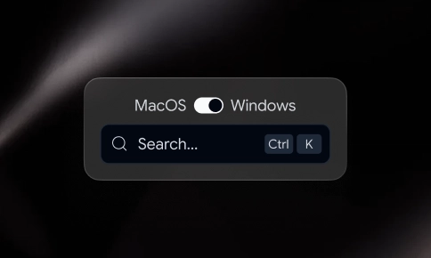
Command
7
Context Menu
2
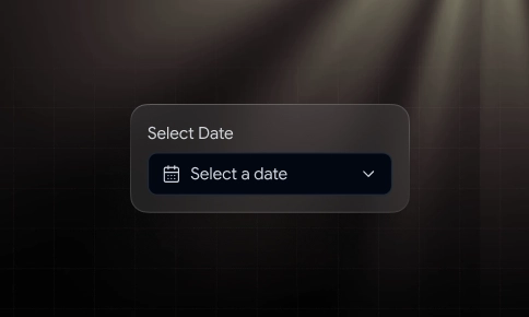
Date Picker
4
+2 New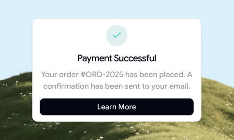
Dialog
8
+2 New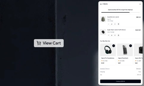
Drawer
New
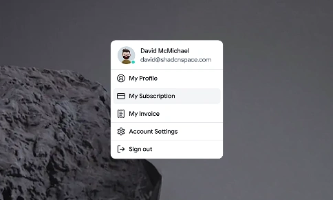
Dropdown Menu
6
Field
New

File Upload
3

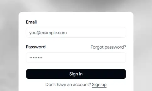
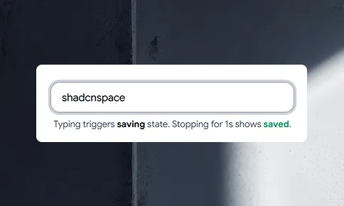
Form
5

Input
20
Input Group
New

Input Mask
3
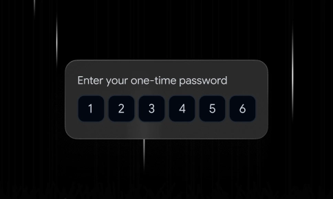
Input OTP
10
+1 New
Item
New
KBD
5

Label
6
Marquee
3
+1 New
Navbar
11

Number Ticker
5
Orbiting Circles
2
Pagination
3

Popover
6
Progress
4
Radio Group
6
Resizable
New

Scroll Area
3
Select
9
Separator
8
Sheet
4
Shine Border
4
Sidebar
9
+2 New
Skeleton
3
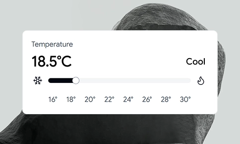
Slider
6

Sonner
7
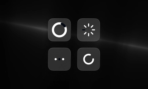
Spinner
10
+3 New
Spinning Text
2
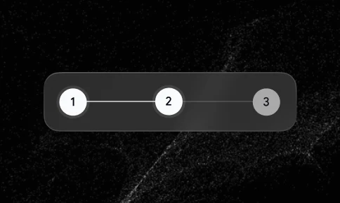
Stepper
New
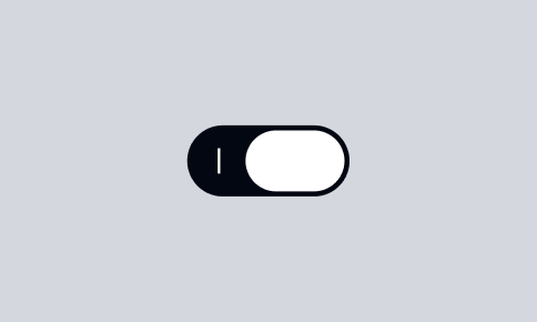
Switch
6
Table
11
Tabs
10
+3 New
Textarea
9

Toggle
New

Toggle Group
New

Tooltip
7
Topbar
6