Shadcn Blocks - Modern UI Building Blocks
Browse a collection of 332+ reusable Shadcn UI blocks for marketing and dashboard layouts. Built with React, Shadcn, Tailwind CSS, and flexible UI primitives, now available with both Base UI and Radix UI support. Each block is easy to customize, ready to copy and paste, or install via the Shadcn CLI to build pages faster.
Marketing
A curated set of Shadcn UI blocks for landing pages, pricing sections, navigation, and CTAs used across marketing websites and product pages.
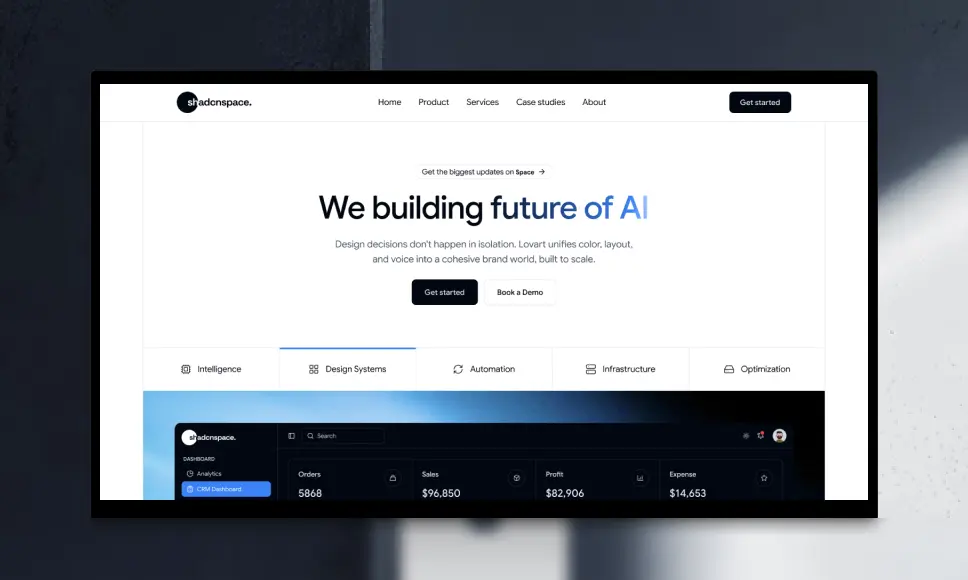
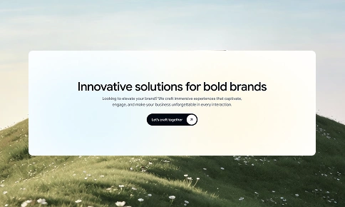
Hero Section
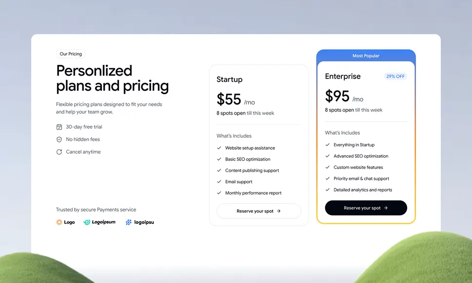
Pricing Section
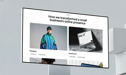
Portfolio
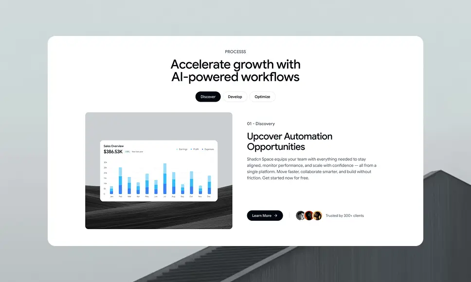
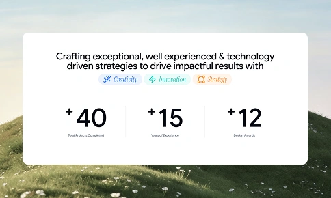
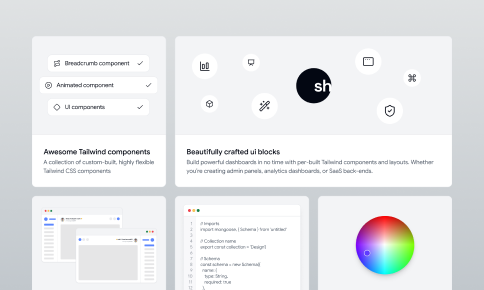
Feature Section
About Us Section
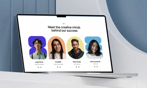
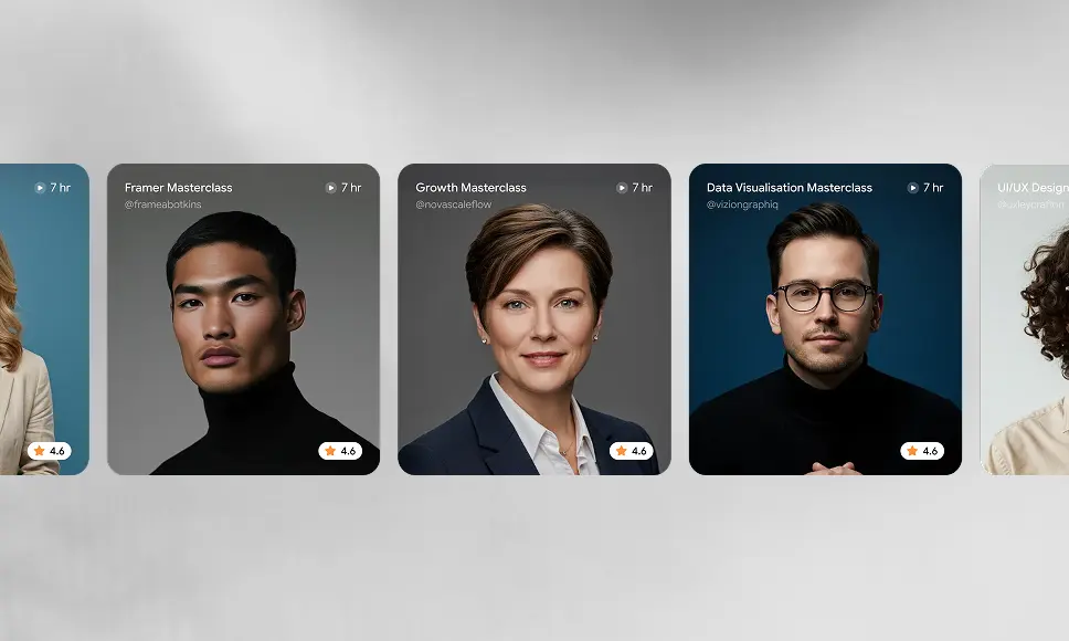
Team Section
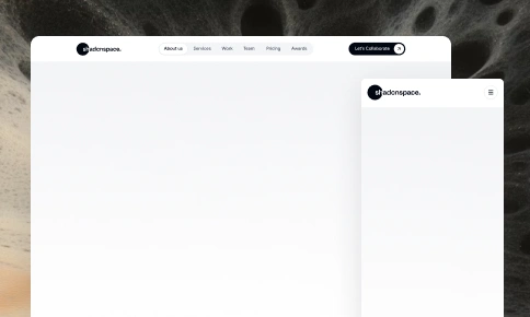
Navbar Section
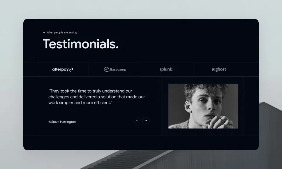
Testimonials
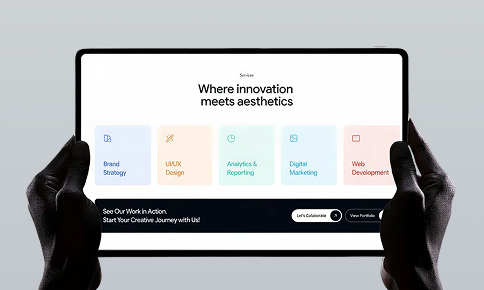
Services Section
CTA Section
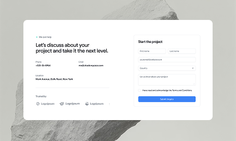
Contact Section
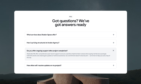
Faqs
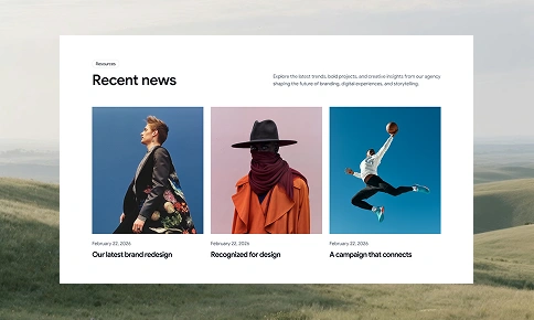
Blog Section
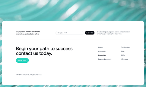
Footer Section
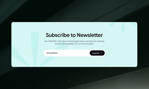
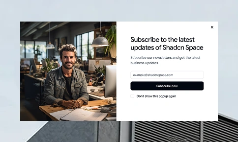
Newsletter Section
Logo Cloud
Gallery
Bento Grid Section
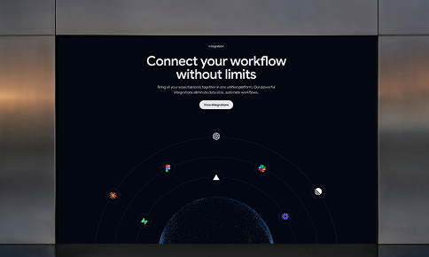
Integration
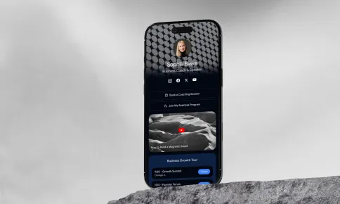
Biolink
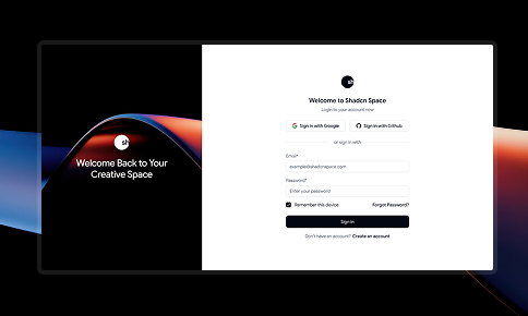
Login
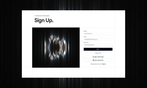
Register
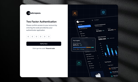
Two Factor authentication
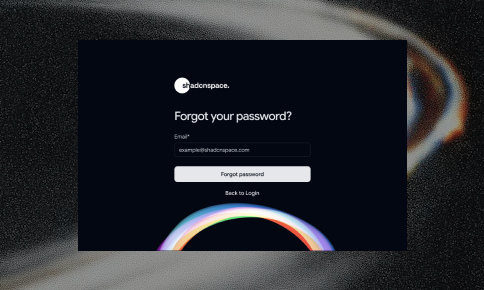
Forgot Password
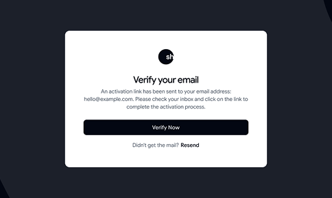
Verify Email
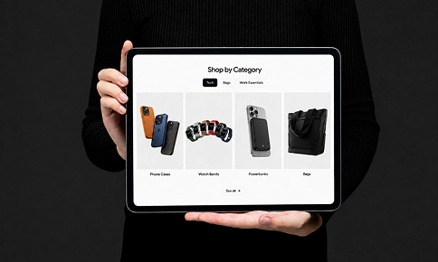
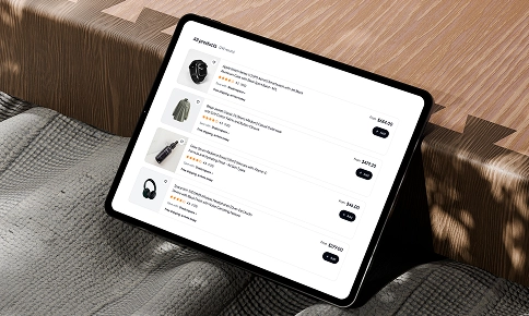
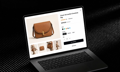
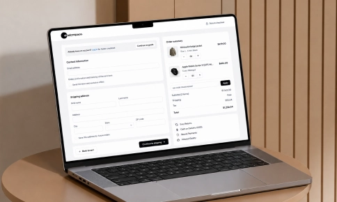
Ecommerce
Ecommerce Blocks are a collection of Shadcn UI Blocks that are designed to help you create stunning and user-friendly marketing websites.

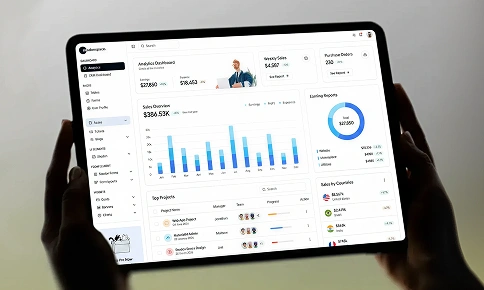
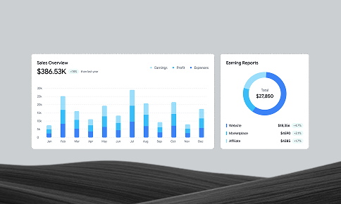
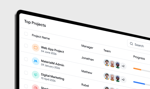
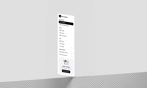
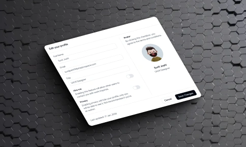
Dashboard UI
Reusable Shadcn UI blocks for dashboards and applications, including charts, tables, forms, sidebars, and layouts for admin panels and data-driven apps.
Building Blocks for the Web
A growing collection of beautifully designed, clean, modern shadcn/ui blocks built for React projects. These blocks focus on layout, composition, and reuse, helping teams keep interfaces consistent while building and scaling web applications.
Key Features
- Preview, copy, or install : Preview blocks live, copy and paste the code, or install directly using the Shadcn CLI and registry.
- Easy to customize : Modify and extend layout, styles, and behavior directly in code without breaking structure or dependencies.
- Structured layouts : Blocks follow common website and application layout patterns for easier composition and reuse.
- Composable blocks : Combine multiple blocks without layout, spacing, or style conflicts across pages and sections.
- Figma Design alignment : Shadcn Figma UI Kit that mirrors blocks and components to support design-to-code consistency.
- Built with modern primitives : Developed using React, shadcn/ui, Tailwind CSS, and flexible UI primitives with support for both Base UI and Radix UI, ensuring a clear and consistent structure.
- Works across React frameworks : Supports React-based setups, including Next.js and similar frameworks.
- Accessibility focused : Includes responsive layouts, keyboard accessibility, and support for light and dark themes.
- MCP Server Integration : Browse, generate, and extend blocks directly within your development environment.
- Open in v0 support : Open blocks in v0 to explore layouts and make visual adjustments quickly.
Shadcn Space offers hundreds of open-source and premium Shadcn UI blocks designed to accelerate modern web development. Copy free blocks instantly or use premium blocks crafted for production-ready applications, advanced layouts, and scalable design systems.
These high-quality modern UI blocks help developers quickly create clean layouts, reusable components, and consistent interfaces using React and shadcn/ui. The collection includes components and blocks perfect for common use cases such as marketing pages, dashboards, and templates. Every block is provided as a simple file, easy to understand, modify, and extend as your application grows.
Highlights
- Preview, copy, and customize with ease
- 332+ Free, open-source Shadcn UI blocks
- 39+ block categories for common use cases
- Blocks for marketing, dashboards, and applications
- Open blocks in v0 for rapid iteration
- CLI and MCP tools for faster installation and extension