
Why Headless UI Libraries matter in modern React?
Modern frontend development has shifted heavily toward custom design systems. Teams no longer want off-the-shelf UI kits that dictate colors, spacing, and layout. Instead, they want full control over styling while still getting:
- Accessibility done right
- Predictable behavior
- Cross-browser consistency
- Composable APIs
This is where headless UI libraries come in.
A headless UI library focuses on logic, state management, accessibility, and interactions, while leaving styling entirely up to the developer. This approach works especially well with:
- Tailwind CSS
- Custom design systems
- shadcn-style component architectures
Rather than fighting predefined styles, developers can build exactly what they need without re-implementing complex behaviors like keyboard navigation, focus management, or ARIA roles.
The rise of Radix UI and Base UI
Among headless UI libraries in the React ecosystem, Radix UI and Base UI have gained significant attention but for different reasons.
Radix UI became popular by offering:
- Production-ready components
- Strong accessibility defaults
- A stable, well-documented API
- Minimal styling, but clear structure
Base UI, on the other hand, takes a more primitive-first approach:
- Extremely low-level building blocks
- Maximum control over the DOM structure
- Fewer assumptions about layout and styling
- Designed for teams building custom component systems
Both libraries aim to solve similar problems but they make very different trade-offs in terms of abstraction, control, and developer freedom.
What this blog covers (and why)
If you’re a developer choosing between Radix UI and Base UI, the real question usually isn’t “Which is better?” it’s:
Which one fits my project, team, and long-term goals?
In this blog, we’ll:
- Break down how Radix UI and Base UI differ at a conceptual level
- Compare their APIs, accessibility models, and developer experience
- Highlight real-world decision points instead of surface-level features
- Explain why we chose Base UI for Shadcn Space, based on actual constraints and requirements
By the end, you should have a clear understanding of:
- When Radix UI makes sense
- When Base UI is the better foundation
- Why Base UI aligns better with highly customizable systems like Shadcn Space
What is Radix UI?
Radix UI is an open-source, headless UI component library for React.
Its main goal is to help developers build accessible and high-quality UI components without having to deal with all the hard accessibility and interaction details themselves.
Radix UI addresses this by providing well-tested, accessible primitives that serve as the foundation of your design system.
Key Features
Radix UI focuses on making developers’ lives easier.
Unstyled
- No CSS included
- You control all styling
- Works well with Tailwind CSS
Open and customizable
- Components are split into parts (like Trigger, Content)
- You can wrap components
- You can add your own props, events, or refs
Uncontrolled by default
- You don’t need to manage state manually
- But you can control the state if needed
Great developer experience
- Fully typed TypeScript APIs
- Consistent patterns across components
- asChild prop lets you control the rendered HTML element
Accessibility Approach
Accessibility is the core strength of Radix UI.
- Follows WAI-ARIA design patterns
- Handles focus traps (e.g., inside dialogs)
- Supports keyboard interactions like Esc, Tab, and arrow keys
- Works well with screen readers
This means developers can build accessible UIs without deep accessibility knowledge.
The trade-off is that accessibility logic is closely tied to Radix’s component structure, which can sometimes limit custom layouts.
Typical Use Cases
Radix UI is ideal when you want accessible components quickly without building complex interaction logic yourself. It handles focus management, keyboard navigation, and ARIA patterns out of the box.
It works best for common UI patterns like dialogs, dropdowns, and tooltips, especially in dashboards or SaaS applications where stability and predictability matter.
Radix is also a strong choice if you want production-ready primitives and are building with shadcn/ui and Tailwind CSS, since it integrates seamlessly with that ecosystem.
What is Base UI?
Base UI is a headless UI library focused on flexibility and control.
While Radix UI gives you ready-made primitives, Base UI gives you behavioral building blocks that you assemble yourself.
Base UI’s philosophy is:
Accessibility first, structure last.
It provides the logic needed for accessible interactions but leaves markup, layout, and styling entirely up to the developer.
Key Features
Base UI focuses on control and customization.
Low-level primitives
- No predefined layouts
- No forced component structure
- You decide how components are built
Flexible APIs
- Props like initialFocus and finalFocus
- Easy to integrate into custom systems
Tested across environments
- Browsers
- Devices
- Screen readers
- Platforms
Component Architecture
Base UI components are meant to be composed, not consumed directly.
Instead of importing a full component, you:
- Attach Base UI behavior to your own components
- Decide where the state lives
- Control the DOM structure completely
Example (conceptually):
- Radix UI → “Here is a Dialog structure.”
- Base UI → “Here is dialog behavior – apply it how you want”
This makes Base UI ideal for building custom design systems.
Accessibility Model
Base UI treats accessibility as a core priority while giving developers more control. It handles essential behaviors like keyboard navigation with Arrow keys, Enter, and Esc, manages focus automatically, and provides the necessary structure for accessible labels and form elements.
At the same time, developers are responsible for styling focus states such as :focus and :focus-visible, maintaining proper color contrast, and ensuring accessible names are provided where needed. This approach offers greater flexibility, but it requires stronger awareness and intentional implementation from the developer.
Typical Use Cases
Base UI works best when you are building a component registry platform or providing ready-to-copy code blocks. It’s especially useful when shipping animated and highly interactive components where users are expected to customize the markup and styling to fit their own design systems.
In these scenarios, flexibility matters more than predefined structures. Components must adapt to different styling setups, layouts, and branding systems. Base UI makes this easier by handling behavior and accessibility while leaving the structure and visual design fully in the developer’s control.
Radix UI vs Base UI: Core Differences (with code)
Design Philosophy
Radix UI gives you a predefined structure that already follows best practices.
Base UI gives you behavior only, and you decide the structure.
This difference becomes very clear in code.
Component Abstraction Level
Radix UI (Structured Components)
import * as Dialog from "@radix-ui/react-dialog";
function RadixDialog() {
return (
<Dialog.Root>
<Dialog.Trigger>Open</Dialog.Trigger>
<Dialog.Portal>
<Dialog.Overlay className="overlay" />
<Dialog.Content className="content">
<Dialog.Title>Dialog title</Dialog.Title>
<Dialog.Description>
Dialog description
</Dialog.Description>
<Dialog.Close>Close</Dialog.Close>
</Dialog.Content>
</Dialog.Portal>
</Dialog.Root>
);
}You:
- Follow Radix’s component tree
- Style the provided parts
- Get correct behavior automatically
Base UI (Behavior-First)
import { Dialog } from "@base-ui-components/react/dialog";
function BaseDialog() {
return (
<Dialog.Root>
<Dialog.Trigger>Open</Dialog.Trigger>
<Dialog.Popup className="content">
<h2>Dialog title</h2>
<p>Dialog description</p>
<button>Close</button>
</Dialog.Popup>
</Dialog.Root>
);
}You:
- Decide what elements to use
- Decide layout and structure
- Attach dialog behavior to your own markup
Styling Flexibility
Radix UI
- Styling is flexible
- Structure is fixed
- You style around Overlay, Content, etc.
<Dialog.Content className="rounded-lg shadow-lg" />Base UI
- No required layout
- No required element types
- Easier to match custom designs
<Dialog.Popup className="grid gap-4 rounded-xl shadow-lg" />With Base UI, you’re not constrained by predefined pieces.
Customization Control
Example scenario ( Dialog Close Customization ):
Both libraries provide a built-in way to render a close button inside a dialog. The difference is how much control you get over that close behavior.
Radix UI – Boolean close Pattern

Using Radix UI, closing is typically handled via a dedicated Dialog.Close component or a simple boolean-driven prop pattern in wrapped abstractions.
Example
<DialogContent close />Here:
- close → boolean
- When true, a default close button is rendered
- Limited configuration options
- Styling usually handled externally
What This Means
The close functionality is:
- Opinionated
- Pre-structured
- Minimal API surface
If you need custom rendering logic, advanced styling, or dynamic behavior, you often move away from the built-in close and implement custom logic manually.
Base UI – Object-Based close Control

With Base UI, the close prop accepts an object.
Example
<DialogContent
close={{
nativeButton: true,
className: "absolute top-4 right-4",
style: { color: "red" },
render: (props) => <MyCustomIcon {...props} />
}}
/>Available Options :
| Property | Type | Purpose |
|---|---|---|
| nativeButton | boolean | Use native <button> element |
| className | string | function | Fully customize styling |
| style | React.CSSProperties | function | Inline style control |
| render | ReactElement | function | Replace default rendering |
Direct Comparison:
| Feature | Radix UI | Base UI |
|---|---|---|
| Simple enable/disable | Boolean | Object |
| Styling control | Limited | Full |
| Replace rendering | Manual workaround | Built-in |
| Dynamic styling logic | External | Supported |
| Native element control | Indirect | Explicit |
The Practical Difference
Radix
You enable a close button.
Customization requires additional structure or overrides.
Base UI
You configure the close button.
The API is designed for deep customization from day one.
Why This Matters
As your component library grows:
- Boolean APIs are simple but rigid.
- Object-based APIs scale better.
- Advanced design systems benefit from configuration-driven control.
Base UI gives developers control without needing to break the abstraction layer.
Animation & Transitions
Radix UI
Uses data-state attributes:
# Need to add styles
[data-state="open"] {
  animation: fadeIn 200ms ease;
}
Base UI
No animation assumptions – works with anything:
# Just using Tailwindcss class
<Dialog.Popup className="animate-scale-in" />
Base UI fits better when:
- Animations are complex
- You use motion libraries
- Layout changes dynamically
Learning Curve
Radix UI
- Easier to start
- Clear mental model
- Faster initial setup
Base UI
- Takes longer to learn
- Requires system-level thinking
- Pays off as complexity grows
Developer Experience Comparison
Developer experience (DX) is not just about documentation or TypeScript types – it’s about how much friction you feel while building and maintaining UI.
Let’s break that down.
API Design
Radix UI
- APIs are consistent across components
- Components follow a predictable pattern (Root, Trigger, Content)
- Easy to remember once you learn one component
Example mindset:
“If you know how Dialog works, you already know how Dropdown or Tooltip works.”
Base UI
- APIs are more flexible and less opinionated
- Fewer assumptions about how components should be structured
- Feels closer to working with hooks and primitives
Example mindset:
“I get the tools, and I decide how to use them.”
Composition Patterns
Radix UI
- Encourages composition through predefined slots
- Composition works well for standard layouts
- Less flexible for uncommon structures
<Dialog.Root>
<Dialog.Trigger /> // Given by Radix UI
<Dialog.Content /> // Given by Radix UI
</Dialog.Root>Base UI
- Encourages composition through your own components
- Works well for custom layouts and reusable blocks
- No required component tree
<Dialog.Root>
<CustomHeader /> // Design by Us
<CustomContent /> // Design by Us
</Dialog.Root>Base UI gives more freedom in how components are composed together.
TypeScript Support
Radix UI
- Excellent TypeScript support
- Fully typed APIs
- Very reliable autocomplete and error checking
Base UI
- Strong TypeScript support
- Types are flexible to support custom composition
- Slightly more responsibility on the developer
For most teams, both libraries offer a solid TypeScript experience.
Integration with Tailwind & shadcn-style systems
Radix UI
- Works extremely well with Tailwind CSS
- Great fit for shadcn-style components
- Structure aligns with copy-paste component patterns
Base UI
- Ideal for building component registries
- Easier to expose raw markup and logic
- Better for animated and customizable code blocks
If your goal is to provide highly customizable components that users adapt to their own projects, Base UI fits more naturally.
Developer Experience Summary
| Area | Radix UI | Base UI |
| Composition | Slot-based | Free-form |
| State Control | Easy defaults | Explicit control |
| TypeScript | Excellent | Excellent |
| API Style | Consistent & structured | Flexible & low-level |
| Best Fit | App development | Design systems & registries |
When to choose Radix UI
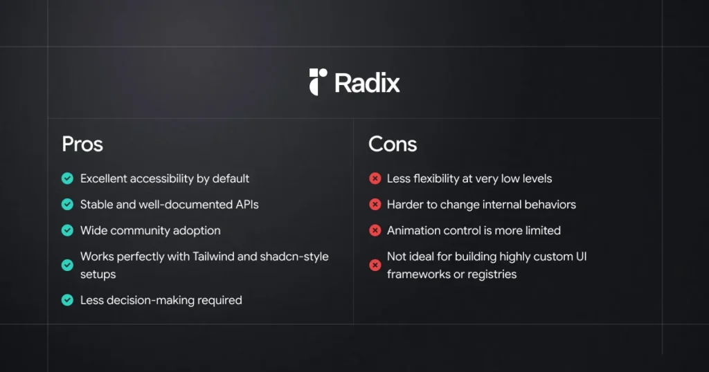
Radix UI works best when you want strong defaults, predictable behavior, and ready-made accessibility without spending time designing your own component logic.
Ideal Project Scenarios
You should strongly consider Radix UI if:
- You want accessible components out of the box
Radix handles keyboard navigation, focus management, and ARIA roles for you. You don’t need to be an accessibility expert to build correct components. - You are building a product UI, not a UI system
For dashboards, admin panels, SaaS apps, and internal tools, Radix helps you move fast. - You want proven, production-tested primitives
Radix has been used in many real-world projects and edge cases are already handled. - Your team prefers clear, stable APIs
The component APIs are consistent and unlikely to change suddenly. - You plan to pair it with Tailwind or shadcn-style components
Radix works very well as the “logic layer” behind styled components.
Example projects:
- SaaS dashboards
- Admin panels
- Internal tools
- MVPs and startup products
- Design systems that prioritize stability
Pros and Cons Summary
In simple terms
If your goal is to build a product quickly and safely, Radix UI is usually the better choice.
It gives you:
“Good defaults, fewer decisions, and fewer bugs.”
When to choose Base UI
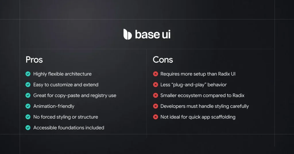
Base UI isn’t trying to be the best choice for every project.
It shines when flexibility, control, and customization matter more than ready-made behavior.
Ideal Project Scenarios
Choose Base UI if you are building:
1. Component Registry Platforms
Platforms like Shadcn Space that:
- Provide copy-pasteable UI components
- Share full component code, not just APIs
- Expect developers to edit structure, logic, and styles
- Offer animated components and layout blocks
Base UI works great because it does not hide logic behind heavy abstractions.
2. Websites that use UI blocks from multiple registries
This is a big one
If your website:
- Uses UI blocks from different registries
- Copies components from open-source libraries
- Mixes layouts, sections, and interactions
- Needs to adapt third-party code quickly
Base UI lets you fully control the copied code without fighting the library.
You’re not locked into:
- Strict component APIs
- Hidden internal logic
- Opinionated structure
Instead, you get plain, understandable React code.
3. Design systems with heavy customization
Best when:
- Your design system changes often
- You customize markup and behavior per project
- You want consistent patterns, not rigid components
Base UI gives you the freedom to reshape components as your system evolves.
4. Animation-First Interfaces
Perfect if:
- Animations are part of the brand identity
- You use Framer Motion or CSS animations
- You need full control over transitions and timing
Base UI keeps animations outside the component logic, where they belong.
5. Teams that want ownership over code
Great for teams that:
- Want to understand every line of UI code
- Prefer composition over configuration
- Don’t want vendor lock-in
- Value long-term maintainability
In one line
If your product consumes UI blocks from registries and needs full control,
Base UI is the better foundation.
Pros and Cons Summary
What we use in Shadcn Space
Since this article compares Radix UI and Base UI, it’s worth mentioning how we use them in Shadcn Space.
Instead of choosing only one library, we decided to support both Radix UI and Base UI in our components and UI blocks. Each library has its own strengths, and different developers prefer different approaches when building interfaces.
Because of that, Shadcn Space provides components built with both ecosystems, so developers can explore, learn from, and use the approach that fits their projects best.
If you want to see how these implementations look in real components, you can explore them here:
All blocks are designed to be easy to copy, understand, and customize inside your own React or Next.js projects.
Final Thoughts
Radix UI and Base UI are both powerful tools for building modern React interfaces, but they approach component design in slightly different ways.
Radix UI focuses on providing well-tested primitives with strong accessibility and structured APIs, making it a great choice for building reliable application interfaces.
Base UI focuses more on flexibility, giving developers greater freedom to modify component structure, logic, and behavior.
The right choice ultimately depends on how you prefer to build your UI and how much control you want over the underlying code.
At Shadcn Space, we support both Radix UI and Base UI components, so developers can explore different approaches and choose what works best for their projects.
If you’re already using Radix UI, we also provide a step-by-step migration guide to help you move from Radix UI to Base UI smoothly.
In the end, the best tool is the one that fits your workflow and helps you build better interfaces.
