Frontend development has changed dramatically over the last few years. We’ve moved from bulky UI frameworks to lightweight, composable systems. Developers want control. Designers want consistency. Teams want speed without sacrificing quality.
In the middle of this shift, shadcn/ui quietly became one of the most influential tool in the modern frontend ecosystem. It didn’t try to be a framework. It didn’t lock you into opinions. Instead, it gives developers something far more powerful: ownership.
And as shadcn/ui adoption exploded, so did the ecosystem around it. That’s where Shadcn Space comes in.
What is Shadcn Space?
Shadcn Space is a curated collection of production-ready components, blocks, templates, and layouts built with shadcn/ui, Tailwind CSS, and modern React practices.
Shadcn Space includes:
- 100+ carefully designed open source, useful, and animated Shadcn components (focused, high-quality set)
- 48+ Free Shadcn UI blocks (hero section, navigation, pricing, auth, dashboard shells, and more)
- 3+ Free High-quality Shadcn Templates
- Copy-paste ready code (no lock-in, fully customizable)
- CLI support for installing components & blocks
- MCP Server
- Free Figma UI Kit for designers and design-to-dev workflow
- Upcoming: Shadcn Builder, Motion utilities, Pro Figma UI kit, and Pro blocks + templates are planned post-MVP and will be part of the upcoming update.
Everything you find here is built with one simple idea in mind: Help developers and designers build real products faster, cleaner, and with confidence.
It’s not about showcasing how clever we can be with code, it’s about delivering a UI that actually works in production.
The rise of shadcn/ui (and why it matters)
Before understanding Shadcn Space, it’s worth understanding why shadcn/ui matters so much today.
shadcn/ui changed the conversation around UI libraries by asking a simple question:
Why should a UI library own your code?
Instead of shipping precompiled components hidden inside node_modules, shadcn/ui gives you direct access to implementation-level code, making customization and long-term maintenance a first-class concern.
This approach resonated deeply with developers.
Today, shadcn/ui is used in:
- SaaS products
- Internal dashboards
- Startups and enterprises
- Design systems
- Side projects and large-scale apps
With this rise came an explosion of resources — templates, UI kits, inspiration sites, and component collections. And that’s exactly where the problem started.
Why we built Shadcn Space
As experienced product builders with 15+ years in design and development, we’ve seen this pattern many times before.
- A great tool becomes popular.
- The ecosystem grows rapidly.
- Quantity increases.
- Quality becomes inconsistent.
Most shadcn-related resources today fall into familiar categories:
- Copied components with new colors
- Minimal-effort layouts
- Sites built more for SEO than usefulness
- “Looks good in screenshots”, but breaks in real apps
They’re not bad — but they’re not special either. We didn’t want to add the platform website to that list.
We wanted to build something that reflects:
- Long-term design thinking
- Real-world product experience
- An understanding of how UI evolves over time
That’s why Shadcn Space exists. Not to compete on volume. Not to chase trends. But to raise the bar. One of the biggest differences with Shadcn Space is experience.
With building world-class themes and templates since 2011, we’ve learned:
- What scales
- What breaks
- What teams struggle with
- What developers actually need at 2 a.m. before a deadline
This experience shapes every decision:
- Design systems that don’t fight you
- Components that don’t fall apart with real data
- Layouts that survive feature creep
We’re not here to chase visual trends. We’re here to build things that last.
Our philosophy: Less, but better
One of the core ideas behind Shadcn Space is intentionality.
We believe:
- Fewer components, designed well, are more valuable than hundreds of rushed ones.
- Consistency matters more than novelty.
- UI should feel calm, not noisy.
Every component, block, and template goes through the same thought process:
- Where would this be used in a real product?
- How easy is it to customize?
- Does it scale beyond a demo?
- Does it respect accessibility basics?
- Is the code readable six months from now?
- Does this actually solve a real user problem?
This mindset comes from years of building and maintaining production systems — not just demos.
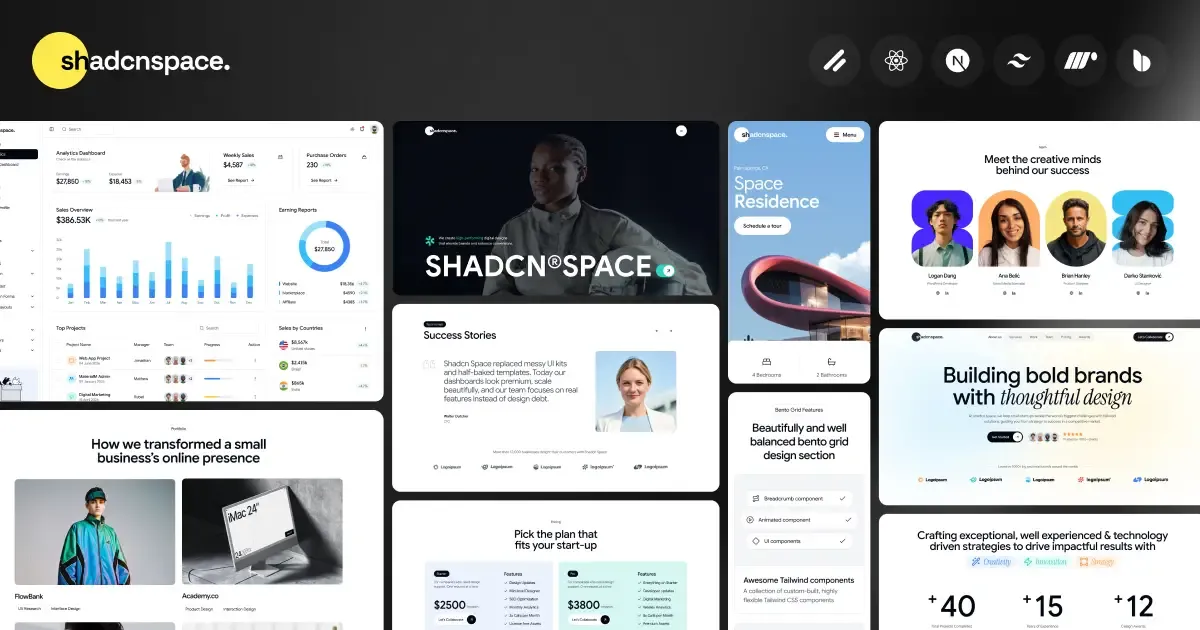
What you’ll find in Shadcn Space
Carefully crafted UI components, blocks and templates
Each component and block in Shadcn Space is built on top of shadcn/ui and follows its core principles:
- Open source
- Copy-paste friendly
- No hidden abstractions
We use:
- Tailwind CSS for styling
- CVA (Class Variance Authority) for variants
- A clean, predictable folder structure based on Base UI
The goal is simple: code that feels familiar and stays maintainable.
Real product layouts (Not just components)
Most UI libraries stop at buttons, inputs, and cards. Shadcn Space goes further.
You’ll find:
- Complete dashboard layouts
- SaaS-style navigation patterns
- Marketing page sections
- Pricing tables
- Authentication flows
- Empty states and edge cases
These layouts are also available as templates, making it easier to start real projects without rebuilding the same foundations repeatedly.
Shadcn CLI & MCP Integration
To reduce friction even further, Shadcn Space includes tooling that fits naturally into developer workflows.
- CLI support to pull components, blocks, or templates directly into your project
- MCP (Model Context Protocol) compatibility, making Shadcn Space usable inside AI-powered dev environments and editors
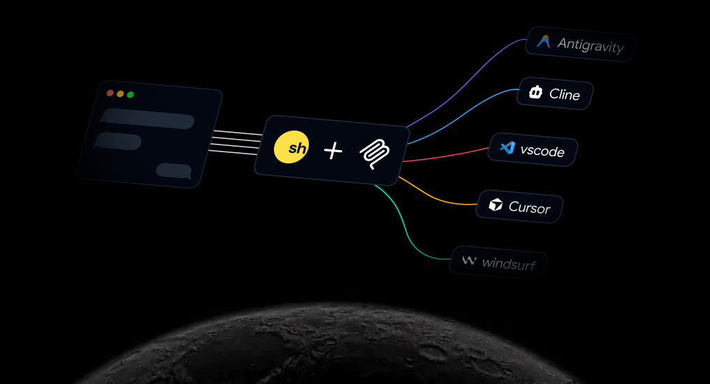
These tools don’t replace code—they accelerate the parts you already write.
Design that thinks ahead
A good UI is not just about how it looks today.
It’s about how it:
- Scales with new features
- Adapts to different content
- Holds up across devices
- Feels after months of usage
All of this is built into our Figma UI Kit. That’s why we focus heavily on:
- Spacing systems
- Typography hierarchy
- Visual balance
- Component composition
Design decisions are made with long-term use in mind — not short-term aesthetics.
How to use Shadcn Space
We intentionally kept the workflow simple.
The process looks like this:
- Browse components, blocks, or templates
- Copy the code or use the CLI
- Paste it into your project
- Customize using Tailwind and CVA
- Ship your feature
Shadcn Space works seamlessly with:
You remain in full control of your codebase at all times.
Feedback is a core feature
Shadcn Space is not a finished product. It’s a living project, and feedback plays a central role.
We actively welcome:
- Design feedback
- Code suggestions
- Missing use cases
- Accessibility improvements
- Feature ideas
If something feels confusing or incomplete, that’s valuable information — not criticism.
Open source at heart
Shadcn Space is open source. That’s not a checkbox — it’s a commitment.
You’re welcome to:
- Contribute components, blocks, or templates
- Improve documentation
- Fix bugs
- Suggest new patterns
- Share ideas and feedback
If you care about:
- Clean code
- Thoughtful UI
- Meaningful design work
There’s a place for you here.
Roadmap: What’s next?
We’re just getting started, but the direction is clear.
Here’s what we’re exploring next:
- Shadcn Builder — Drag and Drop Landing Page Builder
- Introducing Premium blocks and templates (February)
- Motion and micro-interactions
- Improved accessibility coverage
- Premium Shadcn Figma UI Kit
- Design tokens and variant systems
- Community-driven contributions
Everything on the roadmap follows the same principle: Build only what adds real value.
Launch bonus (Limited)
To celebrate the launch, the first 100 supporters will receive lifetime access to the Pro version.
Follow the project to get updates on new components, blocks, tooling, and progress.
Details about the launch bonus will be shared through our channels.
Feedback, discussions, and contributions are always welcome.
Final thoughts
Shadcn Space exists for a simple reason: Great tools deserve thoughtful design.
Built on the foundation of shadcn/ui and shaped by 15+ years of real-world experience, it’s not here to be the loudest voice in the ecosystem. It’s here to be a meaningful one.
If you value:
- Quality over quantity
- Creativity over repetition
- Products over demos
You’ll feel right at home. Welcome to Shadcn Space.
