The way developers create user interfaces has changed a lot. Early UI frameworks mainly focused on speed by offering ready-made UI components and preset layouts. While this method helped developers launch products quickly, it also imposed limitations when projects required greater customization or unique design systems.
Modern applications demand a different approach. Interfaces are expected to be highly interactive, scalable, and adaptable to different product needs. As a result, developers now look for UI ecosystems that provide structure without restricting flexibility.
A Base UI approach focuses on providing foundational building blocks that developers can use to construct their own components, layouts, and templates. Instead of forcing a specific design system, it enables teams to create interfaces that fit their product requirements while maintaining a consistent architecture.
This shift in UI development is why developers are looking for the best Base UI library and why modern tools like Shadcn Space are gaining popularity. They provide the flexibility developers need while still offering a structured ecosystem for building interfaces efficiently.
The shift from traditional UI Libraries
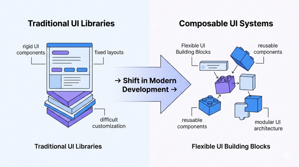
Traditional UI libraries were designed to simplify interface development by offering a large collection of pre-built components with predefined styles. Developers could quickly add buttons, forms, navigation menus, and other UI elements without spending time building them from scratch.
However, these libraries often follow a fixed design philosophy. Their components usually come with styling decisions, layout patterns, and behaviors that are difficult to change without extensive overrides.
As projects grow, this rigidity can slow development. Teams may spend significant time modifying library components to match their design system or replacing them entirely when the limitations become too restrictive.
Because of these challenges, developers are gradually moving away from rigid UI frameworks toward systems that offer more control over both structure and styling.
Why developers prefer composable UI systems
Composable UI systems approach interface development differently. Instead of providing large, opinionated components, they focus on smaller building blocks that can be combined to create more complex interfaces.
This method allows developers to assemble components based on project requirements rather than relying on predefined structures. Each element can be extended, modified, or reused across different parts of an application.
This composable architecture also improves maintainability. Smaller components are easier to test, update, and scale as applications evolve. Teams can gradually expand their UI system without being constrained by the limitations of a traditional library.
For modern applications that require flexibility and long-term scalability, composable UI systems provide a more sustainable approach.
The need for flexible ui building tools
As development workflows continue to evolve, the tools used to build interfaces must also adapt. Developers now work with complex applications, multiple frameworks, and rapidly changing product requirements.
Flexible UI tools allow teams to move faster by enabling them to build, customize, and reuse UI elements without unnecessary restrictions. They also support modern development practices such as component-driven architecture and modular design systems.
A flexible UI ecosystem helps teams maintain consistency across projects while still allowing experimentation and rapid iteration. Instead of rebuilding common UI patterns repeatedly, developers can rely on reusable building blocks that integrate seamlessly into their workflow.
This need for flexibility is one of the key reasons why modern Base UI ecosystems are becoming the preferred choice for developers building scalable web applications.
What is Shadcn Space?
Shadcn Space is a modern UI ecosystem and one of the best Base UI library options available today. Designed to help developers build interfaces faster using a structured set of UI resources. Instead of acting like a traditional component library that controls styling and behavior, it provides a flexible foundation that developers can integrate directly into their projects.
The platform provides developers with production-ready UI elements while still allowing them to maintain full control over their code. This approach makes it easier to customize components, adapt layouts, and build unique interfaces without fighting against a rigid framework.
A Structured UI Ecosystem
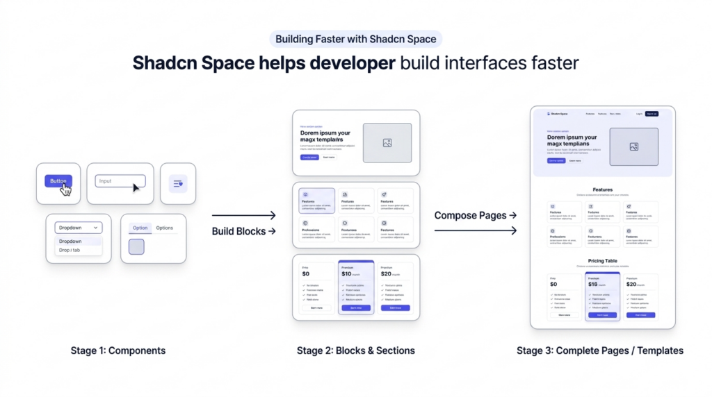
Shadcn Space is organized around a clear structure that helps developers efficiently move from small UI elements to complete pages. The ecosystem includes components, blocks, sections, and templates that work together to support different stages of UI development.
This structure lets developers build interfaces step by step. They start with individual components, combine them into reusable sections, and eventually assemble full page layouts.
By organizing UI resources this way, Shadcn Space helps developers reduce the time they spend designing and implementing common interface patterns.
Designed for modern development workflows
Modern development often involves rapid prototyping, reusable design systems, and collaboration across multiple teams. Shadcn Space supports these workflows by providing UI resources that are easy to integrate, modify, and extend.
Developers can quickly add UI elements to their projects without worrying about complex configuration or restrictive styling systems. This makes it easier to experiment with layouts and iterate on designs as products evolve.
The ecosystem is also structured to work well with modern frameworks and component-based architectures.
Built for Customization and Control
One of the biggest advantages of Shadcn Space is the level of control it gives developers. Instead of relying on a closed library, developers work directly with the UI code that powers their interfaces.
This makes it easier to adjust styles, extend functionality, and integrate components into existing design systems. Teams can create consistent UI patterns while still having the freedom to adapt them for different projects.
Because of this flexibility, Shadcn Space can be used for a wide variety of applications, from simple marketing websites to complex web applications.
Key Features of Shadcn Space
Shadcn Space is designed to support modern UI development by providing tools and architecture that make building interfaces faster and more flexible. Instead of focusing only on visual components, it also supports workflows that are becoming increasingly common in modern development, such as AI-assisted coding and modular UI architecture.
Below are some of the key features that make Shadcn Space a powerful ecosystem for developers.
MCP Support
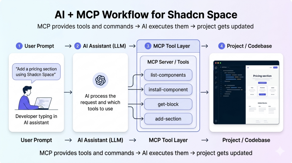
Shadcn Space includes support for MCP (Model Context Protocol). MCP allows AI systems to better understand the structure of a project by providing organized context about components, layouts, and UI resources.
With MCP integration, developers can use AI tools more effectively when generating UI code or modifying existing components. The AI system can reference the available components, blocks, and templates in Shadcn Space, making the generated code more accurate and consistent with the project structure.
This helps reduce repetitive work and improves productivity when using AI-assisted development workflows.
LLM Friendly Architecture
Shadcn Space is designed to work well with large language models. The structure of components, sections, and blocks makes it easier for AI systems to interpret UI patterns and generate meaningful code suggestions.
Because the UI resources are organized and modular, developers can ask AI tools to create layouts, modify components, or generate new sections using existing building blocks. This makes it easier to maintain consistency across the interface while still benefiting from automated code generation.
As AI becomes more integrated into development workflows, having an ecosystem that works well with these tools becomes increasingly valuable.
Developer First Design
The ecosystem is built with developers in mind. Instead of hiding implementation details behind complex abstractions, Shadcn Space focuses on clarity and usability.
Developers can easily understand how components are structured and how they interact with each other. This transparency makes it easier to debug issues, customize functionality, and extend the UI system as a project grows.
A developer-focused approach ensures that the UI system remains flexible and adaptable to different project requirements.
Flexible and Customizable
Customization is one of the core principles of Shadcn Space. Developers are not forced to follow a predefined design system or strict styling rules.
Instead, they can adapt components and layouts to match their own design standards. This flexibility allows teams to build unique interfaces while still benefiting from a structured ecosystem of reusable UI resources.
The ability to modify and extend UI elements without restrictions makes Shadcn Space suitable for both small projects and large-scale applications.
Core ecosystem of Shadcn Space
Shadcn Space is built around a structured UI ecosystem that helps developers build interfaces in a modular way. Instead of relying on a single layer of UI resources, it organizes the system into components, blocks, and templates that work together during development.
This layered structure allows developers to start with small building blocks and gradually assemble complete sections and pages. It also makes the UI easier to maintain, reuse, and scale across different projects.
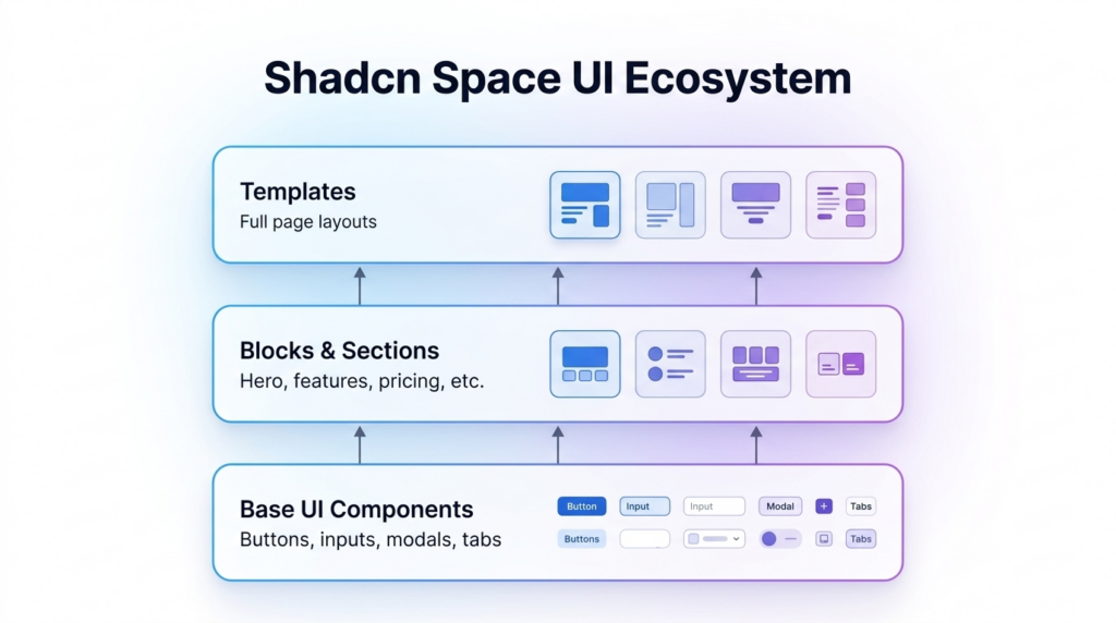
Base UI Components
Base UI Components form the foundation of the Shadcn Space ecosystem. They represent the smallest reusable elements of an interface and provide the basic functionality required to build interactive applications.
These components are designed to be flexible and adaptable, allowing developers to integrate them into different layouts and design systems without being restricted by rigid styling or predefined patterns.
Primitive Building Blocks
Base UI Components act as primitive building blocks for creating user interfaces. Each component focuses on a specific interaction or UI element, such as buttons, form inputs, navigation elements, or dialogs.
Because these components are modular, developers can combine them in different ways to build more complex UI patterns. This modular structure makes it easier to design interfaces that are both scalable and maintainable.
Accessibility First Components
Accessibility is an important consideration in modern UI development. Base UI Components are structured to support accessible interaction patterns, enabling applications to be used by a wider range of users.
This includes support for keyboard navigation, focus management, and proper semantic structure. By incorporating accessibility principles at the component level, developers can create interfaces that remain usable and inclusive as applications grow.
Customizable and Composable Architecture
The architecture of Base UI Components focuses on composability and customization. Developers are not limited to predefined styles or rigid layouts.
Instead, they can modify component styles, extend behavior, or combine components to create new UI patterns that match their product requirements. This composable structure allows teams to build a design system that evolves alongside their application.
Examples of commonly used components
Base UI Components include many of the essential interface elements that developers use when building modern web applications. These components handle common interactions and serve as the foundation for more complex UI patterns.
Some commonly used components include:
- Buttons for handling user actions such as submitting forms or triggering events
- Input fields and other form controls for collecting user data
- Dropdown menus and navigation elements for organizing interface options
- Dialogs and modal components for displaying focused content or actions
- Tabs and interactive elements for structuring content within a page
You can explore the full list of available components in the Shadcn Space Components Library, where each component includes documentation and implementation examples to help you integrate it into your project.
Base UI Blocks and Sections
Base UI Blocks and Sections help developers move beyond individual components to build meaningful parts of a page. While components handle specific interactions, blocks combine multiple components into structured layouts that represent real interface sections.
This approach allows developers to quickly assemble common website sections without manually arranging every element. By using predefined structures, teams can maintain consistent layouts while still having the flexibility to customize design and content.
Reusable Layout Structures
Blocks are designed to be reusable layout structures that can be used across different pages and projects. Instead of rebuilding the same section repeatedly, developers can reuse a block and adapt it to different contexts.
Reusable layouts also help maintain design consistency. Using the same section pattern across multiple pages ensures the interface feels familiar and organized for users.
Combining components into sections
Each block is built by combining multiple Base UI Components. For example, a typical section may include buttons, headings, images, and layout containers working together to form a complete UI structure.
By organizing components into larger sections, developers can focus on building page layouts rather than managing every individual UI element. This makes the development process faster and more efficient.
Examples of Blocks
Base UI Blocks and Sections cover many of the common layout patterns used in modern websites and applications. Some examples include:
- Hero sections that introduce a product or highlight the main message of a page
- Feature sections are used to present product capabilities or services
- Pricing sections that display different pricing tiers or plans
- Testimonial sections that showcase user feedback and social proof
- Call to action sections that encourage users to take the next step
These blocks allow developers to quickly build structured pages while maintaining flexibility in styling and content.
Base UI Templates
Shadcn Space also includes ready-to-use templates that help developers quickly start new projects. These templates provide structured page layouts built using the same components and blocks available in the ecosystem.
Instead of starting from a blank page, developers can use these templates as a foundation and customize them according to their product requirements, branding, and design system.
Templates are designed to work seamlessly with the Base UI Components and Blocks, which means every part of the layout can still be modified or extended as needed.
If you want to explore all available templates, you can view the complete list of templates, Base UI based Shadcn Templates by the shadcn space, where each template can be used as a starting point for building modern websites and applications.
Radix UI vs Base UI
Both Radix UI and Base UI approaches focus on building modern, accessible interfaces, but they solve slightly different problems in the UI development process. Understanding how they differ helps developers choose the right foundation for their projects.
Understanding Radix UI
Radix UI is a collection of low-level UI primitives designed to help developers build accessible and interactive components. Instead of providing styled components, Radix focuses on behavior and accessibility, allowing developers to apply their own styling and structure.
These primitives handle complex UI interactions such as focus management, keyboard navigation, and accessibility patterns. Developers can then combine these primitives with their own design systems to build fully customized components.
Because of this approach, Radix UI is often used as the foundation for building advanced UI components in modern web applications.
Differences Between Radix UI and Base UI
While Radix UI provides primitives for managing UI behavior, a Base UI ecosystem focuses on providing structured components and layout building blocks that developers can use directly in their interfaces.
Radix UI is typically used to create components, while Base UI systems organize those components into reusable UI patterns such as sections, blocks, and templates.
In simple terms:
- Radix UI focuses on interaction primitives and accessibility behavior
- Base UI focuses on reusable components and interface structure
Many modern UI ecosystems combine both approaches, using Radix primitives as a foundation while building higher-level components and layouts on top of them.
When to Choose Each
Choosing between Radix UI and a Base UI approach depends on the project’s needs and the level of control developers want over their UI architecture.
Radix UI is often a good choice when developers want to build fully custom components with complete control over styling and interaction behavior.
A Base UI ecosystem is useful when developers want to use UI building blocks to assemble interfaces faster while maintaining flexibility.
In many cases, developers benefit from using both approaches together, using primitives to power components and then organizing those components into reusable UI structures.
Learn More About the Differences
If you want a deeper comparison of these two approaches, you can read our detailed guide on Radix UI vs Base UI, where we explore their architecture, use cases, and when each approach works best.
Building Faster with Shadcn Space
Modern development teams need to move quickly without sacrificing code quality or design consistency. As the Base UI library, Shadcn Space is designed to support this workflow by providing ready-to-use UI resources that reduce the time required to build interfaces.
Instead of spending hours designing common UI patterns, developers can focus on implementing features and improving the product experience.
Faster Prototyping
When building a new feature or page, speed is important. Shadcn Space allows developers to quickly assemble interface layouts using pre-built UI resources.
This makes it easier to test ideas, iterate on designs, and launch new pages without needing to build every section from scratch.
Better Developer Experience
A well-structured UI system improves the overall developer experience. With clearly organized UI resources and consistent patterns, developers can quickly understand how different parts of the interface are built.
This reduces development friction and makes it easier for teams to collaborate on the same codebase while maintaining a consistent UI architecture.
Final Thoughts
Building modern web interfaces doesn’t have to be complicated or time-consuming. Developers need UI systems that are flexible, scalable, and easy to integrate, tools that let them focus on creating great user experiences instead of reinventing common UI patterns.
Shadcn Space provides exactly that. Its structured ecosystem of components, blocks, and templates allows teams to quickly assemble interfaces while keeping full control over design and functionality.
Whether you’re prototyping a landing page, building a SaaS product, or designing a marketing site, Shadcn Space offers reusable building blocks that accelerate development without sacrificing customization.
By combining speed, modularity, and flexibility, Shadcn Space empowers developers to focus on what really matters: building better products. For teams looking for the best Base UI library that scales with their projects, Shadcn Space provides a solid foundation for maintainable and high-quality web applications.
