
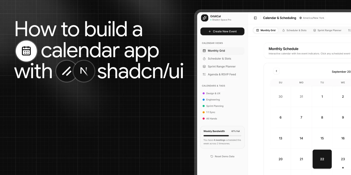
A calendar looks simple until you have to build one that actually handles scheduling.
Selecting a date is only the beginning. A real calendar application has to deal with event management, available time slots, multi-day planning, RSVP actions, different calendar views, and time zone differences. Once these requirements start coming together, a simple calendar component quickly turns into a much larger interface system.
We built this Calendar & Scheduling application to explore how those different workflows can be composed from reusable shadcn/ui components instead of building every interface from scratch.
The application includes a monthly calendar, date and time scheduling, multi-day sprint planning, an agenda with RSVP actions, timezone selection, filters, notifications, and persistent application state. The complete project is built with Next.js and uses components from ShadcnSpace throughout the interface.
In this guide, we’ll break down the application structure, how each calendar experience works, and how the components come together to create a complete scheduling workflow. We’ll also look at practical implementation details such as event modeling, timezone handling, state persistence, and component maintenance.
The complete application is available as an open-source project, so you can explore the implementation and use it as a reference for your own calendar-based applications.
Why did we build this calendar application?
A calendar component can handle date selection, but a scheduling application has to solve several different problems at the same time.
While building this project, we wanted to cover the workflows that commonly appear in real calendar and scheduling interfaces:
- Event planning: Viewing scheduled events, inspecting a selected day, and creating or removing meetings.
- Appointment booking: Selecting a date, choosing an available time slot, and confirming a booking.
- Multi-day planning: Selecting continuous date ranges for sprint planning, leave management, and capacity planning.
- Event participation: Managing attendees, RSVP actions, and meeting links.
- Timezone management: Handling schedules across different time zones.
- Multiple calendar views: Using a monthly calendar, scheduler, range planner, or agenda depending on the task.
The application brings these workflows together through four main views: a monthly calendar, date and time scheduler, multi-day range planner, and interactive agenda with RSVP actions.
The goal was not to build several disconnected calendar screens. We wanted to create one application where these experiences share the same event model and work together as part of a single scheduling workflow.
This also gave us a practical way to explore how reusable shadcn/ui components can be combined to build a more complete application instead of treating every interface as an isolated component
What did we build?
We wanted the application to support more than a traditional month-view calendar, so we built four focused experiences for different scheduling tasks.
Monthly Calendar
A month-based view for browsing dates, spotting scheduled events, and inspecting the selected day’s agenda.
Date & Time Scheduler
A booking flow where users select a date, choose an available time slot, enter meeting details, and confirm an appointment.
Sprint & Range Planner
A range-based calendar for selecting multiple days and calculating planning metrics such as total days and working days.
Agenda & RSVP
An event-focused view that displays meetings as cards with attendees, RSVP actions, meeting details, and cancellation controls.
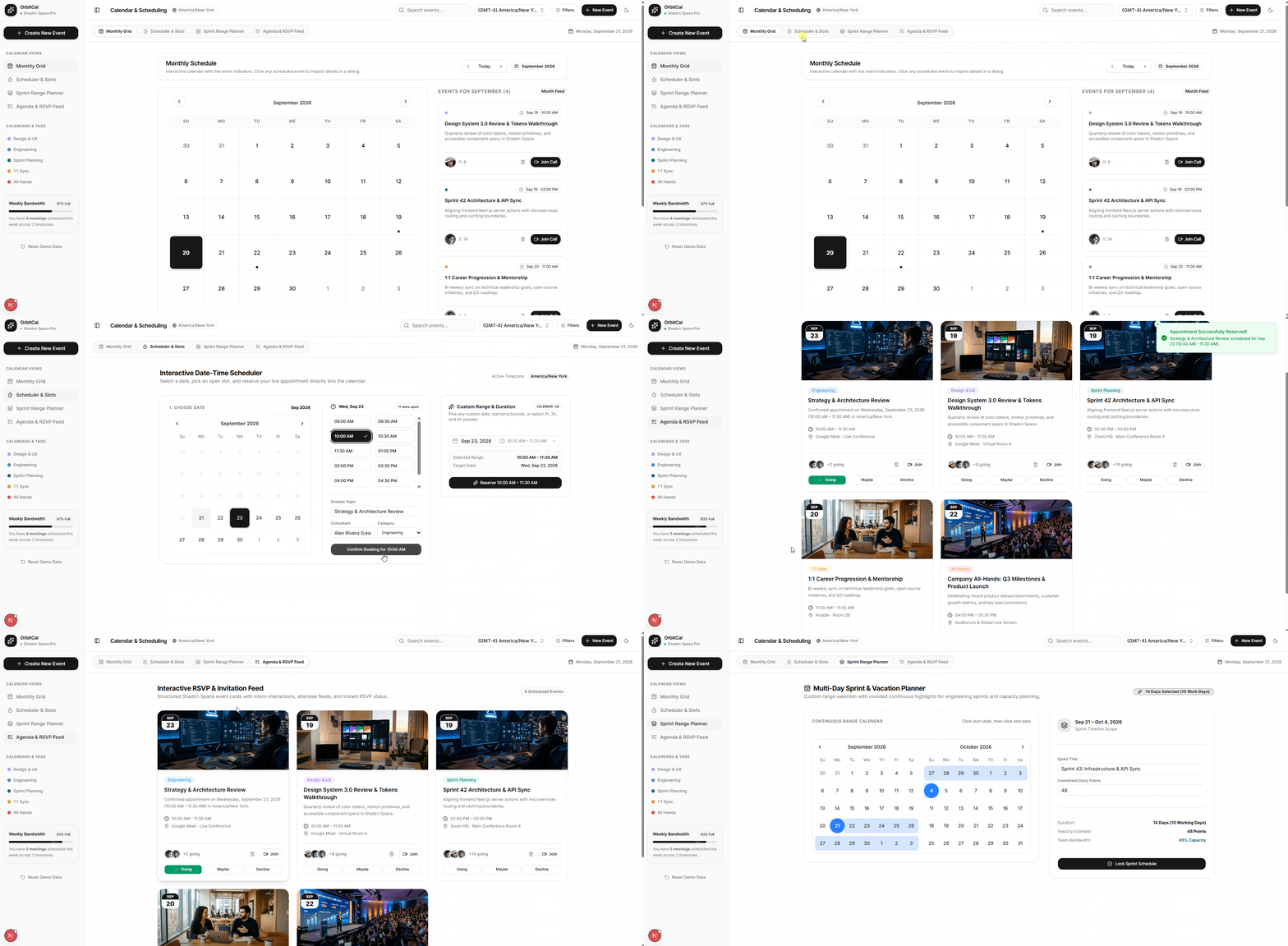
All four views work with the same event data, so an appointment created in the scheduler can also appear in the monthly calendar and agenda. Supporting components such as timezone selection, filters, dialogs, tabs, and notifications complete the application experience.
The result is a single calendar application where each view serves a specific scheduling need rather than trying to make one calendar layout handle everything.
How we organized the code
With several calendar workflows sharing the same data, we separated the application into smaller components instead of keeping the logic in a single page.
The calendar-specific functionality lives under a dedicated components/calendar structure, with separate components for the monthly view, scheduler, sprint planner, agenda, and shared event types. The main application handles shared state such as selected dates, events, filtering, and persistence, while individual views focus on rendering and handling their own interactions.
The project also keeps reusable UI primitives and ShadcnSpace components separate from the calendar-specific application logic. This makes it possible to update or replace a calendar view without rewriting the rest of the application.
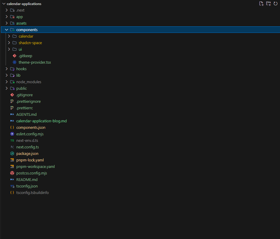
This separation becomes especially useful when adding features such as a new calendar view or changing how events are stored, because the change can stay within the part of the application responsible for it.
Project setup
We’ll start with a Next.js project and initialize shadcn/ui with Base UI. Base UI is now the default component library for new shadcn/ui projects, but specifying it explicitly makes the setup clear and reproducible.
1. Initialize shadcn/ui with Base UI
This sets up shadcn/ui for a Next.js project using Base UI.
pnpm dlx shadcn@latest init -t next --base base2. Install the additional libraries
The calendar application uses date-fns for date calculations, react-day-picker for calendar interactions, lucide-react for icons, motion for animations, and a few utility packages used throughout the UI.
pnpm add lucide-react date-fns clsx tailwind-merge next-themes react-day-picker motionWe can then add the standard shadcn/ui components required by the application, such as calendar, button, dialog, sheet, popover, command, avatar, input, textarea, label, progress, and toast.
pnpm dlx shadcn@latest add calendar button badge dialog sheet popover command avatar input textarea label progress toastThis gives us the base UI foundation and the supporting libraries needed before we start installing the ShadcnSpace components used in the calendar application.
Install the ShadcnSpace Components
With the Next.js and shadcn/ui setup in place, the next step is to add the ShadcnSpace components used by the calendar application.
ShadcnSpace components can be installed directly into your project using the official shadcn CLI. The CLI adds the component source code to your project and handles the required dependencies, so you can work with the code directly in your application.
New to the ShadcnSpace CLI?
Before continuing, see the ShadcnSpace CLI installation guide for the registry setup, CLI versions, authentication, and installation workflow.
For this calendar application, we use several ShadcnSpace components for different parts of the interface:
| Component | Purpose |
|---|---|
| calendar-08 | Monthly calendar |
| calendar-16 | Date and time scheduling |
| calendar-09 | Multi-day range planning |
| card-24 | Event and RSVP cards |
| combobox-04 | Timezone selection |
| sheet-04 | Filter drawer |
| dialog-01 | Event creation |
| tabs-08 | Calendar view switching |
These are the same components used in the open-source calendar application.
Once the ShadcnSpace registry is configured, you can install the calendar components with:
npx shadcn@latest add @shadcn-space/calendar-08
npx shadcn@latest add @shadcn-space/calendar-16
npx shadcn@latest add @shadcn-space/calendar-09
And the supporting components:
npx shadcn@latest add @shadcn-space/card-24
npx shadcn@latest add @shadcn-space/combobox-04
npx shadcn@latest add @shadcn-space/sheet-04
npx shadcn@latest add @shadcn-space/dialog-01
npx shadcn@latest add @shadcn-space/tabs-08
You can also install multiple components in a single command when setting up a new feature. The ShadcnSpace documentation covers this workflow as well.
After the components are installed, we can start connecting them to the shared calendar data model.
Define the calendar event data model
Before building the calendar views, we need a consistent way to represent events. Instead of keeping separate data for the monthly calendar, scheduler, and agenda, the application uses a shared CalendarEvent type.
The model includes the information needed across the different views, such as the event title, category, host, date, time, location, attendees, meeting URL, status, and RSVP state.
A simplified version looks like this:
export interface CalendarEvent {
  id: string;
  title: string;
  category: "design" | "engineering" | "sprint" | "one-on-one" | "all-hands";
  host: string;
  date: Date;
  startTime: string;
  endTime: string;
  location: string;
  callUrl: string;
  attendeesCount: number;
  attendees: { name: string; avatar?: string }[];
  description: string;
  status: "confirmed" | "pending" | "declined";
  rsvpStatus?: "going" | "maybe" | "declined" | null;
}
We also keep the event categories in one place so the same category information can be reused for filters, labels, colors, and event cards. The project defines categories such as Design & UX, Engineering, Sprint Planning, 1:1 Sync, and All Hands.
Keeping this model shared means a newly created appointment can flow through the rest of the application without requiring a separate data structure for each calendar view.
Build the monthly calendar view
The monthly view is the main place where users browse their schedule. We started with the ShadcnSpace calendar-08 block and extended it so it could work with the application’s event data, selected date, month navigation, and event actions.
The original block was designed as a reusable calendar UI. For this application, we added props that allow a parent component to control its state and connect it to real event data.
The updated component now supports:
- Controlled date selection with selected and onSelect
- Controlled month navigation with month and onMonthChange
- Single, multiple, and range modes
- Custom calendar modifiers and class names
- Optional card and footer rendering
- Dynamic events through the events prop
- An add-event action through onAddEvent
- Event inspection through onEventClick
- Internal date state when the component is used without a controlled value
This makes calendar-08 reusable beyond its original standalone use case.
Updated calendar-08 component
Here is the updated component used in the application:
"use client"
import * as React from 'react'
import { Button } from '@/components/ui/button'
import { Calendar } from '@/components/ui/calendar'
import { Card, CardContent, CardFooter } from '@/components/ui/card'
import { PlusIcon } from 'lucide-react'
import { cn } from '@/lib/utils'
const formatTimeRange = (from: Date, to: Date): string => {
if (isNaN(from.getTime()) || isNaN(to.getTime())) return ''
const timeFmt = new Intl.DateTimeFormat('en-US', {
hour: 'numeric',
minute: '2-digit',
hour12: true
})
const dateFmt = new Intl.DateTimeFormat('en-US', {
month: 'short',
day: 'numeric'
})
if (from.toDateString() === to.toDateString()) {
return `${timeFmt.format(from)} - ${timeFmt.format(to)}`
}
return `${dateFmt.format(from)} - ${dateFmt.format(to)}`
}
const colorMap = {
blue: {
dot: 'bg-blue-500',
bg: 'bg-blue-500/10',
time: 'text-blue-500'
},
teal: {
dot: 'bg-teal-400',
bg: 'bg-teal-400/10',
time: 'text-teal-400'
},
orange: {
dot: 'bg-orange-400',
bg: 'bg-orange-400/10',
time: 'text-orange-400'
}
} as const
export interface Calendar08Event {
id?: string
title: string
from: string
to: string
color: 'blue' | 'teal' | 'orange'
rawEvent?: any
[key: string]: any
}
const defaultEvents: Calendar08Event[] = [
{
title: 'Product Standup',
from: '2026-05-28T08:30:00',
to: '2026-05-28T09:00:00',
color: 'blue'
},
{
title: 'UX Walkthrough',
from: '2026-05-28T11:00:00',
to: '2026-05-28T12:00:00',
color: 'teal'
},
{
title: 'Stakeholder Demo',
from: '2026-05-28T15:00:00',
to: '2026-05-28T16:30:00',
color: 'orange'
}
]
export interface Calendar08Props {
selected?: Date
onSelect?: (date: Date | undefined) => void
month?: Date
onMonthChange?: (date: Date) => void
mode?: 'single' | 'multiple' | 'range'
modifiers?: React.ComponentProps<typeof Calendar>['modifiers']
modifiersClassNames?: React.ComponentProps<typeof Calendar>['modifiersClassNames']
className?: string
classNames?: React.ComponentProps<typeof Calendar>['classNames']
cardClassName?: string
showCard?: boolean
showFooter?: boolean
events?: Calendar08Event[]
onAddEvent?: () => void
onEventClick?: (event: Calendar08Event) => void
}
export function Calendar08({
selected,
onSelect,
month,
onMonthChange,
mode = 'single',
modifiers,
modifiersClassNames,
className,
classNames,
cardClassName,
showCard = true,
showFooter = true,
events = defaultEvents,
onAddEvent,
onEventClick,
...calendarProps
}: Calendar08Props) {
const [internalDate, setInternalDate] = React.useState<Date | undefined>(
new Date()
)
const activeDate = selected !== undefined ? selected : internalDate
const handleSelect = onSelect || setInternalDate
const calendarElement = (
<Calendar
mode={mode as any}
selected={activeDate as any}
onSelect={handleSelect as any}
month={month}
onMonthChange={onMonthChange}
modifiers={modifiers}
modifiersClassNames={modifiersClassNames}
className={cn('w-full bg-transparent p-0', className)}
classNames={classNames}
{...(calendarProps as any)}
/>
)
if (!showCard) {
return calendarElement
}
return (
<Card className={cn('min-w-2xs pt-4', cardClassName)}>
<CardContent className="px-4">
{calendarElement}
</CardContent>
{showFooter && (
<CardFooter className="flex flex-col items-start gap-3 border-t bg-card">
<div className="flex w-full items-center justify-between px-1">
<div className="text-sm font-medium">
{activeDate?.toLocaleDateString('en-US', {
day: 'numeric',
month: 'long',
year: 'numeric'
})}
</div>
<Button
variant="ghost"
size="icon"
className="size-6 cursor-pointer"
title="Add Event"
onClick={onAddEvent}
>
<PlusIcon />
<span className="sr-only">Add Event</span>
</Button>
</div>
<div className="flex w-full flex-col gap-2">
{events.map((event, idx) => {
const c =
(event.color &&
colorMap[event.color as keyof typeof colorMap]) ||
colorMap.blue
let timeStr = ''
try {
const fromDate = new Date(event.from)
const toDate = new Date(event.to)
if (
!isNaN(fromDate.getTime()) &&
!isNaN(toDate.getTime())
) {
timeStr = formatTimeRange(fromDate, toDate)
}
} catch {
timeStr = ''
}
return (
<div
key={event.id || `${event.title}-${idx}`}
onClick={() => onEventClick?.(event)}
className={cn(
'flex items-center gap-3 rounded-lg px-3 py-2 transition-opacity hover:opacity-80',
c.bg,
onEventClick &&
'cursor-pointer hover:ring-1 hover:ring-primary/40'
)}
title={onEventClick ? 'Click to view details' : undefined}
>
<span
className={`size-1.5 shrink-0 rounded-full ${c.dot}`}
/>
<span className="flex-1 truncate text-sm font-medium">
{event.title}
</span>
<span
className={`shrink-0 text-xs font-medium ${c.time}`}
>
{timeStr || event.from}
</span>
</div>
)
})}
{events.length === 0 && (
<div className="w-full py-3 text-center text-xs text-muted-foreground">
No scheduled events for this day
</div>
)}
</div>
</CardFooter>
)}
</Card>
)
}
export default Calendar08Connecting the block to the application
The parent MonthView then controls the component through these new props:
<Calendar08
showCard={true}
mode="single"
selected={selectedDate}
onSelect={setSelectedDate}
month={currentMonth}
onMonthChange={setCurrentMonth}
events={calendar08Events}
onAddEvent={onOpenNewEventModal}
onEventClick={(evt) => {
const fullEvent =
evt.rawEvent ||
filteredEvents.find((e) => e.id === evt.id)
setInspectingEvent(fullEvent)
}}
/>The MonthView converts the application’s CalendarEvent objects into the simpler event format expected by calendar-08, then passes the resulting array through the events prop.
This gives us a useful separation of responsibilities:
calendar-08 handles the calendar UI and event presentation.
MonthView handles application state, event filtering, and application-specific actions.
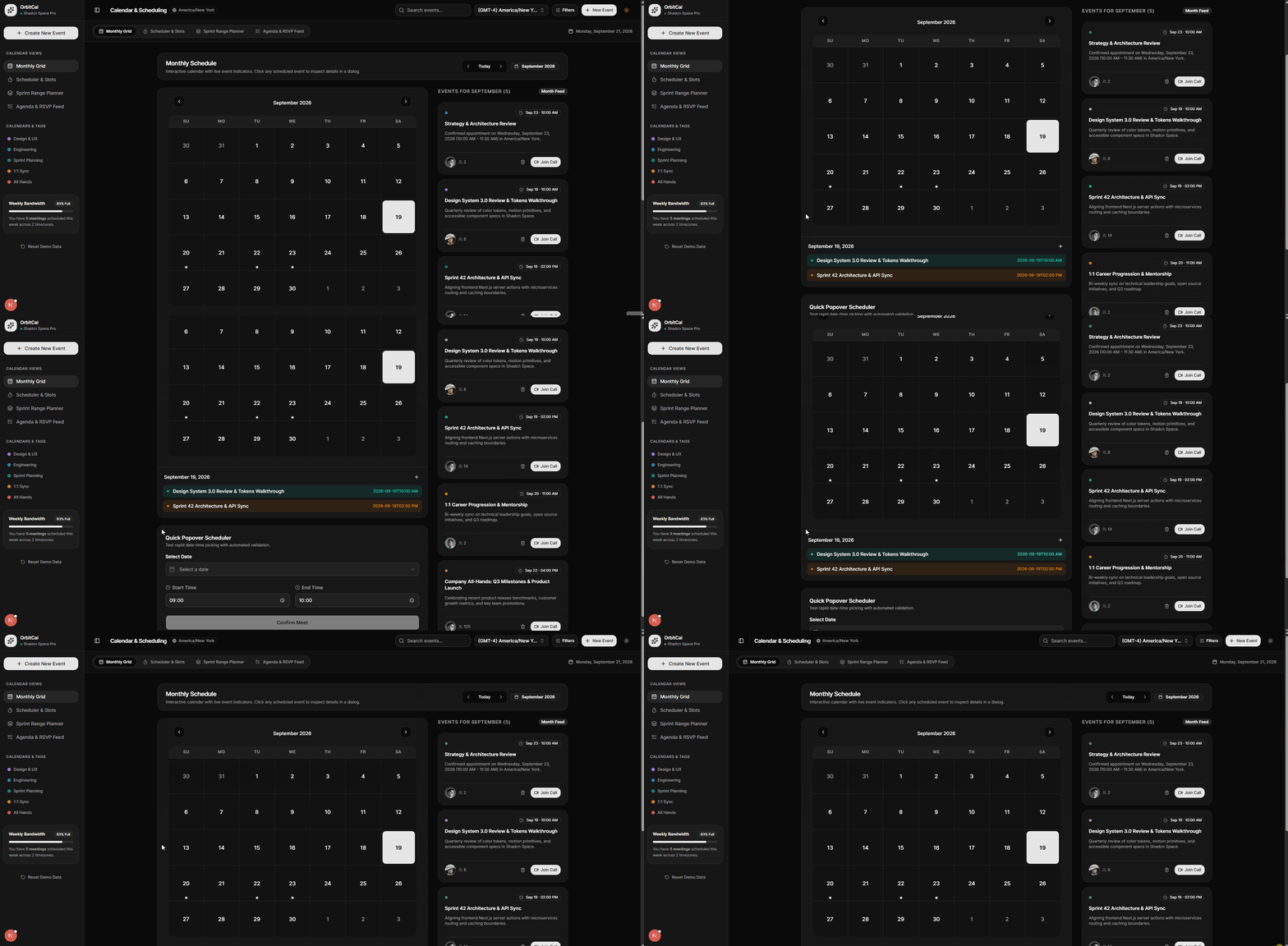
This is a good example of how a reusable ShadcnSpace block can be extended for a specific application without moving the entire application logic into the component.
Add date and time scheduling
Selecting a date is easy. Scheduling a time range that can actually be used by the rest of an application is where things get more interesting.
For our calendar application, we wanted one reusable component that could handle the complete date-and-time selection workflow without forcing every parent component to manage its own picker logic.
That led us to extend ShadcnSpace’s calendar-16.
From a picker to a reusable scheduling component
We extended calendar-16 so it can work in two ways:
- Standalone: the component manages its own date and time state.
- Controlled: a parent component can provide the date and time and receive changes through callbacks.
We also added a few scheduling-specific features:
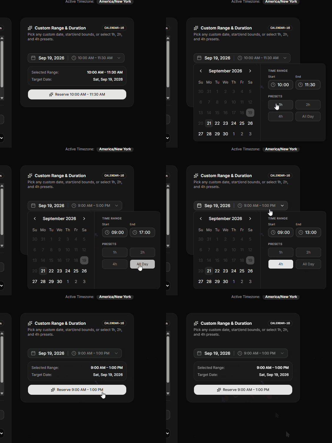
- Start and end time inputs
- 1h, 2h, and 4h duration presets
- An All Day option
- Automatic duration calculation
- Invalid time-range detection
- Disabled dates
- A single onRangeChange callback containing the complete selection
The result is a component that can be dropped into a simple form or connected to a larger scheduling system.
Part 1: Update the ShadcnSpace calendar-16
The main change is the new prop interface. Instead of keeping the selected date and times hidden inside the component, we allow the parent to control them when needed.
export interface CalendarWithTimeRangeProps {
  date?: Date;
  onDateChange?: (date: Date | undefined) => void;
  startTime?: string;
  onStartTimeChange?: (time: string) => void;
  endTime?: string;
  onEndTimeChange?: (time: string) => void;
  onRangeChange?: (range: {
    date: Date | undefined;
    startTime: string;
    endTime: string;
  }) => void;
  className?: string;
  disabled?: (date: Date) => boolean;
}
The component then falls back to its own internal state when those values are not supplied:
const date =
  controlledDate !== undefined
    ? controlledDate
    : internalDate;

const startTime =
  controlledStartTime !== undefined
    ? controlledStartTime
    : internalStartTime;

const endTime =
  controlledEndTime !== undefined
    ? controlledEndTime
    : internalEndTime;
That small change makes the component much more flexible. A parent can now treat it as a reusable input instead of having to rebuild the date and time state around it.
Add duration presets
One of the useful additions is the duration preset system. Instead of manually changing the end time for common meeting lengths, users can select 1 hour, 2 hours, or 4 hours.
const PRESETS = [
  { label: "1h", value: 1 },
  { label: "2h", value: 2 },
  { label: "4h", value: 4 },
];
Selecting a preset calculates the new end time from the current start time:
onClick={() => {
  handleEndTimeChange(
    addHoursToTime(startTime, preset.value)
  );
}}
The component also provides an All Day option and calculates the current duration so the active preset can be highlighted.
Catch invalid time ranges before submission
A scheduling component should not allow a range where the end time is earlier than the start time.
We handle that directly inside the component:
const date =
  controlledDate !== undefined
    ? controlledDate
    : internalDate;

const startTime =
  controlledStartTime !== undefined
    ? controlledStartTime
    : internalStartTime;

const endTime =
  controlledEndTime !== undefined
    ? controlledEndTime
    : internalEndTime;
When the range is invalid, the end-time field is highlighted, and the user sees:
End time must be after start time
This keeps invalid input from propagating into the rest of the application.
The complete updated component
For the open-source implementation, we include the completely updated calendar-16 source so you can see how the controlled state, presets, validation, and callbacks are implemented together.
"use client";
import { useId, useState } from "react";
import { format } from "date-fns";
import { cn } from "@/lib/utils";
import { Button } from "@/components/ui/button";
import { Calendar } from "@/components/ui/calendar";
import {
InputGroup,
InputGroupAddon,
InputGroupInput,
} from "@/components/ui/input-group";
import {
Popover,
PopoverContent,
PopoverTrigger,
} from "@/components/ui/popover";
import { Separator } from "@/components/ui/separator";
import { CalendarIcon, ClockIcon, ChevronDownIcon } from "lucide-react";
export const formatTime12h = (timeStr: string) => {
if (!timeStr) return "";
const parts = timeStr.split(":");
const hours = parseInt(parts[0], 10);
const minutes = parts[1] || "00";
if (isNaN(hours)) return timeStr;
const ampm = hours >= 12 ? "PM" : "AM";
const displayHours = hours % 12 === 0 ? 12 : hours % 12;
return `${displayHours}:${minutes} ${ampm}`;
};
const addHoursToTime = (timeStr: string, hoursToAdd: number): string => {
if (!timeStr) return "";
const [h, m] = timeStr.split(":").map(Number);
if (isNaN(h) || isNaN(m)) return timeStr;
const newHour = (h + hoursToAdd) % 24;
const pad = (n: number) => String(n).padStart(2, "0");
return `${pad(newHour)}:${pad(m)}`;
};
const getDurationHours = (start: string, end: string): number | null => {
if (!start || !end) return null;
const [sh, sm] = start.split(":").map(Number);
const [eh, em] = end.split(":").map(Number);
if (isNaN(sh) || isNaN(sm) || isNaN(eh) || isNaN(em)) return null;
const startMin = sh * 60 + sm;
const endMin = eh * 60 + em;
const diffMin = endMin - startMin;
if (diffMin <= 0) return null;
return diffMin / 60;
};
const PRESETS = [
{ label: "1h", value: 1 },
{ label: "2h", value: 2 },
{ label: "4h", value: 4 },
];
export interface CalendarWithTimeRangeProps {
date?: Date;
onDateChange?: (date: Date | undefined) => void;
startTime?: string;
onStartTimeChange?: (time: string) => void;
endTime?: string;
onEndTimeChange?: (time: string) => void;
onRangeChange?: (range: { date: Date | undefined; startTime: string; endTime: string }) => void;
className?: string;
disabled?: (date: Date) => boolean;
}
export const CalendarWithTimeRange = ({
date: controlledDate,
onDateChange,
startTime: controlledStartTime,
onStartTimeChange,
endTime: controlledEndTime,
onEndTimeChange,
onRangeChange,
className,
disabled,
}: CalendarWithTimeRangeProps = {}) => {
const id = useId();
const [internalDate, setInternalDate] = useState<Date | undefined>(new Date());
const [internalStartTime, setInternalStartTime] = useState("10:30");
const [internalEndTime, setInternalEndTime] = useState("12:30");
const date = controlledDate !== undefined ? controlledDate: internalDate;
const startTime = controlledStartTime !== undefined ? controlledStartTime: internalStartTime;
const endTime = controlledEndTime !== undefined ? controlledEndTime: internalEndTime;
const handleDateChange = (newDate: Date | undefined) => {
if (controlledDate === undefined) {
setInternalDate(newDate);
}
onDateChange?.(newDate);
onRangeChange?.({ date: newDate, startTime, endTime });
};
const handleStartTimeChange = (newStartTime: string) => {
if (controlledStartTime === undefined) {
setInternalStartTime(newStartTime);
}
onStartTimeChange?.(newStartTime);
onRangeChange?.({ date, startTime: newStartTime, endTime });
};
const handleEndTimeChange = (newEndTime: string) => {
if (controlledEndTime === undefined) {
setInternalEndTime(newEndTime);
}
onEndTimeChange?.(newEndTime);
onRangeChange?.({ date, startTime, endTime: newEndTime });
};
const isInvalid = !!(startTime && endTime && startTime > endTime);
const currentDuration = getDurationHours(startTime, endTime);
const isAllDayActive = startTime === "09:00" && endTime === "17:00";
return (
<Popover>
<PopoverTrigger
render={
<Button
className={cn(
"group/pick-date w-full sm:w-fit min-w-0 sm:min-w-80 max-w-full justify-between text-left font-normal border-input hover:bg-accent hover:text-accent-foreground transition-all duration-200 cursor-pointer",
!date && "text-muted-foreground",
)}
id={id}
variant="outline"
/>
}
>
<div className="flex items-center gap-2.5 truncate">
<CalendarIcon
aria-hidden="true"
className="text-muted-foreground/80 group-hover/pick-date:text-foreground shrink-0 transition-colors h-4 w-4"
/>
{date ? (
<span className="text-foreground font-medium text-sm">
{format(date, "MMM d, yyyy")}
</span>
) : (
<span className="text-muted-foreground text-sm">
Pick a date and time
</span>
)}
{date && (startTime || endTime) && (
<>
<span className="text-muted-foreground/30 select-none">|</span>
<div className="flex items-center gap-1.5 text-muted-foreground/90">
<ClockIcon className="h-3.5 w-3.5 shrink-0 text-muted-foreground/70" />
<span className="text-xs font-normal">
{startTime ? formatTime12h(startTime) : "--"}
{" - "}
{endTime ? formatTime12h(endTime) : "--"}
</span>
</div>
</>
)}
</div>
<ChevronDownIcon className="h-4 w-4 text-muted-foreground/60 group-hover/pick-date:text-foreground shrink-0 transition-colors ml-2" />
</PopoverTrigger>
<PopoverContent
align="start"
className="w-auto p-0 flex flex-col sm:flex-row"
>
{/* Left Side: Calendar */}
<div className="p-2.5">
<Calendar
mode="single"
selected={date}
onSelect={handleDateChange}
disabled={disabled}
className="p-0"
/>
</div>
{/* Separator for mobile */}
<Separator orientation="horizontal" className="sm:hidden" />
{/* Separator for desktop */}
<Separator orientation="vertical" className="hidden sm:block" />
{/* Right Side: Time Range & Presets */}
<div className="p-4 flex flex-col gap-4 w-full sm:max-w-70 justify-start">
{/* Time range labels & inputs */}
<div className="flex flex-col gap-1.5">
<span className="text-[10px] font-semibold uppercase tracking-wider text-muted-foreground">
Time Range
</span>
<div className="grid grid-cols-2 gap-2">
<div className="flex flex-col gap-1">
<span className="text-[10px] text-muted-foreground font-medium">
Start
</span>
<InputGroup>
<InputGroupInput
id="time-from"
type="time"
value={startTime}
onChange={(e) => handleStartTimeChange(e.target.value)}
className="appearance-none [&::-webkit-calendar-picker-indicator]:hidden [&::-webkit-calendar-picker-indicator]:appearance-none text-xs"
/>
<InputGroupAddon>
<ClockIcon className="text-muted-foreground/75" />
</InputGroupAddon>
</InputGroup>
</div>
<div className="flex flex-col gap-1">
<span className="text-[10px] text-muted-foreground font-medium">
End
</span>
<InputGroup className={cn(isInvalid && "border-destructive")}>
<InputGroupInput
id="time-to"
type="time"
value={endTime}
onChange={(e) => handleEndTimeChange(e.target.value)}
aria-invalid={isInvalid}
className="appearance-none [&::-webkit-calendar-picker-indicator]:hidden [&::-webkit-calendar-picker-indicator]:appearance-none text-xs"
/>
<InputGroupAddon>
<ClockIcon
className={cn(
"text-muted-foreground/75",
isInvalid && "text-destructive",
)}
/>
</InputGroupAddon>
</InputGroup>
</div>
</div>
</div>
{/* Preset Buttons */}
<div className="flex flex-col gap-1.5">
<span className="text-[10px] font-semibold uppercase tracking-wider text-muted-foreground">
Presets
</span>
<div className="grid grid-cols-2 gap-2">
{PRESETS.map((preset) => {
const isActive = currentDuration === preset.value;
return (
<Button
key={preset.label}
variant={isActive ? "default" : "outline"}
size="sm"
className={cn(
"h-8 text-xs font-normal transition-all w-full cursor-pointer",
isActive
? "shadow-sm"
: "hover:bg-accent hover:text-accent-foreground text-muted-foreground/80",
)}
onClick={() => {
handleEndTimeChange(addHoursToTime(startTime, preset.value));
}}
>
{preset.label}
</Button>
);
})}
<Button
variant={isAllDayActive ? "default" : "outline"}
size="sm"
className={cn(
"h-8 text-xs font-normal transition-all w-full cursor-pointer",
isAllDayActive
? "shadow-sm"
: "hover:bg-accent hover:text-accent-foreground text-muted-foreground/80",
)}
onClick={() => {
handleStartTimeChange("09:00");
handleEndTimeChange("17:00");
}}
>
All Day
</Button>
</div>
</div>
{isInvalid && (
<p className="text-xs text-destructive font-medium mt-1 leading-normal text-center animate-in fade-in duration-200">
End time must be after start time
</p>
)}
</div>
</PopoverContent>
</Popover>
);
};
export default CalendarWithTimeRange;Part 2: Use it inside the scheduler
With the reusable component extended, the main SchedulerView can focus on the application logic instead of rebuilding date-and-time picker behavior.
The scheduler handles the booking-specific state:
const [selectedSlot, setSelectedSlot] =
React.useState<string | null>("10:00 AM");
const [meetingTitle, setMeetingTitle] =
React.useState("Strategy & Architecture Review");
const [hostName, setHostName] =
React.useState("Alex Rivera (Lead Architect)");When the user confirms a slot, the application calculates the appointment end time, creates a CalendarEvent, and sends it back to the main calendar state.
const parsedStart = parse(
  selectedSlot,
  "hh:mm a",
  bookingDate
);

const parsedEnd = addMinutes(parsedStart, 45);

const endTimeStr = format(
  parsedEnd,
  "hh:mm a"
);
The important part is what happens next: the new appointment becomes part of the same event collection used by the Monthly Calendar and Agenda views.
onBookAppointment(newAppointment);
setLastBookedEvent(newAppointment);
The user then gets a confirmation state with direct links back to the Agenda Feed and Monthly Grid.
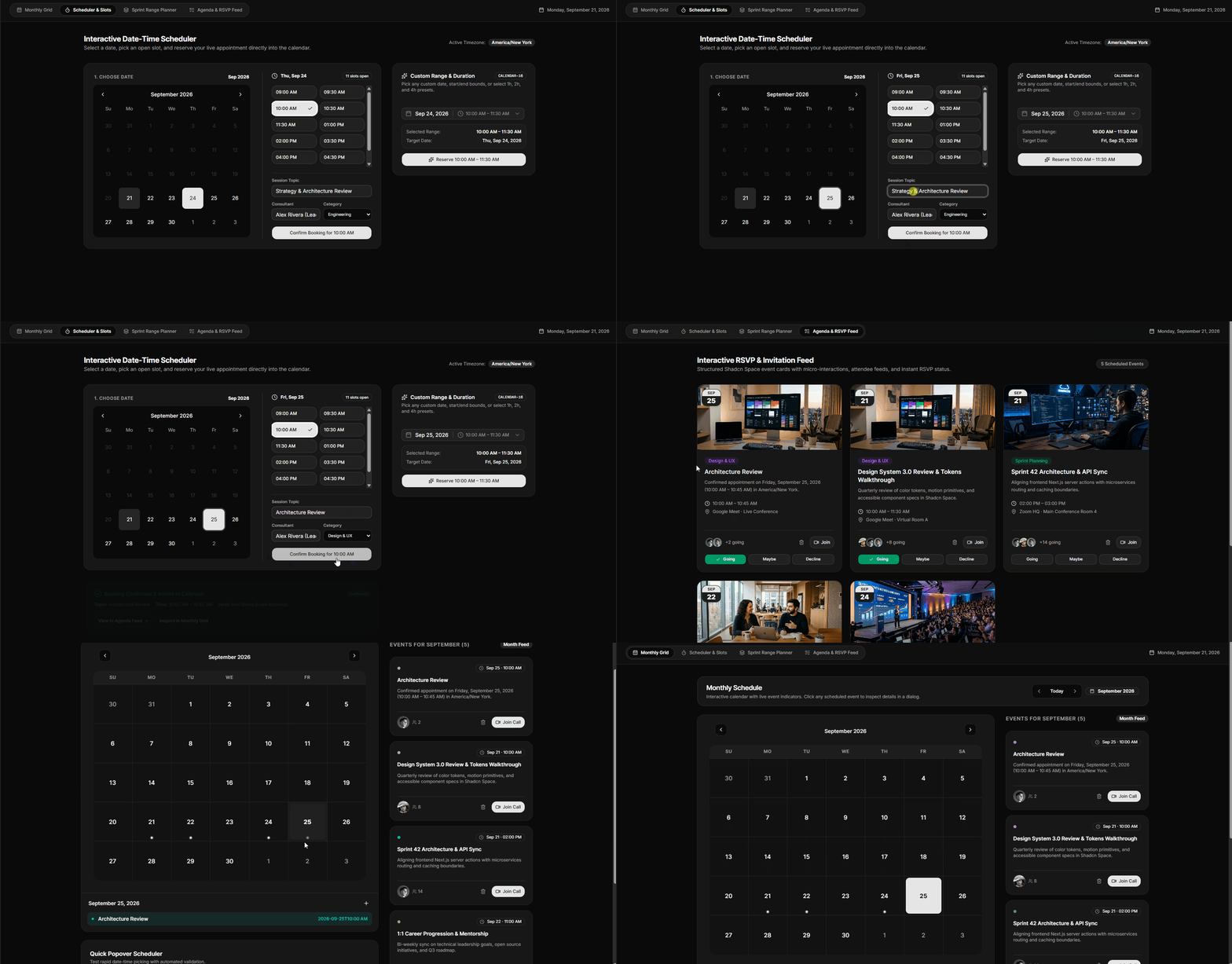
This gives us a clean separation:
calendar-16 handles date and time range selection.
SchedulerView handles the booking workflow and application state.
That distinction is what makes the component reusable beyond this particular calendar application.
Plan multi-day work with a date range
Some calendar tasks are about finding a single meeting time. Others are about planning a period of work.
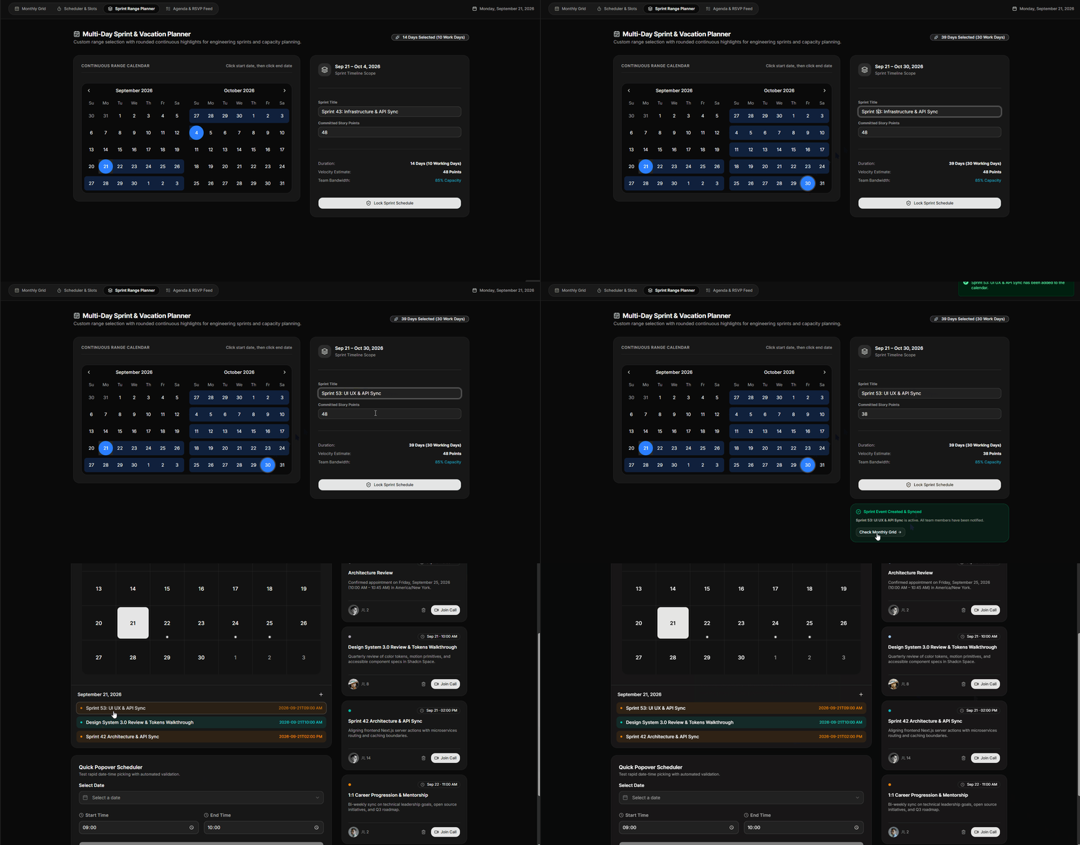
A sprint, vacation, project phase, or team leave period needs a start date, an end date, and some way to understand what that range means. In our application, we turn date-range selection into a small planning workflow that calculates working days, estimates capacity, and lets the user lock the plan into the calendar.
Select a continuous range
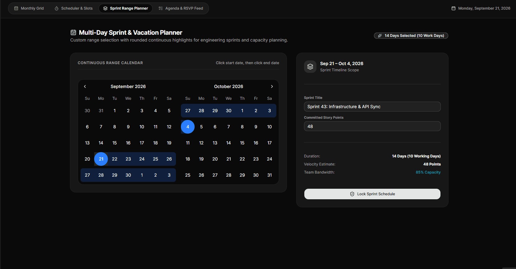
The left side of the planner uses a two-month calendar in range mode. The user selects a start date and an end date, and the selected range is kept in a single DateRange state.
<Calendar
mode="range"
defaultMonth={dateRange?.from}
selected={dateRange}
onSelect={(range) => {
setDateRange(range)
setLockedSprintEvent(null)
}}
numberOfMonths={2}
/>Displaying two months at once is useful when a sprint or vacation period crosses a month boundary. The selected range is also cleared from the success state whenever the user changes it, so the UI always reflects the current plan.
Turn dates into planning metrics
Selecting a range is only useful when the application can interpret it. Here, we calculate both the total duration and the number of working days.
const { totalDays, workingDays, estimatedCapacity } =
  React.useMemo(() => {
    if (!dateRange?.from || !dateRange?.to) {
      return {
        totalDays: 0,
        workingDays: 0,
        estimatedCapacity: 0,
      }
    }

    const total =
      differenceInDays(
        dateRange.to,
        dateRange.from
      ) + 1

    const days = eachDayOfInterval({
      start: dateRange.from,
      end: dateRange.to,
    })

    const work = days.filter(
      (day) => !isWeekend(day)
    ).length

    const capacity = Math.min(
      100,
      Math.max(65, Math.round(85 + (work % 10)))
    )

    return {
      totalDays: total,
      workingDays: work,
      estimatedCapacity: capacity,
    }
  }, [dateRange])
The interface then turns those calculations into useful information such as the total duration, working days, committed story points, and estimated team capacity.
Add sprint details
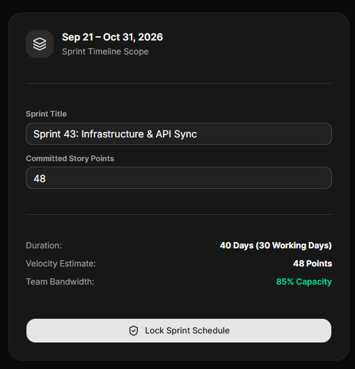
Once the date range is selected, the user can give the plan a name and define the expected story points.
<Input
id="sprint-name-input"
value={sprintName}
onChange={(e) => setSprintName(e.target.value)}
placeholder="e.g. Sprint 44: Search & Telemetry"
/>
<Input
id="sprint-points-input"
value={targetPoints}
onChange={(e) => setTargetPoints(e.target.value)}
type="number"
/>This keeps the date selection separate from the information that describes what the selected period represents.
Lock the plan into the calendar
The final step converts the selected range into a CalendarEvent. That means the sprint becomes part of the same event collection used by the rest of the application.
const newSprintEvent: CalendarEvent = {
  id: `sprint-${Date.now()}`,
  title:
    sprintName.trim() ||
    `Sprint Schedule (${totalDays} Days)`,
  category: "sprint",
  host: "Engineering Team",
  date: dateRange.from,
  startTime: "09:00 AM",
  endTime: "06:00 PM",
  location: "Linear / Jira HQ · Main Sprint Board",
  description:
    `Committed sprint from ${format(
      dateRange.from,
      "MMM d"
    )} to ${format(
      dateRange.to,
      "MMM d, yyyy"
    )}. Total: ${workingDays} working days, ${targetPoints} story points committed.`,
  status: "confirmed",
  rsvpStatus: "going",
}
After the event is created, the application stores it, shows a success state, and provides a shortcut back to the Monthly Calendar.
Create an agenda and RSVP experience
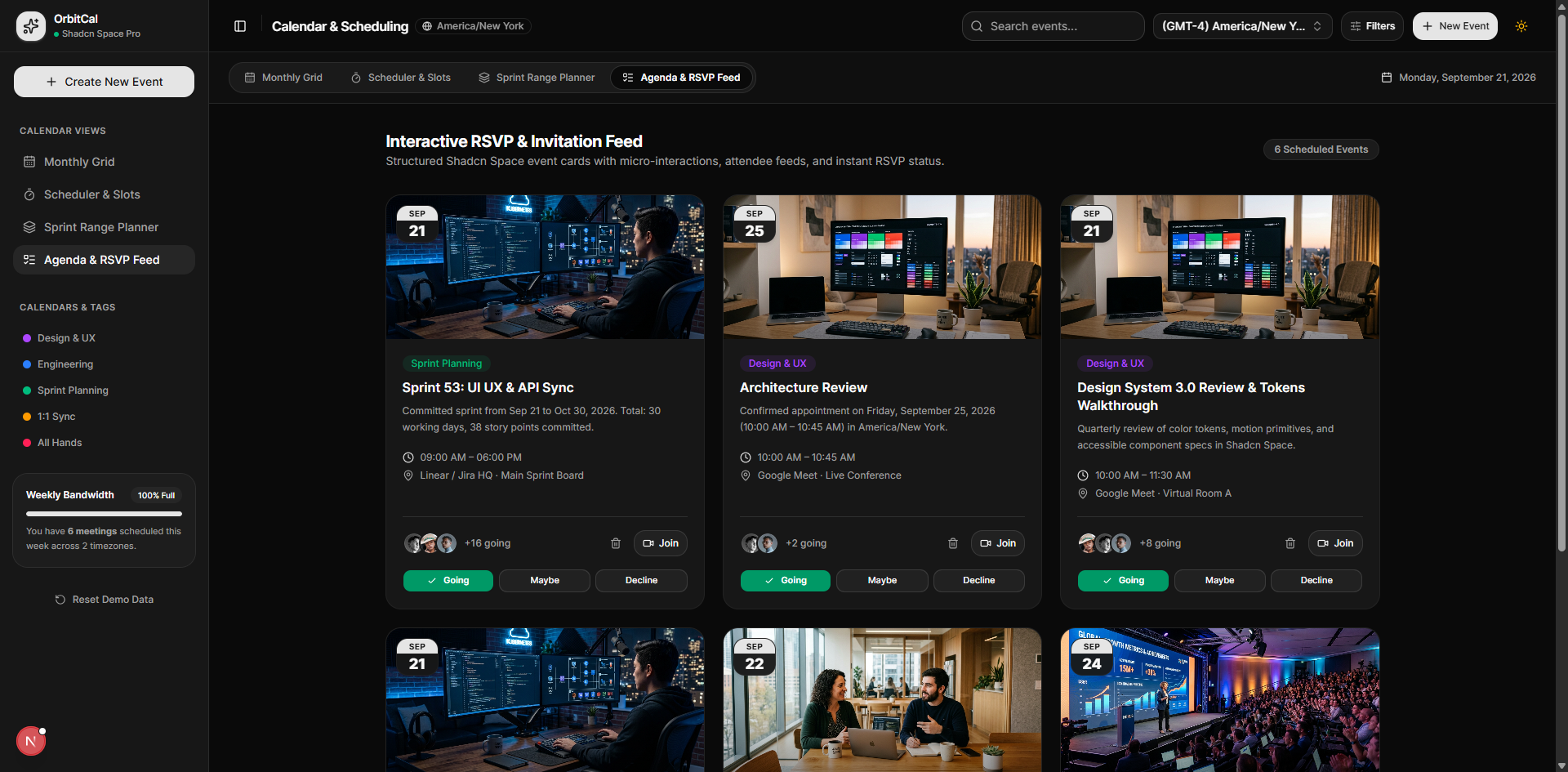
A calendar grid is useful for planning, but when users want to focus on individual events, a card-based agenda is often easier to work with.
For our application, we use card-24 to turn each calendar event into an interactive card. Instead of only displaying event information, the updated card can show attendees, join actions, RSVP controls, and event cancellation. This lets users manage an event directly from the agenda.
Part 1: Update the card-24 component
The original card was primarily focused on presenting event information. We extended it with props for event data and actions so it can be reused inside a real scheduling application.
The updated component supports:
- Event category and category styling
- Title and description
- Event image
- Date and time
- Location
- Meeting URL
- Attendee avatars and attendee count
- Custom CTA label
- RSVP state
- RSVP change callback
- Event deletion callback
- Custom class names
- Animated entrance and hover interactions
The main API is built around the event actions:
export interface EventCardProps {
  category?: string;
  categoryBadgeClass?: string;
  title?: string;
  description?: string;
  image?: string;
  month?: string;
  day?: string;
  time?: string;
  location?: string;
  callUrl?: string;
  attendees?: {
    name: string;
    avatar?: string;
  }[];
  attendeeCount?: number;
  ctaLabel?: string;
  rsvpStatus?: "going" | "maybe" | "declined" | null;
  onRsvpToggle?: (
    status: "going" | "maybe" | "declined"
  ) => void;
  onDelete?: () => void;
  className?: string;
}
The important change is that the card no longer owns the application’s RSVP or event state. It receives the current state through rsvpStatus and notifies the parent through onRsvpToggle. The same pattern is used for event deletion with onDelete.
Interactive RSVP actions
The card provides three RSVP actions:
{onRsvpToggle && (
<div className="grid grid-cols-3 gap-1.5 pt-1">
<Button
size="sm"
variant={
rsvpStatus === "going"
? "default"
: "outline"
}
onClick={() =>
onRsvpToggle("going")
}
>
{rsvpStatus === "going" && (
<Check className="size-3 mr-1" />
)}
Going
</Button>
<Button
size="sm"
variant={
rsvpStatus === "maybe"
? "default"
: "outline"
}
onClick={() =>
onRsvpToggle("maybe")
}
>
Maybe
</Button>
<Button
size="sm"
variant={
rsvpStatus === "declined"
? "default"
: "outline"
}
onClick={() =>
onRsvpToggle("declined")
}
>
Decline
</Button>
</div>
)}The selected RSVP state changes the visual treatment of the button, while the actual event state remains with the parent application.
Add attendees and meeting actions
The footer combines attendee avatars with the actions related to the event.
<div className="flex items-center gap-2">
<div className="flex -space-x-2">
{attendees.map((attendee, index) => (
<Avatar key={index}>
<AvatarImage
src={attendee.avatar}
alt={attendee.name}
/>
<AvatarFallback>
{attendee.name[0]}
</AvatarFallback>
</Avatar>
))}
</div>
<span className="text-xs text-muted-foreground">
+{attendeeCount} going
</span>
</div>When a meeting URL is available, the card also exposes a direct Join action. When onDelete is provided, users can cancel the event without leaving the agenda.
{onDelete && (
<Button
size="icon"
variant="ghost"
onClick={onDelete}
title="Cancel event"
>
<Trash2 className="size-3.5" />
</Button>
)}
{callUrl && (
<Button
size="sm"
variant="outline"
render={
<a
href={callUrl}
target="_blank"
rel="noreferrer"
/>
}
>
<Video className="size-3.5" />
Join
</Button>
)}This gives the event card both information and actions without moving the user into another screen.
Animation without changing the event logic
The updated card also uses Motion for entrance and interaction effects. The main card animates into view, while attendee avatars and content appear progressively.
The animation remains separate from the event logic, so adding motion does not change how RSVP or event state is managed.
Full updated card-24 component
For the open-source example, this is where we should include the complete updated card-24 source rather than only selected snippets.
"use client";
import { useId, useState } from "react";
import { format } from "date-fns";
import { cn } from "@/lib/utils";
import { Button } from "@/components/ui/button";
import { Calendar } from "@/components/ui/calendar";
import {
InputGroup,
InputGroupAddon,
InputGroupInput,
} from "@/components/ui/input-group";
import {
Popover,
PopoverContent,
PopoverTrigger,
} from "@/components/ui/popover";
import { Separator } from "@/components/ui/separator";
import { CalendarIcon, ClockIcon, ChevronDownIcon } from "lucide-react";
export const formatTime12h = (timeStr: string) => {
if (!timeStr) return "";
const parts = timeStr.split(":");
const hours = parseInt(parts[0], 10);
const minutes = parts[1] || "00";
if (isNaN(hours)) return timeStr;
const ampm = hours >= 12 ? "PM" : "AM";
const displayHours = hours % 12 === 0 ? 12 : hours % 12;
return `${displayHours}:${minutes} ${ampm}`;
};
const addHoursToTime = (timeStr: string, hoursToAdd: number): string => {
if (!timeStr) return "";
const [h, m] = timeStr.split(":").map(Number);
if (isNaN(h) || isNaN(m)) return timeStr;
const newHour = (h + hoursToAdd) % 24;
const pad = (n: number) => String(n).padStart(2, "0");
return `${pad(newHour)}:${pad(m)}`;
};
const getDurationHours = (start: string, end: string): number | null => {
if (!start || !end) return null;
const [sh, sm] = start.split(":").map(Number);
const [eh, em] = end.split(":").map(Number);
if (isNaN(sh) || isNaN(sm) || isNaN(eh) || isNaN(em)) return null;
const startMin = sh * 60 + sm;
const endMin = eh * 60 + em;
const diffMin = endMin - startMin;
if (diffMin <= 0) return null;
return diffMin / 60;
};
const PRESETS = [
{ label: "1h", value: 1 },
{ label: "2h", value: 2 },
{ label: "4h", value: 4 },
];
export interface CalendarWithTimeRangeProps {
date?: Date;
onDateChange?: (date: Date | undefined) => void;
startTime?: string;
onStartTimeChange?: (time: string) => void;
endTime?: string;
onEndTimeChange?: (time: string) => void;
onRangeChange?: (range: { date: Date | undefined; startTime: string; endTime: string }) => void;
className?: string;
disabled?: (date: Date) => boolean;
}
export const CalendarWithTimeRange = ({
date: controlledDate,
onDateChange,
startTime: controlledStartTime,
onStartTimeChange,
endTime: controlledEndTime,
onEndTimeChange,
onRangeChange,
className,
disabled,
}: CalendarWithTimeRangeProps = {}) => {
const id = useId();
const [internalDate, setInternalDate] = useState<Date | undefined>(new Date());
const [internalStartTime, setInternalStartTime] = useState("10:30");
const [internalEndTime, setInternalEndTime] = useState("12:30");
const date = controlledDate !== undefined ? controlledDate : internalDate;
const startTime = controlledStartTime !== undefined ? controlledStartTime : internalStartTime;
const endTime = controlledEndTime !== undefined ? controlledEndTime : internalEndTime;
const handleDateChange = (newDate: Date | undefined) => {
if (controlledDate === undefined) {
setInternalDate(newDate);
}
onDateChange?.(newDate);
onRangeChange?.({ date: newDate, startTime, endTime });
};
const handleStartTimeChange = (newStartTime: string) => {
if (controlledStartTime === undefined) {
setInternalStartTime(newStartTime);
}
onStartTimeChange?.(newStartTime);
onRangeChange?.({ date, startTime: newStartTime, endTime });
};
const handleEndTimeChange = (newEndTime: string) => {
if (controlledEndTime === undefined) {
setInternalEndTime(newEndTime);
}
onEndTimeChange?.(newEndTime);
onRangeChange?.({ date, startTime, endTime: newEndTime });
};
const isInvalid = !!(startTime && endTime && startTime > endTime);
const currentDuration = getDurationHours(startTime, endTime);
const isAllDayActive = startTime === "09:00" && endTime === "17:00";
return (
<Popover>
<PopoverTrigger
render={
<Button
className={cn(
"group/pick-date w-full sm:w-fit min-w-0 sm:min-w-80 max-w-full justify-between text-left font-normal border-input hover:bg-accent hover:text-accent-foreground transition-all duration-200 cursor-pointer",
!date && "text-muted-foreground",
)}
id={id}
variant="outline"
/>
}
>
<div className="flex items-center gap-2.5 truncate">
<CalendarIcon
aria-hidden="true"
className="text-muted-foreground/80 group-hover/pick-date:text-foreground shrink-0 transition-colors h-4 w-4"
/>
{date ? (
<span className="text-foreground font-medium text-sm">
{format(date, "MMM d, yyyy")}
</span>
) : (
<span className="text-muted-foreground text-sm">
Pick a date and time
</span>
)}
{date && (startTime || endTime) && (
<>
<span className="text-muted-foreground/30 select-none">|</span>
<div className="flex items-center gap-1.5 text-muted-foreground/90">
<ClockIcon className="h-3.5 w-3.5 shrink-0 text-muted-foreground/70" />
<span className="text-xs font-normal">
{startTime ? formatTime12h(startTime) : "--"}
{" - "}
{endTime ? formatTime12h(endTime) : "--"}
</span>
</div>
</>
)}
</div>
<ChevronDownIcon className="h-4 w-4 text-muted-foreground/60 group-hover/pick-date:text-foreground shrink-0 transition-colors ml-2" />
</PopoverTrigger>
<PopoverContent
align="start"
className="w-auto p-0 flex flex-col sm:flex-row"
>
{/* Left Side: Calendar */}
<div className="p-2.5">
<Calendar
mode="single"
selected={date}
onSelect={handleDateChange}
disabled={disabled}
className="p-0"
/>
</div>
{/* Separator for mobile */}
<Separator orientation="horizontal" className="sm:hidden" />
{/* Separator for desktop */}
<Separator orientation="vertical" className="hidden sm:block" />
{/* Right Side: Time Range & Presets */}
<div className="p-4 flex flex-col gap-4 w-full sm:max-w-70 justify-start">
{/* Time range labels & inputs */}
<div className="flex flex-col gap-1.5">
<span className="text-[10px] font-semibold uppercase tracking-wider text-muted-foreground">
Time Range
</span>
<div className="grid grid-cols-2 gap-2">
<div className="flex flex-col gap-1">
<span className="text-[10px] text-muted-foreground font-medium">
Start
</span>
<InputGroup>
<InputGroupInput
id="time-from"
type="time"
value={startTime}
onChange={(e) => handleStartTimeChange(e.target.value)}
className="appearance-none [&::-webkit-calendar-picker-indicator]:hidden [&::-webkit-calendar-picker-indicator]:appearance-none text-xs"
/>
<InputGroupAddon>
<ClockIcon className="text-muted-foreground/75" />
</InputGroupAddon>
</InputGroup>
</div>
<div className="flex flex-col gap-1">
<span className="text-[10px] text-muted-foreground font-medium">
End
</span>
<InputGroup className={cn(isInvalid && "border-destructive")}>
<InputGroupInput
id="time-to"
type="time"
value={endTime}
onChange={(e) => handleEndTimeChange(e.target.value)}
aria-invalid={isInvalid}
className="appearance-none [&::-webkit-calendar-picker-indicator]:hidden [&::-webkit-calendar-picker-indicator]:appearance-none text-xs"
/>
<InputGroupAddon>
<ClockIcon
className={cn(
"text-muted-foreground/75",
isInvalid && "text-destructive",
)}
/>
</InputGroupAddon>
</InputGroup>
</div>
</div>
</div>
{/* Preset Buttons */}
<div className="flex flex-col gap-1.5">
<span className="text-[10px] font-semibold uppercase tracking-wider text-muted-foreground">
Presets
</span>
<div className="grid grid-cols-2 gap-2">
{PRESETS.map((preset) => {
const isActive = currentDuration === preset.value;
return (
<Button
key={preset.label}
variant={isActive ? "default" : "outline"}
size="sm"
className={cn(
"h-8 text-xs font-normal transition-all w-full cursor-pointer",
isActive
? "shadow-sm"
: "hover:bg-accent hover:text-accent-foreground text-muted-foreground/80",
)}
onClick={() => {
handleEndTimeChange(addHoursToTime(startTime, preset.value));
}}
>
{preset.label}
</Button>
);
})}
<Button
variant={isAllDayActive ? "default" : "outline"}
size="sm"
className={cn(
"h-8 text-xs font-normal transition-all w-full cursor-pointer",
isAllDayActive
? "shadow-sm"
: "hover:bg-accent hover:text-accent-foreground text-muted-foreground/80",
)}
onClick={() => {
handleStartTimeChange("09:00");
handleEndTimeChange("17:00");
}}
>
All Day
</Button>
</div>
</div>
{isInvalid && (
<p className="text-xs text-destructive font-medium mt-1 leading-normal text-center animate-in fade-in duration-200">
End time must be after start time
</p>
)}
</div>
</PopoverContent>
</Popover>
);
};
export default CalendarWithTimeRange;This makes the modification reproducible for developers who want to understand how the reusable component was extended.
Part 2: Connect card-24 to the agenda
The application-level AgendaView is responsible for mapping our shared CalendarEvent objects into the props expected by card-24.
<EventCard
key={evt.id}
category={catObj?.name || "Meeting"}
categoryBadgeClass={cn(
catObj?.bgLight,
catObj?.text
)}
title={evt.title}
description={evt.description}
image={evt.image}
month={format(
evt.date,
"MMM"
).toUpperCase()}
day={format(evt.date, "d")}
time={`${evt.startTime} - ${evt.endTime}`}
location={evt.location}
callUrl={evt.callUrl}
attendees={evt.attendees}
attendeeCount={evt.attendeesCount}
rsvpStatus={evt.rsvpStatus}
onRsvpToggle={(status) =>
  onToggleRsvp(evt.id, status)
}
onDelete={
onDeleteEvent
? () => onDeleteEvent(evt.id)
: undefined
}
/>This is where the reusable component connects to the application’s actual event state. The card does not need to know where an event comes from or how it is stored. It only receives the data it needs and reports user actions back to the parent.
Keep RSVP state in the shared event model
When a user clicks Going, Maybe, or Decline, the AgendaView passes the event ID and new RSVP state back to the application.
onRsvpToggle={(status) =>
onToggleRsvp(evt.id, status)
}That shared event state can then be reflected anywhere else in the application where the same event appears.

This gives the calendar application two complementary ways to work with events:
Monthly Calendar: Find events by date.
Agenda: Focus on an event and take action.
The reusable card-24 component handles the presentation and interaction, while the application remains responsible for the actual event state and business logic.
Add global timezone selection
Scheduling becomes harder when the people using the application are working in different time zones. Showing the selected timezone in the calendar interface gives users context when choosing dates and booking appointments.
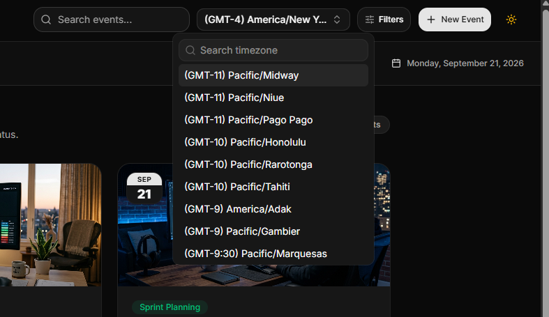
For this application, we use the ShadcnSpace combobox-04 component as a searchable timezone selector. It combines a popover, search input, and selectable timezone list so users can quickly find the timezone they want to use.
Connect the timezone to application state
The component accepts a value and onValueChange, which allows the parent application to keep the selected timezone in a shared state.
const [selectedTimezone, setSelectedTimezone] =
React.useState("Asia/Kolkata");
<TimezoneCombobox
value={selectedTimezone}
onValueChange={setSelectedTimezone}
/>The timezone selector itself keeps the UI interaction local, while the application decides what to do with the selected value.
Make the timezone searchable
A calendar application can have a long list of time zones, so displaying every option at once is not practical. The component uses a searchable command list to filter the available options.
<Command>
<CommandInput placeholder="Search timezone..." />
<CommandList>
<CommandEmpty>No timezone found.</CommandEmpty>
<CommandGroup>
{timezones.map((timezone) => (
<CommandItem
key={timezone.value}
value={timezone.label}
onSelect={() => {
onValueChange(timezone.value);
setOpen(false);
}}
>
{timezone.label}
</CommandItem>
))}
</CommandGroup>
</CommandList>
</Command>This keeps the interaction compact while still making a large timezone list easy to navigate.
Use the selected timezone in scheduling
The selected timezone is also passed into the scheduling workflow. When an appointment is created, the application includes the active timezone in the event description so the booking context remains visible to the user.
description: `Confirmed 45-min appointment on ${
  format(bookingDate, "EEEE, MMMM d, yyyy")
} in ${selectedTimezone.replace("_", " ")}.`,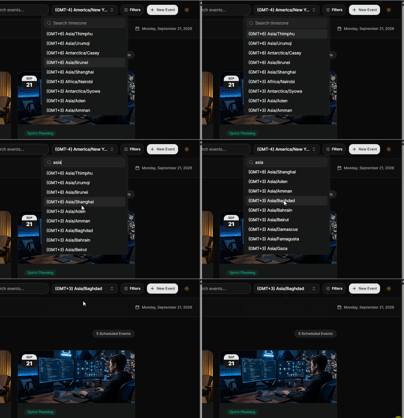
This keeps timezone selection at the application level while allowing the individual calendar and scheduling components to remain reusable.
Handle notifications without modifying generated components
Interactive applications need feedback when something happens. In our calendar application, booking an appointment and locking a sprint both trigger notifications.
Rather than changing the generated toast component directly, we created an AppToaster wrapper. This keeps the underlying component untouched while allowing the application to control its positioning and reuse the same toast API.
The wrapper exposes a simple position prop:
<AppToaster position="top-right" />The application can then use the same toast functions from the wrapper:
toast.add({
  title: "Appointment Successfully Reserved!",
  description: "Your appointment has been scheduled.",
  type: "success",
});
The important idea is to extend the generated UI through a wrapper instead of modifying the generated component itself. This keeps application-specific behavior separate from the reusable UI source and makes future component updates easier to manage.
Persist calendar state in the browser
A calendar demo feels much more realistic when changes survive a page refresh. For the open-source application, we use localStorage to persist the current event collection and provide a reset action for restoring the original demo data.
When the application loads, it checks for saved events and converts the stored date strings back into Date objects:
React.useEffect(() => {
  try {
    const saved =
      localStorage.getItem("orbitcal_events");

    if (saved) {
      setEvents(
        JSON.parse(saved).map(
          (event: CalendarEvent) => ({
            ...event,
            date: new Date(event.date),
          })
        )
      );
    }
  } catch {}
}, []);
A reset action restores the original demo state:
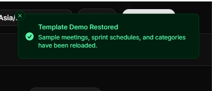
const handleResetDemoData = () => {
  localStorage.removeItem("orbitcal_events");

  setEvents(INITIAL_EVENTS);

  toast.add({
    title: "Demo Data Restored",
    description:
      "Sample meetings, sprint schedules, and categories have been reset.",
    type: "success",
  });
};
This is particularly useful for an open-source demo because developers can experiment with the application, refresh the page, and reset everything back to the original sample data when needed.
Production considerations for calendar applications
A calendar can look correct in the browser while still having problems once real scheduling data and users are involved. A few implementation details are especially important when moving from a demo to a production application.
Store time consistently
Calendar events should have a consistent time representation when they are stored and then be formatted for the user’s timezone when displayed. This becomes particularly important when an appointment is created in one timezone and viewed in another.
In this project, the active timezone is kept as part of the scheduling context, and the scheduler uses it when creating the appointment details.
Keep generated UI components separate from application logic
When extending shadcn or ShadcnSpace components, avoid putting application-specific state directly into generated core files.
For example, instead of changing the original toast implementation, the project adds an AppToaster wrapper to control positioning and expose the same toast functionality.
This keeps reusable UI code separate from application behavior.
Keep calendar state shared
The Monthly Calendar, Scheduler, Sprint Planner, and Agenda all work with the same CalendarEvent structure. That means a new appointment created by the scheduler can appear in the other views without maintaining separate event collections.
Validate scheduling input
User-selected dates and times should be validated before creating an event. Our calendar-16 implementation, for example, checks that the end time occurs after the start time and exposes that state to the UI.
Test the less obvious cases
Calendar interfaces often fail around cases that are easy to overlook:
- Date ranges crossing into another month
- Empty days and months
- Past dates in booking workflows
- Invalid time ranges
- Events with no attendees
- Events without meeting links
- Different timezone selections
- Refreshing the application after creating an event
The open-source implementation gives you a practical starting point for testing these interactions rather than treating the calendar as a purely visual component.
Common mistakes when building a calendar application
Calendar interfaces often look simple until different features start sharing the same dates, events, and scheduling state. A few implementation decisions can create problems later.
Treating the calendar as only a date picker
A date picker solves date selection, but a complete scheduling application also needs event data, time ranges, booking actions, event details, and different ways to view the schedule.
Designing the calendar around the actual workflows first makes it easier to decide which components and states are needed.
Creating separate event data for every view
The Month View, Scheduler, Sprint Planner, and Agenda all work with the same CalendarEvent structure in this project.
Maintaining separate event objects for each view can lead to inconsistencies. A booking created in one view may not appear correctly in another.
Mixing application logic into reusable components
Our updated ShadcnSpace components expose props and callbacks for application integration, while the main views handle application-specific behavior.
For example, calendar-16 manages date and time range selection, while SchedulerView creates the actual CalendarEvent and adds it to the application.
Ignoring invalid or empty states
Scheduling interfaces should account for cases such as:
- No events for the selected date
- No events for the current month
- An incomplete date range
- An end time before the start time
- Past dates that cannot be booked
These states are handled directly in the application and its reusable components.
The main lesson is to treat calendar development as an application state problem as much as a UI problem.
Explore the open-source calendar application
The complete shadcn calendar application is available as an open-source project so you can inspect how the individual pieces work together.
The repository includes the calendar views, shared event model, reusable component updates, scheduling logic, state persistence, and the supporting UI used throughout the application.
You can use the repository to:
- Run the application locally
- Explore the component structure
- See how the ShadcnSpace components were extended
- Experiment with the scheduling workflows
- Adapt the implementation for your own project
The goal of the repository is to provide a complete reference implementation rather than isolated component examples.
Explore more calendar blocks in ShadcnSpace
The open-source application demonstrates one way to combine calendar and scheduling interfaces, but the same components can be adapted to many other use cases.
ShadcnSpace also provides additional Calendar blocks for developers who want reusable interfaces instead of assembling every calendar experience from scratch.
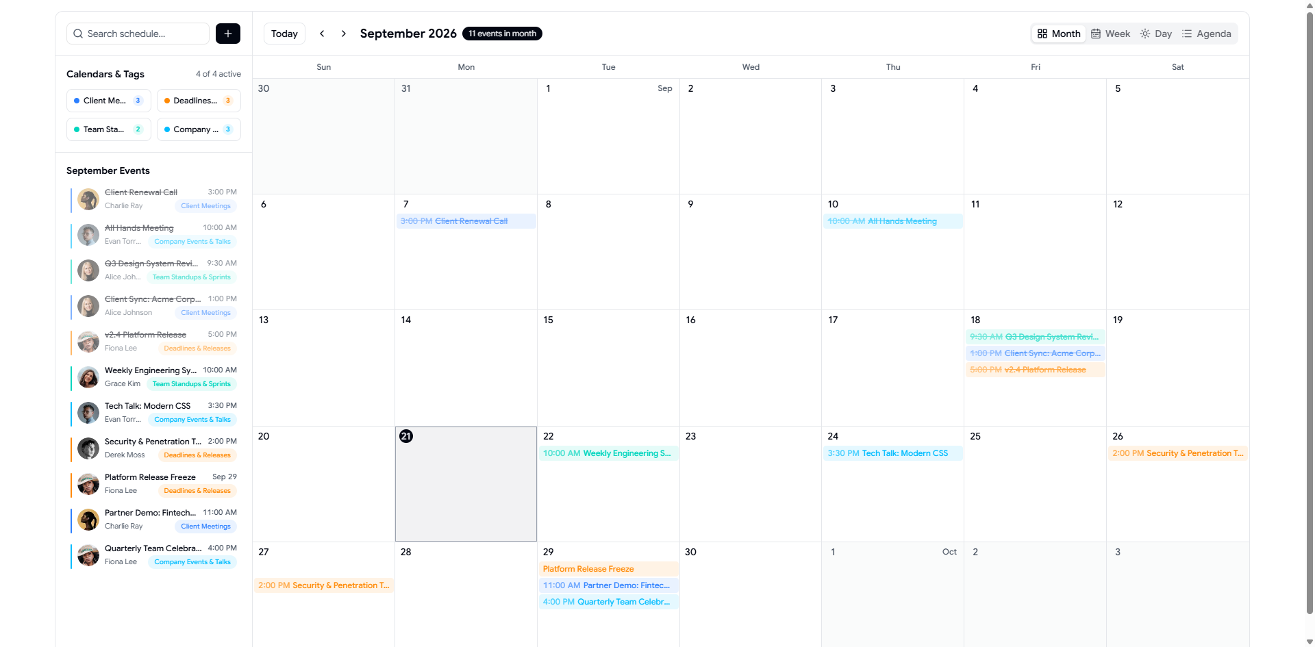
For production projects, you can explore the ShadcnSpace Pro Calendar collection and use the blocks as a starting point for your own application.
Here, we should add the actual URLs for your Pro Calendar application blocks rather than generic links, so each featured block can take the reader directly to its documentation or preview.
Frequently Asked Questions
1. How do I build a calendar application with shadcn/ui?
Start with the calendar component and a shared event data model, then build the scheduling workflows around it. This project combines monthly scheduling, appointment booking, range planning, and agenda management.
2. Can shadcn/ui be used for a complete calendar application?
Yes. The calendar component provides the UI foundation, while application logic handles events, scheduling, persistence, and other workflows.
3. How do I add event scheduling to a shadcn calendar?
Use a shared event model and connect the calendar to a booking workflow. In this project, the scheduler creates a CalendarEvent that can then be displayed by the other calendar views.
4. How should I handle date and time ranges?
Keep the date, start time, and end time as explicit values. The updated calendar-16 component also provides range callbacks, duration presets, and validation for invalid ranges.
5. How do I handle multiple calendar views?
Use the same event data across each view and let each component focus on a particular interaction, such as monthly browsing, scheduling, range planning, or agenda management.
Conclusion
A calendar application is not just a grid of dates. Once you add scheduling, event management, range planning, RSVP actions, time zones, and persistence, it becomes a collection of connected workflows.
In this project, we used reusable ShadcnSpace components as the UI foundation, extended them where the application needed additional behavior, and kept the application-specific logic in the surrounding views.
The result is an open-source Calendar & Scheduling application that shows how reusable shadcn/ui components can be combined into a larger real-world interface.
