Shadcn Card
Explore a collection of awesome 21+ Shadcn Card components featuring multiple customizable and interactive card variants built with React and Tailwind CSS.
Others tools
- Multiple libraries to maintain
- Inconsistent component styles
- Repetitive UI development
- Limited customization options
- Slow project delivery
- Fragmented design systems
- Minimal developer support
Shadcnspace
- Complete UI ecosystem
- Production-ready components
- Fully customizable blocks
- Built with shadcn/ui & Tailwind CSS
- Clean, accessible code
- Regular updates & new releases
- Fast support for developers
Isabella Clark
Finance Manager
"Switching to one platform eliminated the need for multiple tools and reduced unnecessary back-and-forth. Collaboration became smoother, and our team is now moving faster and delivering more consistently."
Seamless Integrations
Connect your favorite tools and keep your workflows unified without switching between platforms.
Card 18 - Credit Card
Click card to flip
Card 17 - Ecommerce Product Variant Card
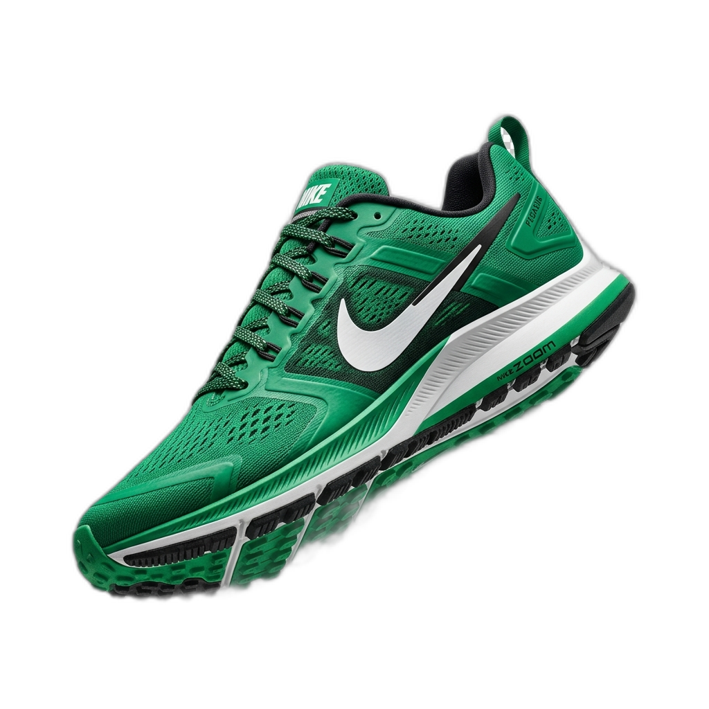 −21%
−21%Nike
Air Max Pulse Running Shoes
Card 16 - Ecommerce Product Rating Card
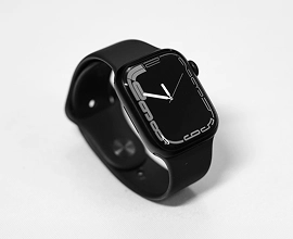
Electronics
Apple Watch S9
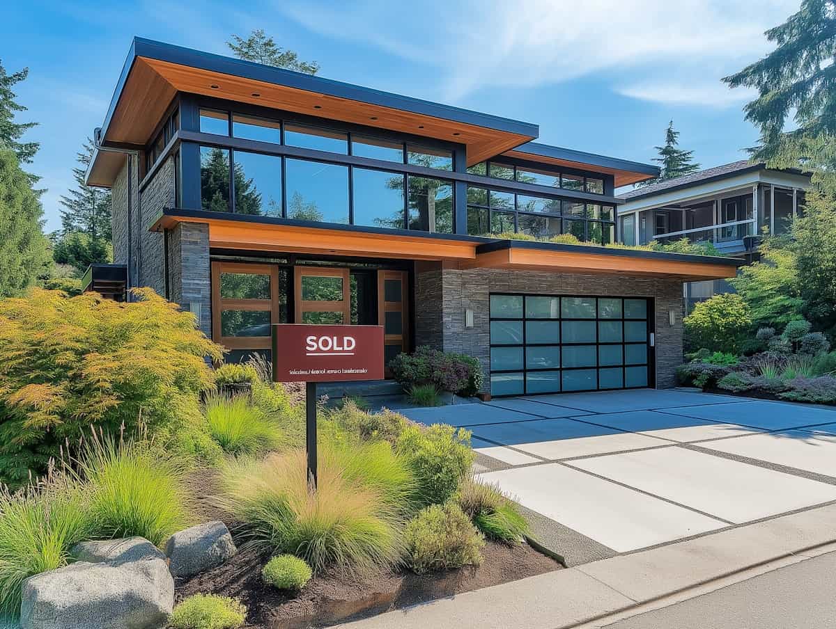
Serenity Residential Home
15 S Aurora Ave, Miami
5 Beds
3 Baths
120m²
Property Highlights
Award-winning residential design with 24/7 smart security and unparalleled tranquility.
Card 13 - Contributed Card
Card 12 - Weekly Card
Card 11 - Assign Task Card
Card 10 - Appointment Card
Card 09 - Invite Member Card
Card 08 - Invite Card
Card 07 - Audio Frequency Visualizer
Card 06 - Statistics Card
Card 05 - Analytics Card
Analytics Dashboard
Check all the statistics
Earnings
$27,850
+18%Expense
$18,453
-5%
Card 04 - Welcome Card
Welcome Back David
Budget
$0
Expenses
$0

Card 03 - Product Card

MaterialPro Dashboard
$23,568
Flexy Admin Template
$24,468
Card 02 - Preview Card
Serenity Residential Home
15 S Aurora Ave, Miami
5 Bedrooms
3 Bathrooms
120m2
Card 01 - Article Preview Card

Figma tips and tricks with Stephan
Nullam lobortis sodales dolor vitae viverra.
Cras lacinia bibendum metus vel rhoncus.