

Building a modern web interface often means solving the same interaction problems again and again: keyboard navigation, focus management, accessible dialogs, menus, popovers, form controls, and more.
Headless UI libraries help solve these problems while leaving the visual design and styling to the developer. React Aria and Base UI are two popular options for building this type of interface.
Both provide accessible, unstyled components and give you control over how the final UI looks. But they take different approaches to component APIs, composition, accessibility, and complex interfaces.
This matters whether you’re building a React application, a Next.js application, or a reusable design system using shadcn ui.
So which one should you choose?
The answer isn’t simply about which library has more components. It depends on the type of interface you’re building, the interaction patterns you need, how much control you want over component behavior, and whether features such as internationalization or complex data components are important to your project.
In this guide, we’ll compare React Aria and Base UI across accessibility, component architecture, composition, styling, internationalization, developer experience, and practical use cases. We’ll also compare real component implementations to see how their APIs differ.
By the end, you’ll have a clear understanding of where React Aria and Base UI differ and which approach makes more sense for your project.
React Aria vs Base UI at a Glance
React Aria and Base UI solve many of the same problems, but they prioritize different things.
React Aria provides a broad set of accessible components, hooks, and interaction utilities. Base UI takes a more focused approach with composable, unstyled components designed to serve as building blocks for application interfaces.
Here is a quick overview of the main differences:
| Feature | React Aria | Base UI |
| Approach | Components, hooks, and accessibility primitives | Composable headless components |
| Styling | Unstyled | Unstyled |
| Accessibility | Built into components and hooks | Built into components |
| Component coverage | Broad | Focused on common UI primitives |
| Low-level APIs | Extensive hooks and utilities | Component-focused APIs |
| Composition | Components, slots, render props | Render prop and composition patterns |
| Internationalization | Strong built-in support | More developer-managed |
| Date and time | Extensive | More limited |
| Tables and collections | Extensive | More focused |
| Custom styling | Full control | Full control |
| TypeScript | Yes | Yes |
| React applications | Yes | Yes |
| Next.js applications | Yes | Yes |
| Best suited for | Complex, accessible, internationalized interfaces | Custom application UI and design systems |
The table gives you the high-level difference, but it doesn’t tell the whole story. Both libraries handle many of the same everyday UI patterns, so the more important question is how they approach those components and what happens as your interface gets more complex.
That’s where the differences become more noticeable.
What is React Aria?
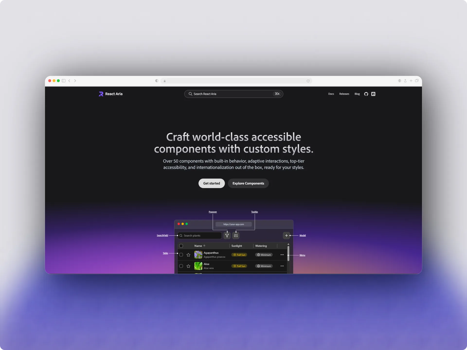
React Aria is a collection of React components and hooks from Adobe’s React Spectrum team. It focuses on making interactive interfaces accessible while also providing support for internationalization and complex interaction patterns.
One of its main strengths is that you can work at different levels.
You can use React Aria Components when you want ready-made accessible component behavior, or use React Aria hooks when you need more control over the underlying implementation.
This gives developers several options:
- Use a higher-level component for common UI patterns.
- Use hooks to build a custom component.
- Combine accessibility behavior with your own markup and styling.
- Use specialized components for dates, collections, tables, color interfaces, and other complex interactions.
This layered approach is particularly useful when an application has interaction requirements that go beyond basic buttons, dialogs, menus, and form controls.
React Aria components vs React Aria hooks
It is important to understand that React Aria is not just one component library.
The ecosystem includes different levels of abstraction.
React Aria Components provide higher-level components that already implement accessibility and interaction behavior.
For example:
import { Button } from "react-aria-components"
export function SaveButton() {
return <Button>Save changes</Button>
}You can then style the component based on its state without implementing the accessibility behavior yourself.
For lower-level control, React Aria provides hooks that let you build your own components around accessible interaction behavior.
This distinction becomes important later when comparing React Aria with Base UI because the two libraries expose component behavior through different APIs.
What does React Aria handle?
React Aria focuses heavily on interaction behavior that can be easy to get wrong when implemented manually.
Depending on the component or hook, this can include:
- Keyboard interaction
- Focus management
- ARIA attributes and roles
- Screen reader behavior
- Pointer and touch interactions
- Selection behavior
- Overlay interactions
- Internationalized behavior
- Locale-aware date and time handling
The goal is not to provide a visual design system. React Aria leaves the visual appearance to you, allowing the same behavior to be used with different design systems and styling approaches.
What is Base UI?
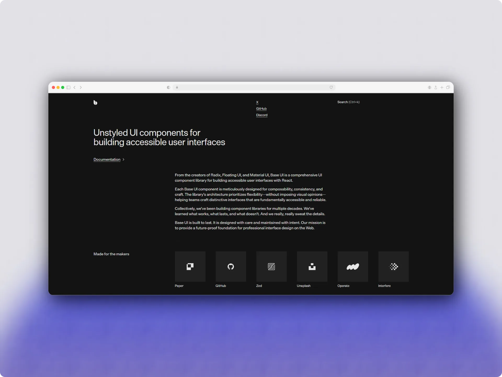
Base UI is an unstyled React component library for building accessible user interfaces. It provides the behavior and interaction logic for common UI patterns while leaving the visual design to the developer.
Instead of shipping predefined styles, Base UI gives you components that you can integrate into your own design system. You decide how buttons, dialogs, menus, selects, tooltips, forms, and other interface elements should look.
This makes Base UI useful when you want accessible component behavior without adopting a predefined visual language.
Base UI’s Headless Approach
Base UI does not come with a visual design system or CSS theme.
The library focuses on the parts of a component that are difficult to implement consistently, such as:
- Keyboard interactions
- Focus management
- Component state
- ARIA attributes
- Pointer interactions
- Opening and closing behavior
- Positioning for overlays and floating elements
You provide the visual layer yourself using CSS, Tailwind CSS, CSS Modules, or another styling solution.
For example, a dialog can use Base UI for its behavior while your application controls its markup, spacing, typography, colors, animations, and responsive behavior.
This separation is useful for teams that already have a design system or want their components to match an existing product rather than adopting another library’s visual styles.
How Base UI components are composed?
One of Base UI’s important API patterns is its render prop.
Instead of forcing every component to render a specific HTML element, Base UI allows you to provide your own element or React component where appropriate.
A simplified example looks like this:
import { Button } from "@base-ui-components/react/button"
export function SaveButton() {
return (
<Button
render={<button className="save-button" />}
>
Save changes
</Button>
)
}This composition model allows the component’s behavior to remain separate from the element used to present it.
Base UI also provides parts for more complex interfaces. This lets you compose a component from smaller pieces rather than treating the entire UI element as a single opaque component.
For example, a dialog can be composed from a root, trigger, backdrop, popup, title, description, and close action.
This approach gives developers control over both the component structure and the styling.
What does Base UI handle?
Base UI is designed to handle much of the interaction logic required by its components.
Depending on the component, this can include:
- Keyboard navigation
- Focus behavior
- ARIA attributes
- Pointer interactions
- Open and closed states
- Selection state
- Overlay behavior
- Positioning and collision handling
- Controlled and uncontrolled state
However, using Base UI does not mean every accessibility decision is automatically solved.
Developers still need to provide appropriate content and semantics for their application. For example, a dialog still needs a meaningful title, interactive elements need appropriate labels, and focus indicators should remain visible.
This distinction is important when evaluating any headless component library: the library can provide accessible behavior, but the application is still responsible for using the components correctly.
Base UI and Design Systems
Base UI works particularly well as a foundation for a custom design system.
A team can build its own reusable components on top of Base UI while keeping control over:
- Design tokens
- Typography
- Colors
- Spacing
- Component variants
- Animations
- Layout
- Brand-specific styling
This is also where Base UI fits naturally into the broader shadcn/ui ecosystem. Rather than adopting a fixed visual theme, developers can use Base UI primitives as the behavioral foundation and build the visual layer around their own requirements.
How do react-aria and base-ui differ?
React Aria and Base UI solve many of the same problems, but they are designed around different priorities.
The biggest difference is not simply the number of components each library provides. It is how much of the interaction model the library tries to provide and how you are expected to build on top of it.
Base UI focuses on composable UI components that can become part of your application’s design system. React Aria provides a broader set of accessibility and interaction building blocks, including both higher-level components and lower-level hooks.
Component Philosophy
Base UI is centered around composable components.
You typically start with a component and compose its parts together:
<Dialog.Root>
<Dialog.Trigger>Open</Dialog.Trigger>
<Dialog.Portal>
<Dialog.Backdrop />
<Dialog.Popup>
<Dialog.Title>Settings</Dialog.Title>
<Dialog.Description>
Update your account settings.
</Dialog.Description>
</Dialog.Popup>
</Dialog.Portal>
</Dialog.Root>This approach works well when you want a predictable component structure while still controlling the rendered markup and styling.
Base UI’s render pattern also makes it possible to compose components with your own React components instead of being locked into a specific DOM structure.
React Aria takes a more layered approach.
You can use ready-made React Aria Components, or move down to React Aria hooks when you need to build a custom interaction from the underlying accessibility behavior.
That makes React Aria particularly useful when the interaction itself is the difficult part, and you want more control over how that behavior is implemented.
Base UI’s focus on application UI
Base UI is designed around the UI patterns commonly found in modern web applications.
Its components provide behavior for things such as dialogs, menus, popovers, selects, comboboxes, tooltips, forms, navigation controls, and other interactive patterns.
The important part is that these components are not tied to a visual style.
You can build your own design system around them and control the markup, CSS, Tailwind classes, variants, animations, and visual states.
Base UI also exposes component state through its APIs and data-* attributes, which makes state-based styling straightforward.
This makes the library a strong fit when your main goal is:
- Build application-specific UI components
- Create a reusable design system
- Keep complete control over visual styling
- Compose components with existing React components
- Avoid adopting a predefined visual design
React Aria’s broader interaction toolkit
React Aria goes beyond common application UI patterns.
Its ecosystem includes components and hooks for more specialized interaction problems, including areas such as internationalized date and time interfaces, collections, selection, tables, and other complex interactions.
The hooks layer is particularly useful when a component needs behavior that does not fit neatly into an existing component.
Instead of starting with a predefined component structure, you can use React Aria’s behavior and state utilities as building blocks for your own implementation.
This becomes valuable in applications where accessibility, internationalization, keyboard behavior, and complex interaction patterns are major requirements.
Where do both libraries overlap?
There is significant overlap between React Aria and Base UI.
Both can be used to build accessible interfaces without forcing a visual design. Both handle important interaction details such as keyboard behavior and focus management, and both allow developers to build their own visual layer. Base UI explicitly handles many ARIA attributes, keyboard interactions, pointer interactions, and focus management.
So the decision is not:
“Which library can build an accessible dialog?”
Both can.
The more useful question is:
“What kind of foundation do I want for the rest of my application?”
If you primarily need composable UI primitives that fit naturally into a custom application design system, Base UI can be a strong choice.
If your application involves more specialized interaction patterns, extensive internationalization, or you want access to lower-level accessibility hooks, React Aria may provide a better foundation.
The differences become clearer when you look at accessibility, composition, styling, and actual component implementations.
Accessibility: React Aria vs Base UI
Accessibility is one of the main reasons developers choose a headless UI library in the first place. Both React Aria and Base UI take responsibility for many of the difficult interaction details, but the exact APIs and scope are different.
Neither library makes an application automatically accessible. They provide the behavior and semantics needed by interactive components, while developers still need to provide meaningful labels, content, focus styles, and correct usage.
Keyboard Navigation
Both libraries handle keyboard interactions for their components.
Base UI follows WAI-ARIA patterns and provides keyboard support for its components, including interactions involving keys such as Arrow keys, Home, End, Enter, and Escape where appropriate.
For example, a Base UI dialog manages common keyboard behavior such as moving focus into the dialog, trapping focus while it is open, and responding to Escape.
React Aria also provides keyboard interaction as part of its component and hook APIs. Its components are designed to work across different input methods rather than relying only on mouse or pointer events.
This is particularly important for components such as menus, list boxes, comboboxes, tables, and other interfaces where keyboard navigation is more complex than simply pressing Tab.
Focus Management
Focus management is another area where both libraries remove a significant amount of manual work.
Base UI components can automatically manage focus during interactions and provide APIs for configuring where focus should initially move and where it should return.
React Aria also provides focus management as part of its interaction and overlay APIs. This is useful for components such as dialogs, popovers, menus, and other interfaces where focus needs to move between different parts of the page.
The important difference is that focus behavior is only one part of accessibility.
Your application still needs to make the focus state visible. Base UI’s documentation specifically points out that developers are responsible for styling visible focus indicators, typically through :focus or :focus-visible.
ARIA Roles and Attributes
Both libraries handle many ARIA roles and attributes automatically.
Base UI components use the appropriate semantics for their interaction patterns and handle many ARIA attributes internally.
React Aria takes a similar approach, with accessibility behavior built into its components and hooks. The library generates the appropriate ARIA attributes and interaction behavior based on the component and its state.
This means you generally should not need to manually implement the complete ARIA behavior for something like a dialog, menu, or combobox from scratch.
However, you still need to provide the information that only your application knows.
For example:
<Dialog.Title>Delete project</Dialog.Title>The library can connect the dialog’s accessibility behavior, but it cannot decide what the dialog should be called or what information the user needs to understand the action.
Screen Reader Support
Both libraries are designed and tested with assistive technologies.
Base UI states that its components are tested across browsers, devices, platforms, and screen readers, while following WAI-ARIA design patterns.
React Aria similarly focuses on accessibility across different interaction modalities and assistive technologies. Its components and hooks are designed to provide the appropriate semantics and behavior for screen reader users as well as keyboard and pointer users.
For developers, this means the important work is not choosing which library can “add ARIA.” Both already do that.
The more important consideration is whether the library’s component model matches the accessibility and interaction requirements of your application.
What developers still need to handle?
A common mistake with headless libraries is assuming that accessibility is completely handled once the library is installed.
It isn’t.
You are still responsible for things such as:
- Providing meaningful accessible names
- Adding useful labels and descriptions
- Maintaining sufficient color contrast
- Showing visible focus states
- Using appropriate text and semantics
- Testing your completed UI with keyboard navigation
- Testing important workflows with screen readers
- Making sure custom composition does not break the expected semantics
For example, Base UI can manage focus for a dialog, but your implementation still needs an appropriate title and description when the dialog requires them.
This is an important distinction:
React Aria and Base UI can provide accessible component behavior, but accessibility is still a responsibility shared between the library and the application developer.
The next difference becomes more visible when you start composing components and customizing their rendered output.
API and Composition
The biggest day-to-day difference between React Aria and Base UI often appears in the component API.
Both libraries let you build custom interfaces without being tied to a visual design, but they approach composition differently. Understanding these patterns before choosing a library can save you from rewriting components later.
Base UI’s Render Pattern
Base UI uses a render prop as one of its main composition patterns.
It allows you to control what element or component is rendered while Base UI continues to provide the component behavior.
For example:
import { Button } from "@base-ui/react/button"
export function SaveButton() {
return (
<Button render={<button className="save-button" />}>
Save changes
</Button>
)
}This becomes useful when you already have a design-system component or need a specific element structure.
You are not simply styling a Base UI component. You can compose its behavior with your own component structure.
Base UI also uses compound components for more complex patterns.
For example, instead of one large dialog component with dozens of configuration props, you can compose a dialog from separate parts:
<Dialog.Root>
<Dialog.Trigger>Open settings</Dialog.Trigger>
<Dialog.Portal>
<Dialog.Backdrop />
<Dialog.Popup>
<Dialog.Title>Settings</Dialog.Title>
<Dialog.Description>
Update your preferences.
</Dialog.Description>
</Dialog.Popup>
</Dialog.Portal>
</Dialog.Root>This makes the component structure explicit and gives you control over where individual pieces are rendered.
React Aria’s component and render patterns
React Aria Components also use composition heavily.
A component can expose state through render props, allowing your styling or markup to react to the current component state.
For example:
import { Button } from "react-aria-components"
export function SaveButton() {
return (
<Button>
{({ isPressed }) => (
<span>
{isPressed ? "Saving..." : "Save changes"}
</span>
)}
</Button>
)
}You can use component state such as isPressed, isHovered, isFocused, or isDisabled to build visual states without implementing the underlying interaction logic yourself.
React Aria also provides slots and composition patterns for building more complex components.
The important difference is that React Aria puts more emphasis on exposing interaction state and accessibility behavior through its component and hooks APIs.
Controlled and Uncontrolled components
Both libraries support controlled and uncontrolled patterns, which is important for real applications.
An uncontrolled component can manage its own state:
<Select defaultValue="react">
...
</Select>A controlled component receives its state from your application:
<Select
  value={framework}
  onChange={setFramework}
>
  ...
</Select>
Controlled state is useful when component behavior needs to interact with other parts of your application.
For example, you might want a selected value to update URL parameters, trigger a data fetch, update another component, or synchronize with a form.
The exact props and state APIs differ between React Aria and Base UI, so code cannot generally be moved from one library to the other without changes.
API Differences in Practice
The practical difference is less about which API is “better” and more about how you prefer to build components.
Base UI tends to feel natural when you think in terms of composable application components:
Component
  → Parts
  → State
  → Render
  → Styling
React Aria gives you more layers to work with:
React Aria Components
        ↓
React Aria Hooks
        ↓
Custom markup and behavior
That layered approach is particularly useful when you need to go beyond the behavior provided by a ready-made component.
Base UI, on the other hand, can be a more straightforward choice when your application primarily needs a collection of composable UI primitives that can become part of a custom design system.
Neither approach is inherently better.
The right choice depends on whether you prefer a component-first composition model or want the option to work deeper into the interaction and accessibility layer when building custom components.
Styling and Theming
One of the main advantages of both React Aria and Base UI is that neither forces your application to use a predefined visual theme.
You can build the same component with Tailwind CSS, CSS Modules, plain CSS, CSS-in-JS, or your own design system. The difference is mainly in how each library exposes component state and how much control you have over the rendered structure.
Styling React Aria components
React Aria Components expose component state that you can use when styling the UI.
For example:
import { Button } from "react-aria-components"
export function SaveButton() {
return (
<Button
className={({ isHovered, isPressed }) =>
`save-button ${isHovered ? "hovered" : ""} ${
isPressed ? "pressed" : ""
}`
}
>
Save changes
</Button>
)
}This allows your styling to respond to interaction state without manually tracking hover, press, focus, or disabled state.
You can also use data attributes and other state-based patterns depending on the component.
This works well with utility-first styling because the visual layer remains completely separate from the accessibility and interaction logic.
Styling Base UI components
Base UI follows a similar headless philosophy.
The components do not come with a predefined visual theme, so you decide how they should look.
Base UI exposes component state through APIs and data attributes, making it possible to style states such as open, closed, selected, highlighted, disabled, and focused.
For example:
<Menu.Trigger className="menu-trigger">
Options
</Menu.Trigger>You can then use CSS or Tailwind classes to define the visual appearance.
For a more complex component, the behavior can remain in Base UI while your design system controls every visual detail around it.
This separation is especially useful when multiple applications need to share the same design language.
State-Based Styling
Interactive components have more states than simply hover and active.
A production component might need visual states for:
- Hovered
- Pressed
- Focused
- Disabled
- Selected
- Checked
- Open
- Closed
- Highlighted
- Invalid
- Loading
Both libraries provide ways to access the relevant state so you do not need to recreate the interaction logic purely for styling purposes.
This is particularly useful for components such as comboboxes, menus, tabs, selects, and list boxes where the visual state needs to stay synchronized with keyboard interaction.
Tailwind CSS and other styling approaches
Both libraries can work with Tailwind CSS because neither requires its own styling system.
A Base UI component can be styled directly with Tailwind utilities:
<Dialog.Popup
  className="rounded-lg bg-white p-6 shadow-lg "
>
  ...
</Dialog.Popup>
React Aria Components can be styled similarly:
<Button
className="rounded-md px-4 py-2 font-medium"
>
Save
</Button>The important point is that the styling decision belongs to your application.
If you already have a Tailwind-based design system, you do not need to change that styling approach simply because you choose React Aria or Base UI.
Which one gives you more styling control?
Both provide substantial styling freedom.
The more useful distinction is how much control you want over component composition.
Base UI’s composition model gives you direct control over parts and rendered elements, which works particularly well when building a custom design system.
React Aria gives you a similar visual freedom while also exposing component state and lower-level hooks when you need to build more specialized interactions.
So if your main requirement is simply:
“I want accessible components without a predefined design.”
Both React Aria and Base UI can satisfy that requirement.
Your decision should instead depend on the component architecture and interaction capabilities you need.
React Aria vs Base UI: Real Code Comparison
The differences between React Aria and Base UI become much easier to understand when you look at actual component implementations.
Instead of comparing every available component, let’s use two common examples: a dialog and a select-style control.
The goal is not to determine which code is shorter. The important question is what each API expects you to think about while building the component.
Dialog Example
A dialog is a good example because both libraries handle complex accessibility behavior such as focus management, keyboard interaction, and modal behavior.
With Base UI, you compose the dialog from individual parts:
import { Dialog } from "@base-ui/react/dialog"

export function SettingsDialog() {
  return (
    <Dialog.Root>
      <Dialog.Trigger>Open settings</Dialog.Trigger>

      <Dialog.Portal>
        <Dialog.Backdrop />

        <Dialog.Popup>
          <Dialog.Title>Settings</Dialog.Title>

          <Dialog.Description>
            Update your account settings.
          </Dialog.Description>

          <Dialog.Close>Cancel</Dialog.Close>
        </Dialog.Popup>
      </Dialog.Portal>
    </Dialog.Root>
  )
}
The structure is explicit. You decide where the trigger, backdrop, popup, title, description, and close action belong.
The library handles the interaction behavior behind those parts.
A React Aria dialog can be built using its component-based API:
import {
Button,
Dialog,
Heading,
Modal,
ModalOverlay
} from "react-aria-components"
export function SettingsDialog() {
return (
<>
<Button>Open settings</Button>
<ModalOverlay>
<Modal>
<Dialog>
<Heading slot="title">Settings</Heading>
<p>Update your account settings.</p>
<Button>Cancel</Button>
</Dialog>
</Modal>
</ModalOverlay>
</>
)
}The exact implementation will depend on how you manage the open state and trigger relationship, but the important difference is already visible.
React Aria separates concepts such as the overlay, modal, and dialog into components that work together.
Base UI’s API is more centered around the Dialog.Root and its composed parts.
Neither approach is inherently better. The difference is primarily about component architecture and how you prefer to compose your UI.
Select or Combobox Example
The difference becomes more interesting with components that involve keyboard navigation and selection.
A simple Base UI select can be composed from several parts:
import { Select } from "@base-ui/react/select"
export function FrameworkSelect() {
return (
<Select.Root defaultValue="react">
<Select.Trigger>
<Select.Value />
</Select.Trigger>
<Select.Portal>
<Select.Positioner>
<Select.Popup>
<Select.Item value="react">
<Select.ItemText>React</Select.ItemText>
</Select.Item>
<Select.Item value="vue">
<Select.ItemText>Vue</Select.ItemText>
</Select.Item>
<Select.Item value="svelte">
<Select.ItemText>Svelte</Select.ItemText>
</Select.Item>
</Select.Popup>
</Select.Positioner>
</Select.Portal>
</Select.Root>
)
}You can then style the trigger, popup, items, selected state, and other parts independently.
React Aria provides a similar higher-level approach:
import {
Button,
ListBox,
ListBoxItem,
Popover,
Select,
SelectValue
} from "react-aria-components"
export function FrameworkSelect() {
return (
<Select defaultSelectedKey="react">
<Button>
<SelectValue />
</Button>
<Popover>
<ListBox>
<ListBoxItem id="react">React</ListBoxItem>
<ListBoxItem id="vue">Vue</ListBoxItem>
<ListBoxItem id="svelte">Svelte</ListBoxItem>
</ListBox>
</Popover>
</Select>
)
}Here the React Aria API exposes the relationship between the select, button, popover, and list box.
This is useful because the same interaction model can be extended to more complex selection interfaces.
What do the code differences tell us?
Looking at the examples side by side, there are a few important differences.
Base UI emphasizes component composition.
You work with a root component and individual parts, then control how those parts are rendered and styled.
React Aria emphasizes interaction semantics and component relationships.
Its component APIs model concepts such as selection, lists, overlays, and dialogs, while its hooks provide another level of control when the component API is not enough.
There is also an important practical consideration: API familiarity matters.
If your team already uses a component architecture similar to Base UI, its APIs may feel more natural. If your application has complex selection, collection, date, or internationalization requirements, React Aria’s broader interaction model may be more useful.
You should also avoid judging the libraries purely by line count.
A shorter implementation is not automatically better if the application later needs custom keyboard behavior, internationalization, complex state management, or accessibility-specific requirements.
The better question is:
Which API makes the interactions your application needs easier to implement correctly?
Hooks and Low-Level Control
One of the clearest differences between React Aria and Base UI appears when you need to build something that does not match an existing component exactly.
This is where React Aria’s hooks become especially useful.
React Aria Hooks
React Aria provides hooks that expose accessibility and interaction behavior separately from the visual component.
Instead of using a complete component, you can build your own markup and connect it to React Aria behavior.
For example, a custom button can use React Aria’s interaction and accessibility hooks while keeping your own HTML structure and styling.
This approach is useful when you need to create a component that does not exist as a ready-made React Aria Component, or when an existing component does not provide the exact structure your design requires.
React Aria’s documentation describes the library as providing both unstyled components and hooks, allowing developers to build accessible components and design systems at different levels of abstraction.
The hooks approach can be particularly valuable for specialized interfaces such as:
- Custom selection controls
- Complex form fields
- Custom drag and drop interactions
- Advanced keyboard interactions
- Specialized data interfaces
- Components with application-specific behavior
You can combine the hook with your own state management and DOM structure instead of adapting your UI to an existing component API.
Base UI’s component-based approach
Base UI takes a more component-focused approach.
Rather than primarily exposing individual accessibility hooks for every interaction, it provides composed components that already contain the required behavior.
For example, instead of implementing the interaction logic for a menu yourself, you can compose:
<Menu.Root>
<Menu.Trigger>Actions</Menu.Trigger>
<Menu.Portal>
<Menu.Positioner>
<Menu.Popup>
<Menu.Item>Edit</Menu.Item>
<Menu.Item>Delete</Menu.Item>
</Menu.Popup>
</Menu.Positioner>
</Menu.Portal>
</Menu.Root>You can still customize how Base UI components render and compose them with your own React components using the render prop.
This means Base UI gives you significant control without requiring you to rebuild the underlying interaction model.
When do you need lower-level control?
The difference becomes important when you’re building a component that goes beyond the library’s existing patterns.
With React Aria, you can move down from:
React Aria Component
        ↓
React Aria Hook
        ↓
Your own component
This gives you a clear escape hatch when you need to control the markup or interaction behavior more directly.
With Base UI, the typical approach is to start with an existing component and customize its composition, rendering, state, and behavior.
For example, Base UI’s render API can replace the default element or compose a component with your own React component. Its function form also gives you access to component state while rendering.
Which approach is better?
It depends on what you’re building.
React Aria is particularly attractive when:
- You frequently build custom interaction patterns.
- You need access to lower-level accessibility behavior.
- Your components do not fit neatly into standard UI primitives.
- You want to separate interaction logic from your own component markup.
Base UI is particularly attractive when:
- Your interface can be built from established UI primitives.
- You want composed components with accessible behavior already implemented.
- You want direct control over parts and rendered elements.
- You are building a reusable application design system.
The important point is that Base UI does not mean less customization.
Its customization happens primarily through composition and component APIs, while React Aria gives you an additional hooks layer when you need to build the interaction yourself.
That distinction becomes even more important for applications dealing with dates, localization, time zones, collections, and other complex interfaces.
Internationalization and complex interfaces
This is an area where React Aria has a broader focus than Base UI.
For a typical application with dialogs, menus, forms, and popovers, the difference may not matter much. But applications with multiple locales, dates, time zones, or complex data interactions need more specialized tooling.
Localization and RTL
React Aria provides internationalization utilities for locale-aware formatting, right-to-left layouts, and other localization requirements.
This can affect:
- Date and time formats
- Number formats
- Text direction
- Calendar systems
- Keyboard interactions
Base UI focuses more on the component behavior itself, so additional libraries or application logic may be needed for advanced internationalization requirements.
Dates and Calendars
React Aria has dedicated date and time utilities through @internationalized/date.
For example:
import { parseZonedDateTime } from "@internationalized/date"

const value = parseZonedDateTime(
  "2026-10-08T10:30[Asia/Kolkata]"
)
This is useful for applications involving scheduling, bookings, calendars, and users across different time zones.
Base UI does not aim to provide the same depth of date and internationalization tooling, so you may need a separate date library.
Collections and complex data
React Aria also provides interaction primitives for more complex interfaces such as:
- List boxes
- Grids
- Tables
- Trees
- Collections
- Selection
This can make React Aria a stronger option for applications with complex data interactions.
Base UI is more focused on common application UI primitives.
When does this matter?
For a standard SaaS application, Base UI may provide everything you need.
For applications involving global localization, advanced date handling, time zones, or complex collections, React Aria’s broader toolkit can be a significant advantage.
The key is to evaluate whether you actually need these capabilities. Using a more extensive library does not automatically make sense if your application only needs standard UI interactions.
Forms, validation, and state management
Forms are another area where both libraries can provide accessible building blocks, but neither is intended to replace a complete form state management solution.
The main difference is how much responsibility the UI library takes for the individual controls and their interaction states.
Form controls
Both React Aria and Base UI provide components for common form interactions such as:
They handle important interaction and accessibility behavior while leaving the visual design to you.
For example, you can build a custom form with Base UI components and style them with your existing design system without changing the underlying interaction logic.
Validation
Validation is usually an application concern rather than something you should expect the UI library to handle completely.
Your application may need to validate:
- Required fields
- Email or URL formats
- Password requirements
- Business rules
- Server-side errors
React Aria provides APIs for communicating validation states to users and assistive technologies.
Base UI also exposes component states that can be used to represent invalid or disabled controls, while your application remains responsible for deciding when a value is valid.
This separation is useful because validation rules usually belong to your application’s domain logic.
Controlled state
Both libraries support controlled components, allowing application state to remain the source of truth.
For example:
const [email, setEmail] = useState("")
<input
value={email}
onChange={(event) => setEmail(event.target.value)}
/>The same concept applies to more complex controls such as selects, dialogs, and checkboxes.
Controlled state becomes particularly useful when form values need to interact with URL state, API requests, global state, or other components.
Integration with form libraries
For larger forms, you will often want a dedicated form library rather than managing every field manually.
React Aria and Base UI can act as the accessible UI layer while your form library manages things such as:
- Form state
- Validation
- Submission
- Error handling
- Field registration
This separation keeps responsibilities clear.
UI library: interaction and accessibility.
Form library: form state and validation logic.
For most projects, this is a better architecture than expecting your component library to handle the entire form lifecycle.
React Aria vs Base UI for different projects
There is no universal winner between React Aria and Base UI. The better choice depends on the type of application you are building and the interaction requirements you expect.
When to choose React Aria?
React Aria is a strong choice when your project needs more than standard application UI.
Consider it when you need:
- Advanced accessibility behavior
- Internationalization and RTL support
- Complex date and time interfaces
- Tables, collections, or advanced selection
- Lower-level hooks for custom interactions
- Components that need to work across different locales
It is particularly useful for applications where accessibility and internationalization are core requirements rather than secondary considerations.
When to choose Base UI?
Base UI is a strong choice when you want a composable foundation for your application’s design system.
Consider it when you need:
- Common application UI primitives
- Full control over visual styling
- Composable component parts
- Custom rendering with the render API
- Tailwind CSS or another existing styling system
- A straightforward foundation for a custom design system
For SaaS applications, admin interfaces, internal tools, and other typical web applications, Base UI can provide the primitives needed without adding a large amount of extra abstraction.
When either option works?
For common components such as:
- Dialogs
- Menus
- Popovers
- Selects
- Tooltips
- Buttons
- Form controls
Either library can be a solid choice.
In these cases, factors such as API preference, existing project architecture, team familiarity, and the rest of your component stack may matter more than the feature differences.
A good approach is to choose based on the hardest requirements in your project, not the easiest ones.
If your most difficult requirement is a highly customized application UI, Base UI may be the better fit.
If your most difficult requirement is internationalization, complex interactions, or custom accessibility behavior, React Aria may be the better fit.
Can you use React Aria and Base UI together?
Yes. React Aria and Base UI can coexist in the same application, but there should be a clear reason for using both.
Because their responsibilities overlap, using both libraries for the same component can make state management, focus handling, and accessibility behavior harder to reason about.
A better approach is to choose one as your primary UI foundation and use the other only where it provides capabilities you specifically need.
Use each library for what it does best
For example, a project could use Base UI for its standard application components:
Base UI
├── Dialogs
├── Menus
├── Popovers
├── Selects
└── Form controls

React Aria
├── Advanced calendars
├── Complex collections
└── Specialized internationalized interactions
This works because each library has a defined boundary.
You might also use React Aria’s date and internationalization utilities alongside Base UI without replacing your entire component foundation.
Avoid mixing behavior in the same component
The main thing to avoid is having both libraries manage the same interaction.
For example, don’t use Base UI to manage a select’s keyboard navigation and state while also using React Aria to manage the same select behavior.
That can lead to:
- Conflicting state
- Duplicate event handling
- Unexpected focus behavior
- More complicated debugging
- Harder-to-maintain components
Instead, choose one library to own the behavior of each interactive component.
When does using both make sense?
A combination can be useful when:
- Your existing application already uses Base UI.
- You need a specialized interaction that React Aria handles particularly well.
- You need React Aria’s internationalization or date utilities.
- You want to keep your existing design system while adding specialized functionality.
The key is to establish a clear boundary between the two.
Use one library as your main component foundation, and introduce the other only when it solves a specific problem better.
That gives you the benefits of both without turning your component architecture into a mixture of overlapping APIs.
React Aria vs Base UI for shadcn/ui
shadcn/ui is more of a component-building approach than a traditional component library. You own the component code and can choose the underlying primitives that provide the interaction behavior.
That makes both Base UI and React Aria relevant foundations, but they fit the shadcn/ui approach in different ways.
Base UI and shadcn/ui
Base UI provides unstyled, composable components that can serve as the behavioral foundation for your shadcn/ui components.
The structure can look like this:
Your application
      ↓
shadcn/ui-style components
      ↓
Base UI primitives
      ↓
Interaction and accessibility behavior
You control the markup, styling, variants, design tokens, and component composition while Base UI handles much of the underlying interaction behavior.
This works particularly well when you want common application components that can be heavily customized without introducing a predefined visual system.
React Aria and shadcn/ui
React Aria can also be used as the foundation for a custom shadcn UI-style component system.
Its component and hooks APIs allow you to build your own visual layer while React Aria provides accessibility and interaction behavior.
The structure can look like this:
Your application
      ↓
shadcn/ui-style components
      ↓
React Aria Components / Hooks
      ↓
Accessibility and interaction behavior
The main advantage is the range of interaction primitives available underneath your components.
For example, you can build your own styled date picker, calendar, list box, or selection component while using React Aria for the underlying accessibility and interaction logic.
This can be useful when your component system needs capabilities beyond standard application primitives.
Choosing between them for shadcn/ui
The decision comes down to the type of component system you want to build.
| Requirement | Base UI | React Aria |
| Custom visual design | Yes | Yes |
| Composable application components | Strong | Strong |
| render-based composition | Yes | Different composition APIs |
| Lower-level accessibility hooks | More component-focused | Strong |
| Advanced internationalization | More limited | Strong |
| Complex date and calendar interfaces | More limited | Strong |
| Common application UI | Strong | Strong |
If your shadcn/ui-based project mainly needs dialogs, menus, popovers, selects, forms, and other application primitives, Base UI provides a focused foundation.
If your component system needs more advanced interaction, internationalization, dates, calendars, or lower-level accessibility control, React Aria can be a better fit.
Both can support the shadcn/ui philosophy. The difference is in the capabilities and abstraction level you want underneath your components.
Common mistakes when choosing
Choosing a headless UI library based only on a feature list can lead to problems later. The better approach is to evaluate how the library fits your actual application requirements.
Choosing based only on component count
More components do not automatically mean a better library.
A project that only needs dialogs, menus, forms, selects, and popovers may not benefit from a much broader component ecosystem.
Instead, identify the components and interactions your application actually needs.
Assuming headless means everything is handled
Headless libraries handle a lot of accessibility and interaction behavior, but they do not make your application automatically accessible.
You still need to consider:
- Accessible names and labels
- Visible focus states
- Color contrast
- Meaningful content
- Keyboard testing
- Screen reader testing
- Correct component usage
The library provides the foundation. Your implementation still matters.
Ignoring Internationalization
If your application will be used internationally, consider localization requirements early.
Dates, times, numbers, calendars, text direction, and keyboard behavior can all become more complicated when supporting multiple locales.
React Aria provides more built-in tooling for these scenarios, while Base UI may require additional libraries depending on your requirements.
Mixing both libraries without a clear boundary
Using React Aria and Base UI together is possible, but mixing their behavior inside the same component can create unnecessary complexity.
If you use both, decide which library owns each component’s interaction and accessibility behavior.
A simple rule is:
One component, one interaction foundation.
This keeps state, focus management, and accessibility behavior easier to understand and maintain.
Choosing without testing the API
Documentation and feature lists can only tell you so much.
Before committing to a library, build two or three components that represent the hardest parts of your application.
For example:
- Dialog
- Select / Combobox
- Date Picker
If the APIs feel natural and the resulting components fit your design system, you have much stronger evidence than a component comparison table can provide.
What do we use in Shadcn Space?
At Shadcn Space, we use Base UI as the primary foundation for our components and blocks.
We chose Base UI because it provides accessible, composable primitives while giving us full control over the visual design and component structure.
At the same time, Shadcn Space currently supports both Base UI and Radix UI across our blocks and components, so developers can choose the foundation that best fits their project.
React Aria is also a strong option, especially for applications that need advanced internationalization, complex date interfaces, or lower-level accessibility APIs. But for the type of application UI we build, Base UI is the foundation we use for our current component development.
In short:
Shadcn Space supports both Base UI and Radix UI, giving developers flexibility while keeping the visual design and implementation in their hands.
Frequently Asked Questions
1. Is Base UI better than React Aria?
Neither is universally better. Base UI is a strong choice for composable application UI and custom design systems, while React Aria is particularly useful for advanced accessibility, internationalization, and complex interactions.
2. What is the difference between React Aria and Base UI?
Both provide unstyled tools for building accessible interfaces, but they have different approaches. Base UI focuses on composable components, while React Aria provides components as well as lower-level hooks and broader internationalization and interaction utilities.
3. Is Base UI accessible?
Yes. Base UI provides accessibility features such as keyboard navigation, focus management, ARIA attributes, and interaction behavior. Developers still need to provide appropriate labels, content, focus styles, and correct component usage.
4. Does Base UI support internationalization?
Base UI supports some localization-related behavior, but it does not provide the same breadth of internationalization tooling as React Aria. For advanced date, calendar, locale, and time-zone requirements, you may need additional libraries.
5. Can React Aria and Base UI be used together?
Yes, but they should have clear boundaries. Using both for the same component can create unnecessary complexity. A better approach is to use one as the primary foundation and introduce the other for specific requirements.
6. Should I use React Aria or Base UI with shadcn/ui?
Both can be used to build a custom shadcn/ui-style component system. Base UI is a strong fit for composable application UI, while React Aria can be useful when advanced accessibility, internationalization, or specialized interactions are important.
Final Thoughts
React Aria and Base UI are both solid choices for building accessible, unstyled interfaces. The better option depends on what your project needs rather than which library has more components.
If you’re building a custom application UI or design system and want composable components with control over the rendered structure and styling, Base UI is a strong choice.
If your project needs advanced internationalization, complex date and calendar interactions, collections, or lower-level accessibility and interaction APIs, React Aria may be a better fit.
A practical way to make the decision is to start with the most important or complex component in your project.
For example, if your application mainly needs dialogs, menus, popovers, selects, and forms, Base UI may be the simpler foundation.
If you’re building a scheduling application with international calendars, time zones, complex selection, and localization, React Aria may provide more of the functionality you need out of the box.
In the end, the goal is not to find the “best” library. It is to choose the foundation that makes your application’s components accessible, maintainable, and flexible without adding unnecessary complexity.
Choose based on your requirements, your component architecture, and the problems you actually need to solve.
