Shadcn Scroll Area
Explore our Shadcn Scroll Area components built using React and Tailwind CSS, made to create clean, customizable scrollable sections in your UI.
Scroll Area 01 - Custom File Explorer
Project Files
15 items
Scroll Area 02 - Horizontal Profile Stories
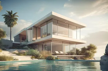
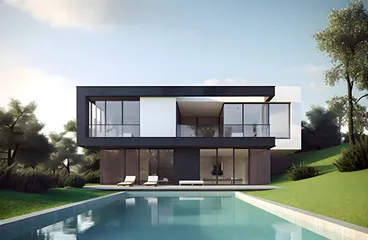
Scroll Area 03 - Vertical Image Gallery


Sometimes your layout is fine, but the content just doesn’t stop. That’s where Scroll Area helps. It keeps things neat, scrollable, and consistent without breaking your design.
Our Shadcn Scroll Area components are built with React and Tailwind CSS to give you full control over scrollable sections. Instead of relying on browser defaults, you get a clean, styled scrollbar that works the same across devices and screens.
What is the Shadcn Scroll Area?
Shadcn Scroll Area is a scrollable container that lets you control how overflow content behaves inside a fixed space. It replaces the default scrollbar with a cleaner, theme-friendly version.
- Wrap long content inside a fixed-height container
- Replace default scrollbars with styled overlay scrollbars
- Support vertical, horizontal, or both directions
Why Developers Use Shadcn Scroll Area
When building dashboards or admin panels, long content is unavoidable. Scroll Area helps manage that without making the UI messy.
- Clean, controlled scrolling for real UI layouts
- Keeps layouts clean even with large content
- Consistent scrollbar design across browsers
- Prevents layout shift caused by native scrollbars
- Works well with fixed height panels
- Easy to style using Tailwind classes
- Smooth scrolling with native performance
- Helps structure complex UI sections
Scroll Area Variants
Each variant uses the same base structure but adapts to different layout needs.
- Vertical Scroll - best for feeds, lists, and sidebars
- Horizontal Scroll - useful for wide tables or image rows
- Both Axes - for grids or large datasets
- Styled Scrollbar - matches your UI theme
- Custom Height - control container size easily
Key Features
- Custom overlay scrollbar for consistent UI
- Works in both vertical and horizontal directions
- No layout shift like native scrollbars
- Built with accessibility support
- Works with any content without restructuring
- Fully responsive with Tailwind
- Lightweight and easy to use
Tips for Using Shadcn Scroll Area
Using scroll areas well can improve UX a lot, but overusing them can confuse users.
- Keep scroll areas for clearly defined sections only
- Avoid nested scroll areas unless really needed
- Set proper height using Tailwind classes
- Use vertical scroll for lists and feeds
- Combine with headers or sticky elements for better UX
- Test on mobile for smooth touch scrolling
- Keep scrollbar visible enough for usability
Common Uses of Shadcn Scroll Area
Scroll Area fits naturally in many real-world layouts.
- Sidebar navigation menus
- Chat or messaging interfaces
- Notification panels
- Data tables with fixed height
- Code editors or logs
- Modal or drawer content
- Dropdown lists with many options
Easy to Integrate with any Components
Shadcn Scroll Area works best when combined with other UI elements to control layout and content flow. It fits naturally into dashboards, forms, and navigation systems.
- Use with Shadcn Dialog to handle long modal content
- Combine with Shadcn Card to create scrollable widgets
- Wrap Shadcn Table for horizontal scrolling data
- Pair with Shadcn Tabs for multi-view panels
- Add Shadcn Breadcrumb for navigation context
- Use with Shadcn Badge for status lists
- Combine with Shadcn Avatar for chat layouts
- Wrap Shadcn Combobox for searchable lists
- Use with Shadcn Dropdown for long menus
- Combine with Shadcn Accordion for structured sections
FAQs
Free Shadcn Scroll Area
Our Shadcn Scroll Area components are free to use. They are clean, flexible, and ready for real-world projects without any hidden rules.